Product
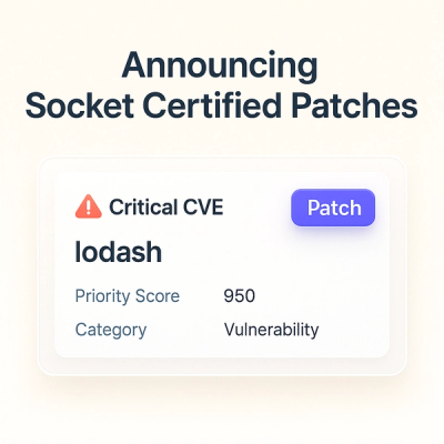
Announcing Socket Certified Patches: One-Click Fixes for Vulnerable Dependencies
A safer, faster way to eliminate vulnerabilities without updating dependencies
@stenajs-webui/panels
Advanced tools
This package contains larger, more use‑case driven components built by composing primitives from other @stenajs-webui/* packages.
Use these panels to quickly assemble common application scaffolding and rich UI building blocks.
Note: Not all subcomponents are listed; see Storybook for examples and usage.
ImageCarousel relies on yet-another-react-lightbox and some of its plugins. Required styles are now included automatically by the panels package when you use ImageCarousel or components that render it (no manual CSS imports needed).
Basic example:
<ImageCarousel images={[ { url: "https://example.com/image-900x600.jpg", alt: "Front view", width: 900, height: 600, title: "Front view", description: "Click to open fullscreen", fullscreenImage: { url: "https://example.com/image-1800x1200.jpg", width: 1800, height: 1200, }, }, ]} altLabelPrevious="Previous image" altLabelNext="Next image" altLabelClose="Close" altLabelZoomIn="Zoom in" altLabelZoomOut="Zoom out" />
Accessibility: Provide meaningful alt text and labels for all controls as shown above.
ProductCard uses ImageCarousel internally to display images. The required lightbox styles are bundled automatically when using the component.
FAQs
This package contains larger, more use‑case driven components built by composing primitives from other `@stenajs-webui/*` packages.
We found that @stenajs-webui/panels demonstrated a healthy version release cadence and project activity because the last version was released less than a year ago. It has 3 open source maintainers collaborating on the project.
Did you know?

Socket for GitHub automatically highlights issues in each pull request and monitors the health of all your open source dependencies. Discover the contents of your packages and block harmful activity before you install or update your dependencies.

Product
A safer, faster way to eliminate vulnerabilities without updating dependencies

Product
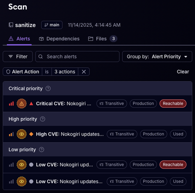
Reachability analysis for Ruby is now in beta, helping teams identify which vulnerabilities are truly exploitable in their applications.

Research
/Security News
Malicious npm packages use Adspect cloaking and fake CAPTCHAs to fingerprint visitors and redirect victims to crypto-themed scam sites.