storybook-addon-a11y
This Storybook addon can be helpful to make your UI components more accessible.
Framework Support
Getting started
First, install the addon.
$ yarn add @storybook/addon-a11y --dev
Add this line to your main.js file (create this file inside your Storybook config directory if needed).
export default {
  addons: ['@storybook/addon-a11y'],
};
And here's a sample story file to test the addon:
import React from 'react';

export default {
  title: 'button',
};

export const Accessible = () => <button>Accessible button</button>;

export const Inaccessible = () => (
  <button style={{ backgroundColor: 'red', color: 'darkRed' }}>Inaccessible button</button>
);
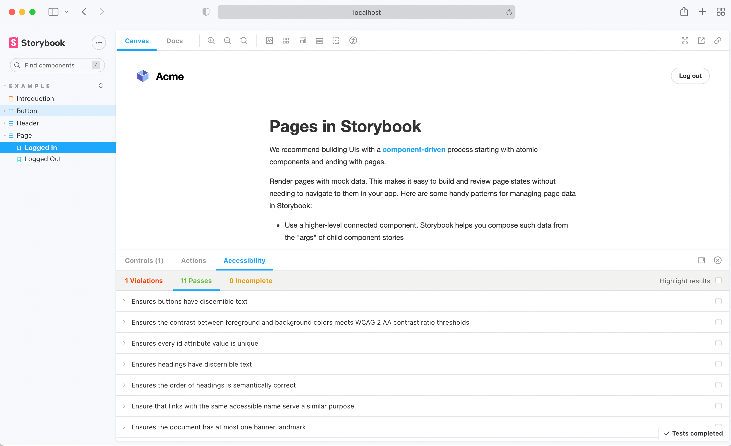
Handling failing rules
When Axe reports accessibility violations in stories, there are multiple ways to handle these failures depending on your needs.
Story-level overrides
At the Story level, override rules using parameters.a11y.config.rules.
export const InputWithoutAutofill = () => <input type="text" autocomplete="nope" />;
InputWithoutAutofill.parameters = {
a11y: {
disable: true,
config: {
rules: [
{
id: 'autocomplete-valid',
selector: '*:not([autocomplete="nope"])',
},
{
id: 'landmark-complementary-is-top-level',
reviewOnFail: true,
},
],
},
},
};
Alternatively, you can disable specific rules in a Story:
export const Inaccessible = () => (
  <button style={{ backgroundColor: 'red', color: 'darkRed' }}>Inaccessible button</button>
);
Inaccessible.parameters = {
  a11y: {
    config: {
      rules: [{ id: 'color-contrast', enabled: false }],
    },
  },
};
Tip: clearly explain in a comment why a rule was overridden, it’ll help you and your team trace back why certain violations aren’t being reported or need to be addressed. For example:
MyStory.parameters = {
a11y: {
config: {
rules: [
{
id: 'autocomplete-valid',
selector: '*:not([autocomplete="nope"])',
},
{
id: 'color-contrast',
reviewOnFail: true,
},
],
},
},
};
Global overrides
When you want to ignore an accessibility rule or change its settings across all stories, set parameters.a11y.config.rules in your Storybook’s preview.ts file. This can be particularly useful for ignoring false positives commonly reported by Axe.
export const parameters = {
a11y: {
config: {
rules: [
{
id: 'autocomplete-valid',
selector: '*:not([autocomplete="nope"])',
},
{
id: 'autocomplete-valid',
enabled: false,
},
],
},
},
};
Disabling checks
If you wish to entirely disable a11y checks for a subset of stories, you can control this with story parameters:
export const MyNonCheckedStory = () => <SomeComponent />;
MyNonCheckedStory.parameters = {
a11y: { disable: true },
};
Parameters
For more customizability use parameters to configure aXe options.
You can override these options at story level too.
import React from 'react';
import { storiesOf, addDecorator, addParameters } from '@storybook/react';
export default {
title: 'button',
parameters: {
a11y: {
element: '#storybook-root',
config: {},
options: {},
manual: true,
},
},
};
export const accessible = () => <button>Accessible button</button>;
export const inaccessible = () => (
<button style={{ backgroundColor: 'red', color: 'darkRed' }}>Inaccessible button</button>
);
Automate accessibility tests with test runner
The test runner does not apply any rules that you have set on your stories by default. You can configure the runner to correctly apply the rules by following the guide on the Storybook docs.
Roadmap
- Make UI accessible
- Show in story where violations are.
- Add more example tests
- Add tests
- Make CI integration possible