
Security News
Critical Security Vulnerability in React Server Components
React disclosed a CVSS 10.0 RCE in React Server Components and is advising users to upgrade affected packages and frameworks to patched versions now.
@storybook/addon-toolbars
Advanced tools
The Toolbars addon controls global story rendering options from Storybook's toolbar UI. It's a general purpose addon that can be used to:
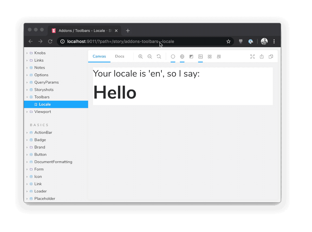
Toolbars is part of essentials and so is installed in all new Storybooks by default. If you need to add it to your Storybook, you can run:
npm i -D @storybook/addon-toolbars
Then, add following content to .storybook/main.js:
export default {
addons: ['@storybook/addon-toolbars'],
};
The usage is documented in the documentation.
addon-contexts?Addon-toolbars is the successor to addon-contexts, which provided convenient global toolbars in Storybook's toolbar.
The primary difference between the two packages is that addon-toolbars makes use of Storybook's new Story Args feature, which has the following advantages:
Standardization. Args are built into Storybook in 6.x. Since addon-toolbars is based on args, you don't need to learn any addon-specific APIs to use it.
Ergonomics. Global args are easy to consume in stories, in Storybook Docs, or even in other addons.
addon-toolbars is compatible with React, Vue 3, Angular, etc. out of the box with no framework logic needed in the addon.The @storybook/addon-knobs package allows developers to add UI controls to tweak the component props in real-time. It is similar to @storybook/addon-toolbars in that it provides a way to dynamically adjust the presentation of components, but it focuses more on component props rather than global contexts.
The @storybook/addon-controls package is a successor to @storybook/addon-knobs. It automatically generates controls based on component properties and provides a more integrated and less manual approach compared to @storybook/addon-toolbars, which is more about setting global contexts.
The @storybook/addon-contexts package allows you to provide contextual data to your stories, such as themes or internationalization. It is similar to @storybook/addon-toolbars in that it can be used to switch contexts, but it does so through a different UI approach, using a panel rather than a toolbar.
FAQs
Empty package - please don't use it anymore
The npm package @storybook/addon-toolbars receives a total of 3,870,056 weekly downloads. As such, @storybook/addon-toolbars popularity was classified as popular.
We found that @storybook/addon-toolbars demonstrated a healthy version release cadence and project activity because the last version was released less than a year ago. It has 12 open source maintainers collaborating on the project.
Did you know?

Socket for GitHub automatically highlights issues in each pull request and monitors the health of all your open source dependencies. Discover the contents of your packages and block harmful activity before you install or update your dependencies.

Security News
React disclosed a CVSS 10.0 RCE in React Server Components and is advising users to upgrade affected packages and frameworks to patched versions now.

Research
/Security News
We spotted a wave of auto-generated “elf-*” npm packages published every two minutes from new accounts, with simple malware variants and early takedowns underway.

Research
/Security News
Malicious Rust crate evm-units disguised as an EVM version helper downloads and silently executes OS-specific payloads likely aimed at crypto theft.