Security Fundamentals
Turtles, Clams, and Cyber Threat Actors: Shell Usage
The Socket Threat Research Team uncovers how threat actors weaponize shell techniques across npm, PyPI, and Go ecosystems to maintain persistence and exfiltrate data.
@syncfusion/ej2-angular-buttons
Advanced tools
A package of feature-rich Essential JS 2 components such as Button, CheckBox, RadioButton and Switch. for Angular
A package of Syncfusion Angular UI Components (Essential JS 2) Button, CheckBox, RadioButton and Switch.

This is a commercial product and requires a paid license for possession or use. Syncfusion’s licensed software, including this component, is subject to the terms and conditions of Syncfusion's EULA (https://www.syncfusion.com/eula/es/). To acquire a license, you can purchase one at https://www.syncfusion.com/sales/products or start a free 30-day trial here (https://www.syncfusion.com/account/manage-trials/start-trials).
A free community license (https://www.syncfusion.com/products/communitylicense) is also available for companies and individuals whose organizations have less than $1 million USD in annual gross revenue and five or fewer developers.
To install Button and its dependent packages, use the following command
npm install @syncfusion/ej2-angular-buttons
Following list of components are available in the package.
Button - Button is a graphical user interface element that triggers an event on its click action.
CheckBox - CheckBox is a graphical user interface element that allows to select one or more options from the choices.
RadioButton - RadioButton is a graphical user interface element that allows to select one option from the choices.
Switch - Switch is a graphical user interface element that allows you to toggle between checked and unchecked states.
These components are available in following list of frameworks.
Types - Provided with different types of Button.
Predefined Styles - Provided with predefined styles of Button.
Sizes - Provided with different sizes of Button.
Icons - Supports text and icon on the Button.
States - Provided with different states of CheckBox.
Label - Supports label and its positioning.
Sizes - Provided with different sizes of CheckBox.
States - Provided with different states of RadioButton.
Label - Supports label and its positioning.
Sizes - Provided with different sizes of RadioButton.
Product support is available for through following mediums.
syncfusion, ej2.Check the license detail here.
Check the changelog here
© Copyright 2019 Syncfusion, Inc. All Rights Reserved. The Syncfusion Essential Studio license and copyright applies to this distribution.
FAQs
Did you know?

Socket for GitHub automatically highlights issues in each pull request and monitors the health of all your open source dependencies. Discover the contents of your packages and block harmful activity before you install or update your dependencies.

Security Fundamentals
The Socket Threat Research Team uncovers how threat actors weaponize shell techniques across npm, PyPI, and Go ecosystems to maintain persistence and exfiltrate data.

Security News
At VulnCon 2025, NIST scrapped its NVD consortium plans, admitted it can't keep up with CVEs, and outlined automation efforts amid a mounting backlog.

Product
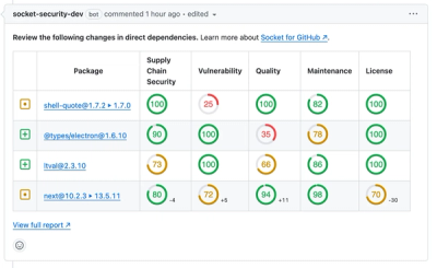
We redesigned our GitHub PR comments to deliver clear, actionable security insights without adding noise to your workflow.