Security News
TC39 Advances 11 Proposals for Math Precision, Binary APIs, and More
TC39 advances 11 JavaScript proposals, with two moving to Stage 4, bringing better math, binary APIs, and more features one step closer to the ECMAScript spec.
@syncfusion/ej2-angular-buttons
Advanced tools
A package of feature-rich Essential JS 2 components such as Button, CheckBox, RadioButton and Switch. for Angular
The Angular Buttons package includes the following list of components.
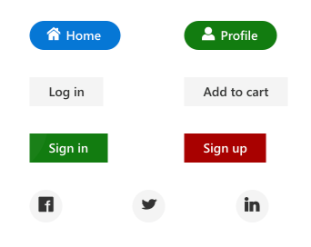
The Angular Button component is a custom HTML5 button component. It has several built-in features such as support for icons, predefined styles, different button types, different button sizes, and UI customization.
Getting Started . Online demos . Learn more
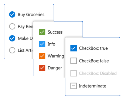
The Angular CheckBox component is a custom checkbox-type HTML5 input component for selecting one or more options from a list of predefined choices. It supports an indeterminate state, different sizes, custom labels and positions, and UI customization.
Getting Started . Online demos . Learn more
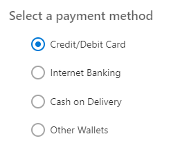
The Angular RadioButton component is a custom radio-type HTML5 input component for selecting one option from a list of predefined choices. It supports different states, sizes, labels, label positions, and UI customizations.
Getting Started . Online demos . Learn more
The Angular Switch component is a custom HTML5 input-type component control that allows you to perform a toggle (on/off) action between checked and unchecked states. It supports different sizes, labels, label positions, and UI customization.
Getting Started . Online demos . Learn more

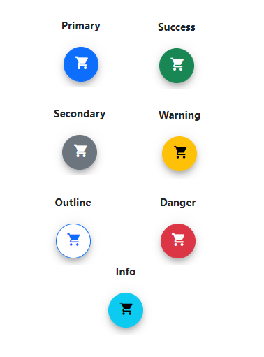
The Angular Floating Action Button component performs the primary action that appears in front of all screen contents. It has several built-in features such as support for icons, predefined styles, positions, and UI customization.
Getting Started . Online demos . Learn more
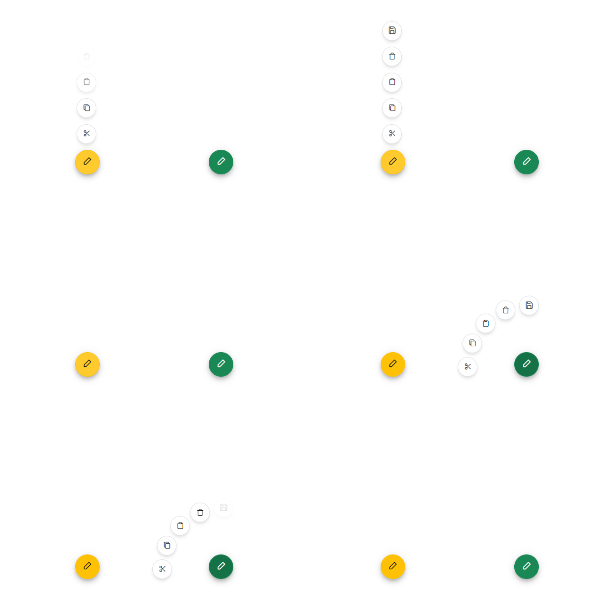
The Angular Speed Dial component is an extension of the floating action button that displays a list of action buttons when clicked. It has several built-in features such as support for items, predefined styles, positions, and UI customization.
Getting Started . Online demos . Learn more
Trusted by the world's leading companies

To install buttons and its dependent packages, use the following command.
npm install @syncfusion/ej2-angular-buttons
Button components are available in following list of frameworks.
 JavaScript |  React |  Vue |  ASP.NET Core |  ASP.NET MVC |
|---|
Product support is available through following mediums.
Check the changelog here. Get minor improvements and bug fixes every week to stay up to date with frequent updates.
This is a commercial product and requires a paid license for possession or use. Syncfusion® licensed software, including this component, is subject to the terms and conditions of Syncfusion® EULA. To acquire a license for 80+ Angular UI components, you can purchase or start a free 30-day trial.
A free community license is also available for companies and individuals whose organizations have less than $1 million USD in annual gross revenue and five or fewer developers.
See LICENSE FILE for more info.
© Copyright 2024 Syncfusion® Inc. All Rights Reserved. The Syncfusion® Essential Studio® license and copyright applies to this distribution.
FAQs
Did you know?

Socket for GitHub automatically highlights issues in each pull request and monitors the health of all your open source dependencies. Discover the contents of your packages and block harmful activity before you install or update your dependencies.

Security News
TC39 advances 11 JavaScript proposals, with two moving to Stage 4, bringing better math, binary APIs, and more features one step closer to the ECMAScript spec.

Research
/Security News
A flawed sandbox in @nestjs/devtools-integration lets attackers run code on your machine via CSRF, leading to full Remote Code Execution (RCE).

Product
Customize license detection with Socket’s new license overlays: gain control, reduce noise, and handle edge cases with precision.