
Security News
npm Adopts OIDC for Trusted Publishing in CI/CD Workflows
npm now supports Trusted Publishing with OIDC, enabling secure package publishing directly from CI/CD workflows without relying on long-lived tokens.
@syncfusion/ej2-angular-charts
Advanced tools
Feature-rich chart control with built-in support for over 25 chart types, technical indictors, trendline, zooming, tooltip, selection, crosshair and trackball. for Angular
The Angular Charts component is a well-crafted charting component for visualizing data with 50+ charts and graphs, ranging from line to financial types. It can bind data from datasource such as array of JSON objects, OData web services or DataManager. All chart elements are rendered using Scalable Vector Graphics (SVG).
The Angular Charts package includes the following list of components.
The Angular Chart Component is a feature-rich chart component with built-in support for over 50 chart types, technical indictors, trendline, zooming, tooltip, selection, crosshair and trackball.
Getting started . Online demos . Learn more
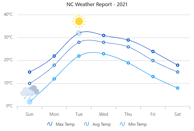
Built-in support for pie, doughnut, pyramid and funnel chart types, to show the proportions and percentages between the categories.
Getting started . Online demos . Learn more
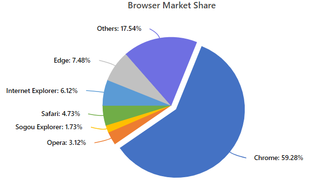
The Angular Stock Chart Component is a well-crafted, easy-to-use financial charting package to track and visualize stock price of any company over a specific period using charting and range tools.
Getting started . Online demos . Learn more
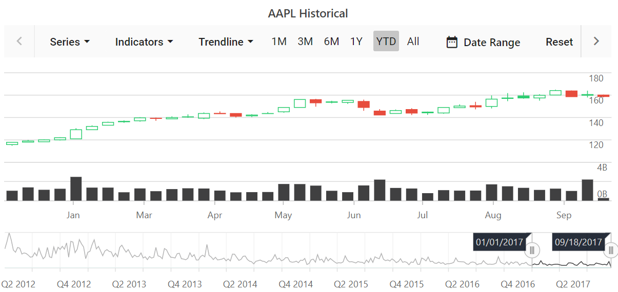
The Angular Range Navigator Component is an interface for selecting a small range from a large collection. It is commonly used in financial dashboards to filter a date range for data that needs to be visualized.
Getting started . Online demos . Learn more
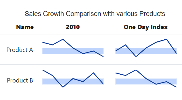
The Angular Sparkline Component is a very small chart control drawn without axes or coordinates. The sparklines are easy to interpret and convey more information to users by visualizing data in a small amount of space.
Getting started . Online demos . Learn more
The Angular Bullet Chart Component is a interface to visually compare measures, similar to the commonly used bar chart. A bullet chart displays one or more measures and compares them with a target value.
Getting started . Online demos . Learn more

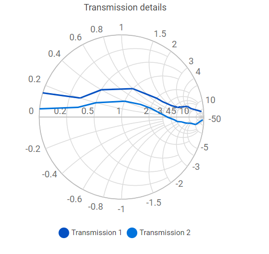
The Angular Smith Chart Component visualize data of high frequency circuit applications. It contains two sets of circles to plot parameters of transmission lines.
Getting started . Online demos . Learn more
You can use Angular CLI to setup your Angular applications. To install the Angular CLI, use the following command.
npm install -g @angular/cli
Create a new Angular application using the following Angular CLI command.
ng new my-app
cd my-app
All Syncfusion Angular packages are available in npmjs.com. To install the Angular chart package, use the following command.
ng add @syncfusion/ej2-angular-charts
The above command does the below configuration to your Angular app.
@syncfusion/ej2-angular-charts package and its peer dependencies to your package.json file.ChartModule in your application module app.module.ts.angular.json file.This makes it easy to add the Syncfusion Angular Charts module to your project and start using it in your application.
In src/app/app.component.ts, use <ejs-chart> selector in the template attribute of the @Component directive to render the Syncfusion Angular Chart component.
import { Component, OnInit } from '@angular/core';

@Component({
    selector: 'app-root',
    template: `<ejs-chart id="chart-container" [primaryXAxis]='primaryXAxis'>
               <e-series-collection>
                  <e-series [dataSource]='chartData' type='Line' xName='month' yName='sales' name='Sales'></e-series>
               </e-series-collection>
               </ejs-chart>`
})
export class AppComponent implements OnInit {

    public data: object[] = [];

    ngOnInit(): void {
         this.chartData = [
         { month: 'Jan', sales: 35 }, { month: 'Feb', sales: 28 },
         { month: 'Mar', sales: 34 }, { month: 'Apr', sales: 32 },
         { month: 'May', sales: 40 }, { month: 'Jun', sales: 32 },
         { month: 'Jul', sales: 35 }, { month: 'Aug', sales: 55 },
         { month: 'Sep', sales: 38 }, { month: 'Oct', sales: 30 },
         { month: 'Nov', sales: 25 }, { month: 'Dec', sales: 32 }
         ];
         this.primaryXAxis = {
           valueType: 'Category'
         };
    }
}
Chart components are available in following list of frameworks.
 JavaScript |  React |  Vue |  ASP.NET Core |  ASP.NET MVC |
|---|
Product support is available through the following mediums.
Check the changelog here. Get minor improvements and bug fixes every week to stay up to date with frequent updates.
This is a commercial product and requires a paid license for possession or use.Syncfusion® Essential Studio®licensed software, including this component, is subject to the terms and conditions ofSyncfusion® Essential Studio®EULA. To acquire a license for 80+ Angular UI components, you can purchase or start a free 30-day trial.
A free community license is also available for companies and individuals whose organizations have less than $1 million USD in annual gross revenue and five or fewer developers.
See LICENSE FILE for more info.
© Copyright 2025 Syncfusion® Inc. All Rights Reserved. The Syncfusion® Essential Studio® license and copyright applies to this distribution.
FAQs
Feature-rich chart control with built-in support for over 25 chart types, technical indictors, trendline, zooming, tooltip, selection, crosshair and trackball. for Angular
The npm package @syncfusion/ej2-angular-charts receives a total of 13,116 weekly downloads. As such, @syncfusion/ej2-angular-charts popularity was classified as popular.
We found that @syncfusion/ej2-angular-charts demonstrated a healthy version release cadence and project activity because the last version was released less than a year ago. It has 3 open source maintainers collaborating on the project.
Did you know?

Socket for GitHub automatically highlights issues in each pull request and monitors the health of all your open source dependencies. Discover the contents of your packages and block harmful activity before you install or update your dependencies.

Security News
npm now supports Trusted Publishing with OIDC, enabling secure package publishing directly from CI/CD workflows without relying on long-lived tokens.

Research
/Security News
A RubyGems malware campaign used 60 malicious packages posing as automation tools to steal credentials from social media and marketing tool users.

Security News
The CNA Scorecard ranks CVE issuers by data completeness, revealing major gaps in patch info and software identifiers across thousands of vulnerabilities.