Vue Buttons components
What's Included in the Vue Buttons Package
The Vue Buttons package includes the following list of components.
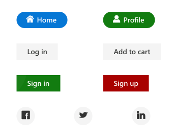
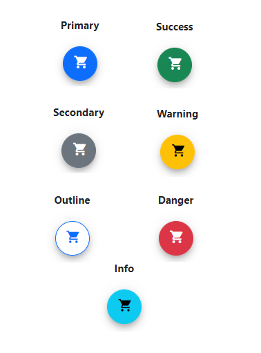
Vue Button
The Vue Button component is a custom HTML5 button component. It has several built-in features such as support for icons, predefined styles, different button types, different button sizes, and UI customization.
Getting Started .
Online demos .
Learn more
Key features
- Types - Provided with different types of Button.
- Predefined styles - Provided with predefined styles of Button.
- Sizes - Provided with different sizes of Button.
- Icons - Supports text and icon on the Button.
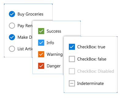
Vue CheckBox
The Vue CheckBox component is a custom checkbox-type HTML5 input component for selecting one or more options from a list of predefined choices. It supports an indeterminate state, different sizes, custom labels and positions, and UI customization.
Getting Started .
Online demos .
Learn more
Key features
- States - Provided with different states of CheckBox.
- Label - Supports label and its positioning.
- Sizes - Provided with different sizes of CheckBox.
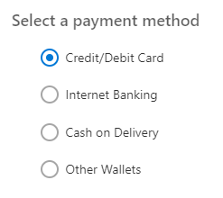
Vue RadioButton
The Vue RadioButton component is a custom radio-type HTML5 input component for selecting one option from a list of predefined choices. It supports different states, sizes, labels, label positions, and UI customizations.
Getting Started .
Online demos .
Learn more
Key features
- States - Provided with different states of RadioButton.
- Label - Supports label and its positioning.
- Sizes - Provided with different sizes of RadioButton.
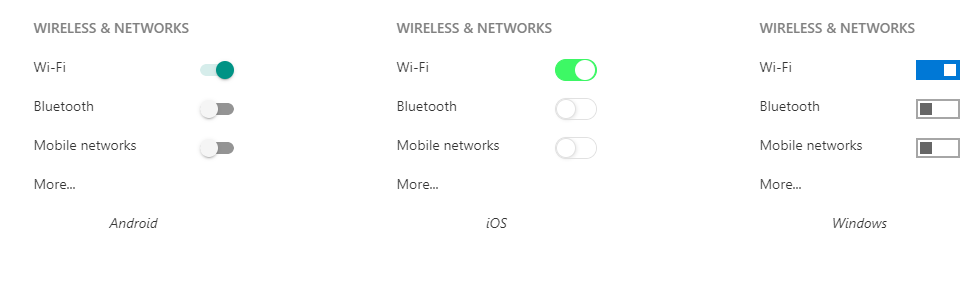
Vue Switch
The Vue Switch component is a custom HTML5 input-type component control that allows you to perform a toggle (on/off) action between checked and unchecked states. It supports different sizes, labels, label positions, and UI customization.
Getting Started .
Online demos .
Learn more
Key features
- Text - Supports text.
- Sizes - Provided with different sizes of Switch.
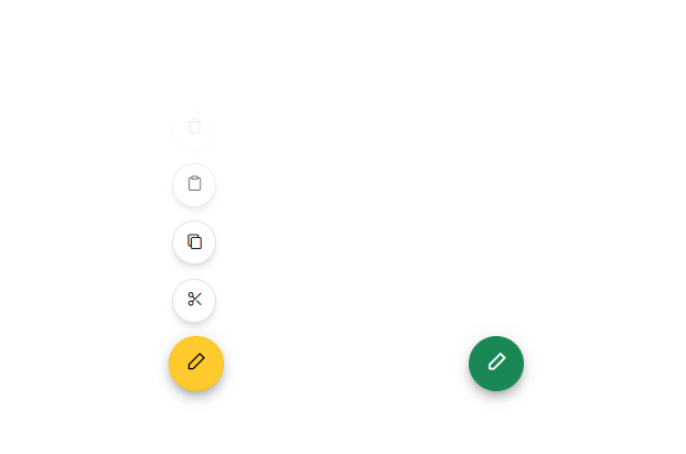
Vue Floating Action Button
The Vue Floating Action Button component performs the primary action that appears in front of all screen contents. It has several built-in features such as support for icons, predefined styles, positions, and UI customization.
Getting Started .
Online demos .
Learn more
Key features
- Icons - Supports addition of both text and icon on the Button.
- Predefined styles - Provided with predefined styles for the Floating Action Button.
- Positions - Positioned anywhere on the target. If the target is not defined, then Floating Action Button is positioned based on the browser viewport.
Vue Speed Dial
The Vue Speed Dial component is an extension of the floating action button that displays a list of action buttons when clicked. It has several built-in features such as support for items, predefined styles, positions, and UI customization.
Getting Started .
Online demos .
Learn more
Key features
- Items - Provides different items support for the Speed Dial.
- Predefined styles - Provided with predefined styles for the Speed Dial.
- Positions - Positioned anywhere on the target. If the target is not defined, then Speed Dial is positioned based on the browser viewport.
- Modes - Supports display of items in both linear and radial display modes.
- Modal - Adds an overlay to prevent the background interaction.
- Templates - Customize Speed Dial items and the popup content using templates.
Trusted by the world's leading companies

Setup
To install buttons and its dependent packages, use the following command,
npm install @syncfusion/ej2-vue-buttons
Supported frameworks
Buttons components are also offered in following list of frameworks.
Showcase samples
Support
Product support is available for through following mediums.
Changelog
Check the changelog here. Get minor improvements and bug fixes every week to stay up to date with frequent updates.
License and copyright
This is a commercial product and requires a paid license for possession or use. Syncfusion® licensed software, including this component, is subject to the terms and conditions of Syncfusion® EULA. To acquire a license for 80+ Vue UI components, you can purchase or start a free 30-day trial.
A free community license is also available for companies and individuals whose organizations have less than $1 million USD in annual gross revenue and five or fewer developers.
See LICENSE FILE for more info.
© Copyright 2025 Syncfusion® Inc. All Rights Reserved. The Syncfusion® Essential Studio® license and copyright applies to this distribution.


