Research
/Security News
Malicious Chrome Extension Performs Hidden Affiliate Hijacking
A Chrome extension claiming to hide Amazon ads was found secretly hijacking affiliate links, replacing creators’ tags with its own without user consent.
@team-plain/react-chat-ui
Advanced tools
This package provides everything you need to add Plain's chat capabilities to your React website.
In order to use the 'Plain React Chat UI', you need to sign up with Plain at https://www.plain.com.
Please refer to our documentation to learn how to integrate the chat UI in your website.
Chat component which renders the Plain chat.usePlain hook which exposes a function to log out and the number of unread messages for the customer.PlainProvider which provides context for the Chat component and the usePlain hook.PlainProviderThe PlainProvider is the required context provider for the Chat component and the usePlain hook.
appKeyRequired prop. Used to specify which workspace your chat is for. Learn how to get an app key in our documentation.
customerOptional prop. This is how you specify which kind of customer is currently using your app.
In the case of a logged-out customer you can provide an object which matches this type. If the customer prop is not provided this is the default.
type LoggedOutCustomer = {
  type: 'logged-out';
};
If you have a logged-in customer you should provide an object which matches this type:
type LoggedInCustomer = {
  type: 'logged-in';
  getCustomerJwt: () => Promise<string>;
};
getCustomerJwt should return a JWT signed with the private key whose public key you uploaded to Plain. Learn more on
this function in our documentation.
themeThrough the theme prop, you can incrementally adopt a custom theme for your chat UI. If any values not provided by
your custom theme will fall back to the defaultTheme which you can import from @team-plain/react-chat-ui.
For those using Typescript, the type ThemeConfig is available from @team-plain/react-chat-ui.
ChatThe component which renders the chat UI. It can be used anywhere within the PlainProvider. It will take the full width
of its parents.
usePlain()This hook can be used anywhere within the PlainProvider. It returns:
logout: a function you can call when you need to log the customer out and reset any state within the chatnotificationsCount: a number which is the current number of unread messages a customer has. You can use this to
render custom badges and such.FAQs
Plain and simple React chat UI
We found that @team-plain/react-chat-ui demonstrated a not healthy version release cadence and project activity because the last version was released a year ago. It has 1 open source maintainer collaborating on the project.
Did you know?

Socket for GitHub automatically highlights issues in each pull request and monitors the health of all your open source dependencies. Discover the contents of your packages and block harmful activity before you install or update your dependencies.

Research
/Security News
A Chrome extension claiming to hide Amazon ads was found secretly hijacking affiliate links, replacing creators’ tags with its own without user consent.

Security News
A surge of AI-generated vulnerability reports has pushed open source maintainers to rethink bug bounties and tighten security disclosure processes.

Product
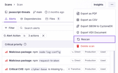
Scan results now load faster and remain consistent over time, with stable URLs and on-demand rescans for fresh security data.