


Product
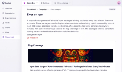
Introducing Supply Chain Attack Campaigns Tracking in the Socket Dashboard
Campaign-level threat intelligence in Socket now shows when active supply chain attacks affect your repositories and packages.
By Philipp Burckhardt - Jan 21, 2026
@testing-library/user-event
Advanced tools

Fire events the same way the user does


From testing-library/dom-testing-library#107:
[...] it is becoming apparent the need to express user actions on a web page using a higher-level abstraction than
fireEvent
user-event tries to simulate the real events that would happen in the browser
as the user interacts with it. For example userEvent.click(checkbox) would
change the state of the checkbox.
The library is still a work in progress and any help is appreciated.
click(element, eventInit, options)dblClick(element, eventInit, options)type(element, text, [options])keyboard(text, options)upload(element, file, [{ clickInit, changeInit }], [options])clear(element)selectOptions(element, values)deselectOptions(element, values)tab({shift, focusTrap})hover(element)unhover(element)paste(element, text, eventInit, options)specialCharsWith NPM:
npm install @testing-library/user-event @testing-library/dom --save-dev
With Yarn:
yarn add @testing-library/user-event @testing-library/dom --dev
Now simply import it in your tests:
import userEvent from '@testing-library/user-event'

// or

const {default: userEvent} = require('@testing-library/user-event')
Note: All userEvent methods are synchronous with one exception: when delay
with userEvent.type as described below). We also discourage using userEvent
inside before/after blocks at all, for important reasons described in
"Avoid Nesting When You're Testing".
click(element, eventInit, options)Clicks element, depending on what element is it can have different side
effects.
import React from 'react'
import {render, screen} from '@testing-library/react'
import userEvent from '@testing-library/user-event'

test('click', () => {
  render(
    <div>
      <label htmlFor="checkbox">Check</label>
      <input id="checkbox" type="checkbox" />
    </div>,
  )

  userEvent.click(screen.getByText('Check'))
  expect(screen.getByLabelText('Check')).toBeChecked()
})
You can also ctrlClick / shiftClick etc with
userEvent.click(elem, {ctrlKey: true, shiftKey: true})
See the
MouseEvent
constructor documentation for more options.
Note that click will trigger hover events before clicking. To disable this,
set the skipHover option to true. Also note that trying to click an element
with pointer-events being set to "none" (i.e. unclickable) will throw an error.
dblClick(element, eventInit, options)Clicks element twice, depending on what element is it can have different
side effects.
import React from 'react'
import {render, screen} from '@testing-library/react'
import userEvent from '@testing-library/user-event'

test('double click', () => {
  const onChange = jest.fn()
  render(<input type="checkbox" onChange={onChange} />)
  const checkbox = screen.getByRole('checkbox')
  userEvent.dblClick(checkbox)
  expect(onChange).toHaveBeenCalledTimes(2)
  expect(checkbox).not.toBeChecked()
})
type(element, text, [options])Writes text inside an <input> or a <textarea>.
import React from 'react'
import {render, screen} from '@testing-library/react'
import userEvent from '@testing-library/user-event'

test('type', () => {
  render(<textarea />)

  userEvent.type(screen.getByRole('textbox'), 'Hello,{enter}World!')
  expect(screen.getByRole('textbox')).toHaveValue('Hello,\nWorld!')
})
options.delay is the number of milliseconds that pass between two characters
are typed. By default it's 0. You can use this option if your component has a
different behavior for fast or slow users. If you do this, you need to make sure
to await!
type will click the element before typing. To disable this, set the
skipClick option to true.
The following special character strings are supported:
| Text string | Key | Modifier | Notes |
|---|---|---|---|
{enter} | Enter | N/A | Will insert a newline character (<textarea /> only). |
{space} | ' ' | N/A | |
{esc} | Escape | N/A | |
{backspace} | Backspace | N/A | Will delete the previous character (or the characters within the selectedRange, see example below). |
{del} | Delete | N/A | Will delete the next character (or the characters within the selectedRange, see example below) |
{selectall} | N/A | N/A | Selects all the text of the element. Note that this will only work for elements that support selection ranges (so, not email, password, number, among others) |
{arrowleft} | ArrowLeft | N/A | |
{arrowright} | ArrowRight | N/A | |
{arrowup} | ArrowUp | N/A | |
{arrowdown} | ArrowDown | N/A | |
{home} | Home | N/A | |
{end} | End | N/A | |
{shift} | Shift | shiftKey | Does not capitalize following characters. |
{ctrl} | Control | ctrlKey | |
{alt} | Alt | altKey | |
{meta} | OS | metaKey | |
{capslock} | CapsLock | modifierCapsLock | Fires both keydown and keyup when used (simulates a user clicking their "Caps Lock" button to enable caps lock). |
A note about modifiers: Modifier keys (
{shift},{ctrl},{alt},{meta}) will activate their corresponding event modifiers for the duration of type command or until they are closed (via{/shift},{/ctrl}, etc.). If they are not closed explicitly, then events will be fired to close them automatically (to disable this, set theskipAutoCloseoption totrue).
We take the same stance as Cypress in that we do not simulate the behavior that happens with modifier key combinations as different operating systems function differently in this regard.
An example of an usage with a selection range:
import React from 'react'
import {render, screen} from '@testing-library/react'
import userEvent from '@testing-library/user-event'

test('delete characters within the selectedRange', () => {
  render(
    <div>
      <label htmlFor="my-input">Example:</label>
      <input id="my-input" type="text" value="This is a bad example" />
    </div>,
  )
  const input = screen.getByLabelText(/example/i)
  input.setSelectionRange(10, 13)
  userEvent.type(input, '{backspace}good')

  expect(input).toHaveValue('This is a good example')
})
The following is an example of usage of this library with
<input type="time" />
import React from 'react'
import {render, screen} from '@testing-library/react'
import userEvent from '@testing-library/user-event'

test('types into the input', () => {
  render(
    <>
      <label for="time">Enter a time</label>
      <input type="time" id="time" />
    </>,
  )
  const input = screen.getByLabelText(/enter a time/i)
  userEvent.type(input, '13:58')
  expect(input.value).toBe('13:58')
})
keyboard(text, options)Simulates the keyboard events described by text. This is similar to
userEvent.type() but without any clicking or changing the selection range.
You should use
userEvent.keyboardif you want to just simulate pressing buttons on the keyboard. You should useuserEvent.typeif you just want to conveniently insert some text into an input field or textarea.
Keystrokes can be described:
userEvent.keyboard('foo') // translates to: f, o, o
{ and [ are used as special character and can be referenced
by doubling them.
userEvent.keyboard('{{a[[') // translates to: {, a, [
key)
userEvent.keyboard('{Shift}{f}{o}{o}') // translates to: Shift, f, o, o
Shift will be lifted before pressing
f.userEvent.keyboard('[ShiftLeft][KeyF][KeyO][KeyO]') // translates to: Shift, f, o, o
userEvent.type modifier/specialChar The modifiers like {shift}
(note the lowercase) will automatically be kept pressed, just like before. You
can cancel this behavior by adding a / to the end of the descriptor.
userEvent.keyboard('{shift}{ctrl/}a{/shift}') // translates to: Shift(down), Control(down+up), a, Shift(up)
Keys can be kept pressed by adding a > to the end of the descriptor - and
lifted by adding a / to the beginning of the descriptor:
userEvent.keyboard('{Shift>}A{/Shift}') // translates to: Shift(down), A, Shift(up)
userEvent.keyboard returns a keyboard state that can be used to continue
keyboard operations.
const keyboardState = userEvent.keyboard('[ControlLeft>]') // keydown [ControlLeft]
// ... inspect some changes ...
userEvent.keyboard('a', {keyboardState}) // press [KeyA] with active ctrlKey modifier
The mapping of key to code is performed by a
default key map
portraying a "default" US-keyboard. You can provide your own local keyboard
mapping per option.
userEvent.keyboard('?', {keyboardMap: myOwnLocaleKeyboardMap})
Future versions might try to interpolate the modifiers needed to reach a printable key on the keyboard. E.g. Automatically pressing
{Shift}when CapsLock is not active andAis referenced. If you don't wish this behavior, you can passautoModify: falsewhen usinguserEvent.keyboardin your code.
upload(element, file, [{ clickInit, changeInit }], [options])Uploads file to an <input>. For uploading multiple files use <input> with
multiple attribute and the second upload argument must be array then. Also
it's possible to initialize click or change event with using third argument.
If options.applyAccept is set to true and there is an accept attribute on
the element, files that don't match will be discarded.
import React from 'react'
import {render, screen} from '@testing-library/react'
import userEvent from '@testing-library/user-event'

test('upload file', () => {
  const file = new File(['hello'], 'hello.png', {type: 'image/png'})

  render(
    <div>
      <label htmlFor="file-uploader">Upload file:</label>
      <input id="file-uploader" type="file" />
    </div>,
  )
  const input = screen.getByLabelText(/upload file/i)
  userEvent.upload(input, file)

  expect(input.files[0]).toStrictEqual(file)
  expect(input.files.item(0)).toStrictEqual(file)
  expect(input.files).toHaveLength(1)
})

test('upload multiple files', () => {
  const files = [
    new File(['hello'], 'hello.png', {type: 'image/png'}),
    new File(['there'], 'there.png', {type: 'image/png'}),
  ]

  render(
    <div>
      <label htmlFor="file-uploader">Upload file:</label>
      <input id="file-uploader" type="file" multiple />
    </div>,
  )
  const input = screen.getByLabelText(/upload file/i)
  userEvent.upload(input, files)

  expect(input.files).toHaveLength(2)
  expect(input.files[0]).toStrictEqual(files[0])
  expect(input.files[1]).toStrictEqual(files[1])
})
clear(element)Selects the text inside an <input> or <textarea> and deletes it.
import React from 'react'
import {render, screen} from '@testing-library/react'
import userEvent from '@testing-library/user-event'

test('clear', () => {
  render(<textarea value="Hello, World!" />)

  userEvent.clear(screen.getByRole('textbox', 'email'))
  expect(screen.getByRole('textbox', 'email')).toHaveAttribute('value', '')
})
selectOptions(element, values)Selects the specified option(s) of a <select> or a <select multiple>
element.
import React from 'react'
import {render, screen} from '@testing-library/react'
import userEvent from '@testing-library/user-event'

test('selectOptions', () => {
  render(
    <select multiple data-testid="select-multiple">
      <option data-testid="val1" value="1">
        A
      </option>
      <option data-testid="val2" value="2">
        B
      </option>
      <option data-testid="val3" value="3">
        C
      </option>
    </select>,
  )

  userEvent.selectOptions(screen.getByTestId('select-multiple'), ['1', '3'])

  expect(screen.getByTestId('val1').selected).toBe(true)
  expect(screen.getByTestId('val2').selected).toBe(false)
  expect(screen.getByTestId('val3').selected).toBe(true)
})
The values parameter can be either an array of values or a singular scalar
value.
It also accepts option nodes:
userEvent.selectOptions(screen.getByTestId('select-multiple'), [
  screen.getByText('A'),
  screen.getByText('B'),
])
deselectOptions(element, values)Remove the selection for the specified option(s) of a <select multiple>
element.
import * as React from 'react'
import {render, screen} from '@testing-library/react'
import userEvent from '@testing-library/user-event'

test('deselectOptions', () => {
  render(
    <select multiple>
      <option value="1">A</option>
      <option value="2">B</option>
      <option value="3">C</option>
    </select>,
  )

  userEvent.selectOptions(screen.getByRole('listbox'), '2')
  expect(screen.getByText('B').selected).toBe(true)
  userEvent.deselectOptions(screen.getByRole('listbox'), '2')
  expect(screen.getByText('B').selected).toBe(false)
  // can do multiple at once as well:
  // userEvent.deselectOptions(screen.getByRole('listbox'), ['1', '2'])
})
The values parameter can be either an array of values or a singular scalar
value.
tab({shift, focusTrap})Fires a tab event changing the document.activeElement in the same way the browser does.
Options:
shift (default false) can be true or false to invert tab direction.focusTrap (default document) a container element to restrict the tabbing
within.A note about tab: jsdom does not support tabbing, so this feature is a way to enable tests to verify tabbing from the end user's perspective. However, this limitation in jsdom will mean that components like focus-trap-react will not work with
userEvent.tab()or jsdom. For that reason, thefocusTrapoption is available to let you ensure your user is restricted within a focus-trap.
import React from 'react'
import {render, screen} from '@testing-library/react'
import '@testing-library/jest-dom/extend-expect'
import userEvent from '@testing-library/user-event'

it('should cycle elements in document tab order', () => {
  render(
    <div>
      <input data-testid="element" type="checkbox" />
      <input data-testid="element" type="radio" />
      <input data-testid="element" type="number" />
    </div>,
  )

  const [checkbox, radio, number] = screen.getAllByTestId('element')

  expect(document.body).toHaveFocus()

  userEvent.tab()

  expect(checkbox).toHaveFocus()

  userEvent.tab()

  expect(radio).toHaveFocus()

  userEvent.tab()

  expect(number).toHaveFocus()

  userEvent.tab()

  // cycle goes back to the body element
  expect(document.body).toHaveFocus()

  userEvent.tab()

  expect(checkbox).toHaveFocus()
})
hover(element)Hovers over element.
import React from 'react'
import {render, screen} from '@testing-library/react'
import userEvent from '@testing-library/user-event'
import Tooltip from '../tooltip'

test('hover', () => {
  const messageText = 'Hello'
  render(
    <Tooltip messageText={messageText}>
      <TrashIcon aria-label="Delete" />
    </Tooltip>,
  )

  userEvent.hover(screen.getByLabelText(/delete/i))
  expect(screen.getByText(messageText)).toBeInTheDocument()
  userEvent.unhover(screen.getByLabelText(/delete/i))
  expect(screen.queryByText(messageText)).not.toBeInTheDocument()
})
unhover(element)Unhovers out of element.
See above for an example
paste(element, text, eventInit, options)Allows you to simulate the user pasting some text into an input.
test('should paste text in input', () => {
  render(<MyInput />)

  const text = 'Hello, world!'
  userEvent.paste(getByRole('textbox', {name: /paste your greeting/i}), text)
  expect(element).toHaveValue(text)
})
You can use the eventInit if what you're pasting should have clipboardData
(like files).
specialCharsA handful set of special characters used in type method.
| Key | Character |
|---|---|
| arrowLeft | {arrowleft} |
| arrowRight | {arrowright} |
| arrowDown | {arrowdown} |
| arrowUp | {arrowup} |
| home | {home} |
| end | {end} |
| enter | {enter} |
| escape | {esc} |
| delete | {del} |
| backspace | {backspace} |
| selectAll | {selectall} |
| space | {space} |
| whitespace | ' ' |
Usage example:
import React from 'react'
import {render, screen} from '@testing-library/react'
import userEvent, {specialChars} from '@testing-library/user-event'

test('delete characters within the selectedRange', () => {
  render(
    <div>
      <label htmlFor="my-input">Example:</label>
      <input id="my-input" type="text" value="This is a bad example" />
    </div>,
  )
  const input = screen.getByLabelText(/example/i)
  input.setSelectionRange(10, 13)
  userEvent.type(input, `${specialChars.backspace}good`)

  expect(input).toHaveValue('This is a good example')
})
Looking to contribute? Look for the Good First Issue label.
Please file an issue for bugs, missing documentation, or unexpected behavior.
Please file an issue to suggest new features. Vote on feature requests by adding a 👍. This helps maintainers prioritize what to work on.
Thanks goes to these people (emoji key):
This project follows the all-contributors specification. Contributions of any kind welcome!
MIT
Selenium WebDriver is a browser automation library. It is more comprehensive than @testing-library/user-event as it can control the browser at a lower level, but it is also more complex and can be overkill for simple DOM interaction tests.
Cypress is an end-to-end testing framework that includes a rich set of methods for simulating user events. It is similar to @testing-library/user-event but is designed for full end-to-end testing and offers a complete testing environment with a browser-based UI.
Puppeteer is a Node library which provides a high-level API to control Chrome or Chromium over the DevTools Protocol. It is used for browser automation and can perform actions similar to @testing-library/user-event, but it operates at the browser level and can be used for tasks beyond testing, such as web scraping or generating pre-rendered content.
FAQs
Fire events the same way the user does
The npm package @testing-library/user-event receives a total of 16,148,746 weekly downloads. As such, @testing-library/user-event popularity was classified as popular.
We found that @testing-library/user-event demonstrated a not healthy version release cadence and project activity because the last version was released a year ago. It has 16 open source maintainers collaborating on the project.
Did you know?

Socket for GitHub automatically highlights issues in each pull request and monitors the health of all your open source dependencies. Discover the contents of your packages and block harmful activity before you install or update your dependencies.
Product
Campaign-level threat intelligence in Socket now shows when active supply chain attacks affect your repositories and packages.

Research
Malicious PyPI package sympy-dev targets SymPy users, a Python symbolic math library with 85 million monthly downloads.

Security News
Node.js 25.4.0 makes require(esm) stable, formalizing CommonJS and ESM compatibility across supported Node versions.