react-circular-progress-bar
React library to help developers to draw animated, cross-browser, highly customizable progress circles using SVG. IntersectionObserver support, the animation starts when the individual chart appears in the view.


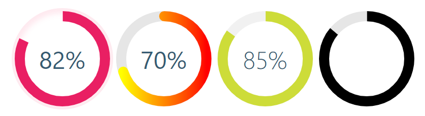
Demo
See the demo - example
Install
yarn add @tomik23/react-circular-progress-bar
npm install @tomik23/react-circular-progress-bar
Usage
import { CircularProgressBar } from "@tomik23/react-circular-progress-bar";
const props = {
percent: 60,
colorSlice: "#00a1ff",
colorCircle: "#00a1ff",
fontColor: "#365b74",
fontSize: "1.6rem",
fontWeight: 400,
size: 200,
stroke: 10,
strokeBottom: 5,
speed: 60,
cut: 0,
rotation: -90,
opacity: 10,
fill: "#00897B",
unit: "%",
textPosition: "0.35em",
animationOff: false,
strokeDasharray: "10,1",
inverse: false,
round: false,
number: true,
linearGradient: ["#ffff00", "brown"]
};
<CircularProgressBar {...props} />;
Update percent
If you want to update component you have to add id to each of them
const config = {
id: 0,
percent: 50,
colorSlice: "#E91E63"
};
function App() {
const [update, setUpdate] = useState(config);
useEffect(() => {
const interval = setInterval(() => {
setUpdate({
...config,
id: 0,
percent: Math.floor(Math.random() * 100 + 1)
colorSlice: "#000",
fontColor: "#F50057",
fontSize: "1.2rem",
fontWeight: 700
});
}, 3000);
return () => clearInterval(interval);
}, []);
const newObject = { ...config, ...update };
return (
<div>
<CircularProgressBar {...newObject} />
</div>
);
}
Add photos and text
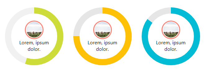
const config = {
percent: 55,
colorSlice: "#E91E63",
colorCircle: "#f1f1f1",
fontWeight: 100,
number: false
};
<CircularProgressBar key={index} {...props}>
<img
src="https://picsum.photos/100/100"
style={{
width: "60px",
borderRadius: "50%",
padding: "2px",
border: "3px solid salmon"
}}
alt="Random image"
/>
<div style={{ textAlign: "center", padding: "0 35px" }}>
Lorem, ipsum dolor.
</div>
</CircularProgressBar>;
Add photos and percent animation
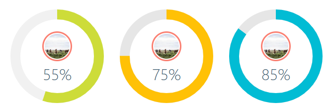
const config = {
percent: 55,
colorSlice: "#CDDC39",
colorCircle: "#f1f1f1",
fontWeight: 100,
fontSize: "1rem",
textPosition: "1.5em"
};
<CircularProgressBar key={index} {...props}>
<img
src="https://picsum.photos/100/100"
style={{
width: "60px",
borderRadius: "50%",
marginTop: "-40px",
padding: "2px",
border: "3px solid salmon"
}}
alt="Random image"
/>
</CircularProgressBar>;
How to turn off % or style them?
Turning off the percentage and leaving the number alone is very simple.
Each percent (%) has a class of circular-unit-x of course you must add for each circle id. If you don't do this, the class will always be circular-unit-0. Just add .circular-unit-x { display: none } to our styles. Digit animation remains but percent sign [%] disappears.
You can also style this elements to create your own styles, example below:
.circular-unit-15 {
  fill: #f50057;
  font-size: 0.8rem;
  font-weight: 700;
}
Instead of adding styles to a component, you can add them in the configuration stage.
const examples = [
  {
    percent: 75,
    styles: {
      borderRadius: "50%",
      boxShadow: "inset 0 0 25px 10px #a2caff"
    }
  }
];

{examples.map((props, index) => {
  return <CircularSection key={index} {...props} />;
})}
See an example Minimal Width Shadow
Configuration of the plugin
| percent | number | | ✔ | Represents the progress bar and animation of the animation progress expressed by a number e.g. 65% |
| id | number | | | If you want to update a component, you need to add an id to each of them. Also when you want to display several components with different gradients - linearGradient |
| speed | number | | | Frame rate animation [fps]. Let's say you want the animation to be 60fps, just add the parameter speed: 60 |
| animationOff | boolean | false | | Turn off the progress animation |
| animationSmooth | string | `` | | The transition property allows you to create animations (a smooth transition effect), e.g. 500ms ease-out |
| colorSlice | string | '#00a1ff' | | Progress layer color and background "#ffff00","brown" * |
| colorCircle | string | '#00a1ff' | | Bottom circle color Font "#ffff00","brown" * |
| stroke | number | 10 | | Stroke width, chart thickness |
| strokeBottom | number | 10 | | If "strokBottom" is set, it is used to generate a background circle size |
| round | boolean | false | | Path rounding |
| inverse | boolean | false | | Counterclockwise animation |
| opacity | number | 10 | | Opacity box-shadow, 10 = 1, 9 = 0.9 ... 1 = 0.1 |
| rotation | number | -90 | | Chart rotation |
| number | boolean | true | | Add props number and set to false to hide the number with percent |
| size | number | 200 | | Size progress bar width and height in px |
| cut | number | 0 | | Angle of the circle sector |
| unit | string | % | | Different unit instead of percentage (%) inside the circle |
| fill | string | none | | Inner circle color |
| strokeDasharray | string | `` | | It works only on the lowest circle and only on whole circles - stroke-dasharray |
| textPosition | string | 0.35em | | The position of the SVG TEXT element vertically |
| fontSize | string | 1.6rem | | Font size. The font can be shown in units rem, em, px ... |
| fontWeight | number | 400 | | 400, 600, ... |
| fontColor | string | '#365b74' | | Font color "#ffff00","brown" * |
| linearGradient | array | | | Array of colors "lineargradient": "#ffff00","brown" * |
| styles | object | | | Possibility to add styles to parent div see example Minimal Width Shadow |
Colors names
* See colors names
Browsers support
| IE11+, Edge | last 2 versions | last 2 versions | last 2 versions | last 2 versions |


