Research
Security News
Lazarus Strikes npm Again with New Wave of Malicious Packages
The Socket Research Team has discovered six new malicious npm packages linked to North Korea’s Lazarus Group, designed to steal credentials and deploy backdoors.
@tomik23/react-circular-progress-bar
Advanced tools
React library to help developers to draw animated, cross-browser, highly customizable progress circles using SVG and plain JavaScript.

See the demo - example
yarn add @tomik23/react-circular-progress-bar
# or
npm install @tomik23/react-circular-progress-bar
import { CircularProgressBar } from '@tomik23/react-circular-progress-bar'
// available control variables
const props = {
  percent: 60, // is require
  colorSlice: '#00a1ff',
  colorCircle: '#00a1ff',
  fontColor: '#365b74',
  fontSize: '1.6rem',
  fontWeight: 400,
  size: 200,
  stroke: 10,
  strokeBottom: 5,
  opacity: 10,
  speed: 60,
  round: true,
  number: true,
  linearGradient: ["#ffff00", "brown"]
}

<CircularProgressBar {...props} />
If you want to update component you have to add
idto each of them
const config = {
  id: 0, // important
  percent: 50,
  colorSlice: '#E91E63',
}

function App() {
  const [update, setUpdate] = useState(config);

  useEffect(() => {
    const interval = setInterval(() => {
      setUpdate({
        ...config,
        id: 0, // we indicate which component we want to change
        percent: Math.floor(Math.random() * 100 + 1),
      });
    }, 3000);
    return () => clearInterval(interval);
  }, []);

  const newObject = { ...config, ...update };

  return (
    <div>
      <CircularProgressBar {...newObject} />
    </div>
  );
}

const config = {
  percent: 55,
  colorSlice: '#E91E63',
  colorCircle: '#f1f1f1',
  fontWeight: 100,
  number: false // turn off the percentage animation first
}

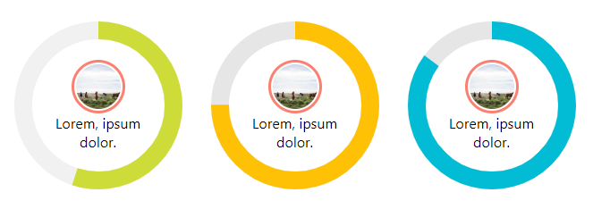
<CircularProgressBar key={index} {...props}>
  <img
    src="https://picsum.photos/100/100"
    //
    style={{
      width: '60px',
      borderRadius: '50%',
      padding: '2px',
      border: '3px solid salmon',
    }}
    alt="Random image"
  />
  <div style={{ textAlign: 'center', padding: '0 35px' }}>
    Lorem, ipsum dolor.
  </div>
</CircularProgressBar>

const config = {
  percent: 55,
  colorSlice: '#CDDC39',
  colorCircle: '#f1f1f1',
  fontWeight: 100,
  fontSize: '1rem',
  textPosition: '1.5em', // needed element to move the percentage animation lower
}

<CircularProgressBar key={index} {...props}>
  <img
    src="https://picsum.photos/100/100"
    //
    style={{
      width: '60px',
      borderRadius: '50%',
      marginTop: '-40px',
      padding: '2px',
      border: '3px solid salmon',
    }}
    alt="Random image"
  />
</CircularProgressBar>
| props | type | default | require | description |
|---|---|---|---|---|
| percent | number | ✔ | Represents the progress bar and animation of the animation progress expressed by a number e.g. 65% | |
| id | number | If you want to update a component, you need to add an id to each of them. Also when you want to display several components with different gradients - linearGradient | ||
| animationOff | boolean | Turn off the progress animation | ||
| colorSlice | string | '#00a1ff' | Progress layer color and background "#ffff00","brown" * | |
| colorCircle | string | '#00a1ff' | Bottom circle color Font "#ffff00","brown" * | |
| stroke | number | 10 | Stroke width, chart thickness | |
| strokrBottom | number | 10 | If "strokBottom" is set, it is used to generate a background circle size | |
| round | boolean | false | Path rounding | |
| speed | number | 60 | Animation speed, 60fps by default | |
| opacity | number | 10 | Opacity box-shadow, 10 = 1, 9 = 0.9 ... 1 = 0.1 | |
| number | boolean | true | Add props number and set to false to hide the number with percent | |
| size | number | 200 | Size progress bar width and height in px | |
| textPosition | string | 0.35em | The position of the SVG TEXT element vertically | |
| fontSize | string | 1.6rem | Font size. The font can be shown in units rem, em, px ... | |
| fontWeight | number | 400 | 400, 600, ... | |
| fontColor | string | '#365b74' | Font color "#ffff00","brown" * | |
| linearGradient | array | Array of colors "lineargradient": "#ffff00","brown" * |
 IE / Edge |  Firefox |  Chrome |  Opera |  Vivaldi |
|---|---|---|---|---|
| IE11+, Edge | last 2 versions | last 2 versions | last 2 versions | last 2 versions |
FAQs
A circular progress bar in svg
The npm package @tomik23/react-circular-progress-bar receives a total of 294 weekly downloads. As such, @tomik23/react-circular-progress-bar popularity was classified as not popular.
We found that @tomik23/react-circular-progress-bar demonstrated a not healthy version release cadence and project activity because the last version was released a year ago. It has 1 open source maintainer collaborating on the project.
Did you know?

Socket for GitHub automatically highlights issues in each pull request and monitors the health of all your open source dependencies. Discover the contents of your packages and block harmful activity before you install or update your dependencies.

Research
Security News
The Socket Research Team has discovered six new malicious npm packages linked to North Korea’s Lazarus Group, designed to steal credentials and deploy backdoors.

Security News
Socket CEO Feross Aboukhadijeh discusses the open web, open source security, and how Socket tackles software supply chain attacks on The Pair Program podcast.

Security News
Opengrep continues building momentum with the alpha release of its Playground tool, demonstrating the project's rapid evolution just two months after its initial launch.