Security News
curl Shuts Down Bug Bounty Program After Flood of AI Slop Reports
A surge of AI-generated vulnerability reports has pushed open source maintainers to rethink bug bounties and tighten security disclosure processes.
@toolz/material-ui
Advanced tools
A few simple (borderline-silly, they're so simple) wrapper components for Material UI Grid components
material-ui is just a few simple (borderline-silly, they're so simple) wrapper components for Material UI. Specifically, the package provides <Row> and <Column>, which are meant to provide a more intuitive interface to Material UI's <Grid> component.
Most paradigms for responsive design work off a concept of having rows, with each of those rows containing columns. But for some reason, the folks who designed Material UI decided that rows and columns should both be controlled by a single component - <Grid>. This can lead to React code that looks like this:
export const SomeComponent = () => {
   return <>
      <Grid container={true}>
         <Grid item={true} xs={12}>
            <Grid container={true}>
               <Grid item={true} xs={6}>
                  Some content
               </Grid>
               <Grid item={true} xs={6}>
                  Some more content
               </Grid>
            </Grid>
         </Grid>
      </Grid>>
   </>
}
In the example above, there is one row, that contains a column, that spans the entire row. Inside that column, there's another row. The inner row contains two columns, each spanning half the length of the row. Despite this, the code contains no references to "rows" or "columns". Every component is a "Grid". The rows are grids - with the container attribute set to true. The columns are grids - with the item attribute set to true.
This is very counterintuitive for anyone who's accustomed to dealing with "traditional" responsive design systems. It's difficult to mentally parse the successive layers of nested <Grid>s. It's also difficult to quickly peruse the code and determine which <Grid>s represent rows, and which ones represent columns. It just looks like a big pile of <Grid> components (which... it is).
This package provides two simple wrapper components that will transform the above code as such:
export const SomeComponent = () => {
   return <>
      <Row>
         <Column xs={12}>
            <Row>
               <Column xs={6}>
                  Some content
               </Column>
               <Column xs={6}>
                  Some more content
               </Column>
            </Row>
         </Column>
      </Row>
   </>
}
After installation, import the components:
import { Row } from '@toolz/material-ui/dist/Row';
import { Column } from '@toolz/material-ui/dist/Column';
<Row>A <Row> is a responsive container designed to hold <Column> components.
const props = {
   alignContent: {
      optional,
      format: oneOf[
         'center',
            'flex-end',
            'flex-start',
            'space-around',
            'space-between',
            'stretch',
         ],
      defaultValue: 'stretch',
   },
   alignItems: {
      optional,
      format: oneOf[
         'baseline',
            'center',
            'flex-end',
            'flex-start',
            'stretch',
         ],
      defaultValue: 'stretch',
   },
   direction: {
      optional,
      format: oneOf[
         'column',
            'column-reverse',
            'row',
            'row-reverse',
         ],
      defaultValue: 'row',
   },
   justify: {
      optional,
      format: oneOf[
         'center',
            'flex-end',
            'flex-start',
            'space-around',
            'space-between',
            'space-evenly',
         ],
      defaultValue: 'flex-start',
   },
   spacing: {
      optional,
      format: oneOf[0, 1, 2, 3, 4, 5, 6, 7, 8, 9, 10],
      defaultValue: 0,
   },
   wrap: {
      optional,
      format: oneOf[
         'nowrap',
            'wrap',
            'wrap-reverse',
         ],
      defaultValue: 'wrap',
   },
}
<Column>A <Column> is a wrapper component that denotes a responsive column of content, residing inside a <Row> component.
const props = {
   lg: {
      optional,
      format: oneOf[false, 'auto', true, 1, 2, 3, 4, 5, 6, 7, 8, 9, 10, 11, 12],
      defaultValue: false,
   },
   md: {
      optional,
      format: oneOf[false, 'auto', true, 1, 2, 3, 4, 5, 6, 7, 8, 9, 10, 11, 12],
      defaultValue: false,
   },
   sm: {
      optional,
      format: oneOf[false, 'auto', true, 1, 2, 3, 4, 5, 6, 7, 8, 9, 10, 11, 12],
      defaultValue: false,
   },
   xl: {
      optional,
      format: oneOf[false, 'auto', true, 1, 2, 3, 4, 5, 6, 7, 8, 9, 10, 11, 12],
      defaultValue: false,
   },
   xs: {
      optional,
      format: oneOf[false, 'auto', true, 1, 2, 3, 4, 5, 6, 7, 8, 9, 10, 11, 12],
      defaultValue: false,
   },
   zeroMinWidth: {
      optional,
      format: Boolean,
      defaultValue: false,
   },
}
FAQs
A few simple (borderline-silly, they're so simple) wrapper components for Material UI Grid components
The npm package @toolz/material-ui receives a total of 2 weekly downloads. As such, @toolz/material-ui popularity was classified as not popular.
We found that @toolz/material-ui demonstrated a not healthy version release cadence and project activity because the last version was released a year ago. It has 1 open source maintainer collaborating on the project.
Did you know?

Socket for GitHub automatically highlights issues in each pull request and monitors the health of all your open source dependencies. Discover the contents of your packages and block harmful activity before you install or update your dependencies.

Security News
A surge of AI-generated vulnerability reports has pushed open source maintainers to rethink bug bounties and tighten security disclosure processes.

Product
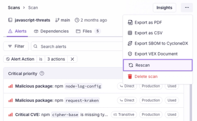
Scan results now load faster and remain consistent over time, with stable URLs and on-demand rescans for fresh security data.

Product
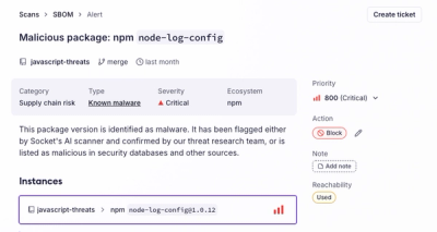
Socket's new Alert Details page is designed to surface more context, with a clearer layout, reachability dependency chains, and structured review.