Research
/Security News
DuckDB npm Account Compromised in Continuing Supply Chain Attack
Ongoing npm supply chain attack spreads to DuckDB: multiple packages compromised with the same wallet-drainer malware.
@trend/focustrap
Advanced tools
A React component that traps focus.
This component is a wrapper for focus-trap and a manual fork of focus-trap-react tailored for trend-components needs.
## Has peer dependency with react and react-dom
npm i react react-dom
npm i @trend/focustrap
With a module bundler like webpack, use as you would anything else:
import React from 'react';
import FocusTrap from '@trend/focustrap';

class Demo extends React.Component {
  state = {
    activeTrap: false
  }

  mountTrap = () => {
    this.setState({ activeTrap: true });
  }

  unmountTrap = () => {
    this.setState({ activeTrap: false });
  }

  render() {
    const trap = this.state.activeTrap
      ? <FocusTrap
          focusTrapOptions={{
            onDeactivate: this.unmountTrap
          }}>
          <div style={{
            border: '1px solid rgba(0, 0, 0, 0.2',
            padding: '1rem'
          }}>
            <p>
              Here is a focus trap
              {' '}
              <a href="#">with</a>
              {' '}
              <a href="#">some</a>
              {' '}
              <a href="#">focusable</a>
              {' '}
              parts.
            </p>
            <p>
              <button onClick={this.unmountTrap}>
                deactivate trap
              </button>
            </p>
          </div>
        </FocusTrap>
      : false;

    return (
      <div className="tc-pal">
        <div className="tc-mbl">
          <button onClick={this.mountTrap}>toggle trap</button>
        </div>
        {trap}
      </div>
    );
  }
}
object| optional
See focus-trap createOptions for available options.
boolean| optional
Toggle the activation state of a mounted FocusTrap. By default a FocusTrap is activated and deactivated by mounting and unmounting the component.
boolean| optional
See (focus-trap docs)(https://github.com/davidtheclark/focus-trap#focustrap--createfocustrapelement-createoptions) to pause and unpause a FocusTrap.
string| Optional, defaults todiv
An HTML tag for FocusTrap DOM node.
All additional props are passed through to the rendered DOM element.
FAQs
A React component that traps focus.
We found that @trend/focustrap demonstrated a not healthy version release cadence and project activity because the last version was released a year ago. It has 1 open source maintainer collaborating on the project.
Did you know?

Socket for GitHub automatically highlights issues in each pull request and monitors the health of all your open source dependencies. Discover the contents of your packages and block harmful activity before you install or update your dependencies.

Research
/Security News
Ongoing npm supply chain attack spreads to DuckDB: multiple packages compromised with the same wallet-drainer malware.

Security News
The MCP Steering Committee has launched the official MCP Registry in preview, a central hub for discovering and publishing MCP servers.

Product
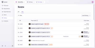
Socket’s new Pull Request Stories give security teams clear visibility into dependency risks and outcomes across scanned pull requests.