Product
Introducing Data Exports
Export Socket alert data to your own cloud storage in JSON, CSV, or Parquet, with flexible snapshot or incremental delivery.
@trendmicro/react-form-control
Advanced tools
React Form Control
Demo: https://trendmicro-frontend.github.io/react-form-control
npm install --save react @trendmicro/react-form-control
@trendmicro/react-form-control and its styles in your application as follows:import FormControl, { Input, Select, Textarea } from '@trendmicro/react-form-control';
// Be sure to include styles at some point, probably during your bootstraping
import '@trendmicro/react-form-control/dist/react-form-control.css';
The <FormControl> component renders a form control with block-level styling (display: block and width: 100%). Supported textual form controls includes <Input>, <Select>, and <Textarea>.
<FormGroup>
    <label>Email address</label>
    <Input type="text" placeholder="name@example.com" />
</FormGroup>
<FormGroup>
    <label>Example select</label>
    <Select defaultValue="1">
        <option value="1">1</option>
        <option value="2">2</option>
        <option value="3">3</option>
        <option value="4">4</option>
        <option value="5">5</option>
    </Select>
</FormGroup>
<FormGroup>
    <label>Example multiple select</label>
    <Select multiple defaultValue="1">
        <option value="1">1</option>
        <option value="2">2</option>
        <option value="3">3</option>
        <option value="4">4</option>
        <option value="5">5</option>
    </Select>
</FormGroup>
<FormGroup>
    <label>Example textarea</label>
    <Textarea rows={3} />
</FormGroup>
Using the <FormGroup> component is the easiest way to add some structure to forms, it provides a flexible way that encourages proper grouping of labels, controls, and form validation messaging.
The <FormGroup> component is not provided here, but you can use styled-components to style with plain CSS styles. By default, it only applies margin-bottom as below:
const FormGroup = styled.div`
    margin-bottom: 12px;
`;
| Name | Type | Default | Description |
|---|---|---|---|
| tag | element | 'div' | |
| lg | boolean | ||
| md | boolean | Defaults to 'md' if nothing is specified. | |
| sm | boolean |
| Name | Type | Default | Description |
|---|---|---|---|
| tag | element | 'input' | |
| lg | boolean | ||
| md | boolean | Defaults to 'md' if nothing is specified. | |
| sm | boolean |
| Name | Type | Default | Description |
|---|---|---|---|
| tag | element | 'select' | |
| lg | boolean | ||
| md | boolean | Defaults to 'md' if nothing is specified. | |
| sm | boolean |
| Name | Type | Default | Description |
|---|---|---|---|
| tag | element | 'textarea' |
MIT
FAQs
React Form Control component
The npm package @trendmicro/react-form-control receives a total of 183 weekly downloads. As such, @trendmicro/react-form-control popularity was classified as not popular.
We found that @trendmicro/react-form-control demonstrated a not healthy version release cadence and project activity because the last version was released a year ago. It has 4 open source maintainers collaborating on the project.
Did you know?

Socket for GitHub automatically highlights issues in each pull request and monitors the health of all your open source dependencies. Discover the contents of your packages and block harmful activity before you install or update your dependencies.

Product
Export Socket alert data to your own cloud storage in JSON, CSV, or Parquet, with flexible snapshot or incremental delivery.

Research
/Security News
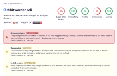
Bitwarden CLI 2026.4.0 was compromised in the Checkmarx supply chain campaign after attackers abused a GitHub Action in Bitwarden’s CI/CD pipeline.

Research
/Security News
Docker and Socket have uncovered malicious Checkmarx KICS images and suspicious code extension releases in a broader supply chain compromise.