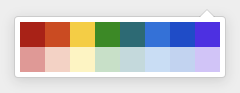
React Color Github


Github Component is a subcomponent of @react-color.
Install
npm i @uiw/react-color-github
Usage
import React, { useState } from 'react';
import Github from '@uiw/react-color-github';

export default function Demo() {
  const [hex, setHex] = useState("#fff");
  return (
    <>
      <Github
        color={hex}
        style={{
          '--github-background-color': '#d1eff9'
        }}
        onChange={(color) => {
          setHex(color.hex);
        }}
      />
      <div style={{ width: 120, height: 50, backgroundColor: hex }} />
    </>
  );
}
Add clear button
import React, { useState } from 'react';
import Github from '@uiw/react-color-github';

export default function Demo() {
  const [hex, setHex] = useState("#fff");
  return (
    <>
      <Github
        color={hex}
        style={{
          '--github-background-color': '#d1eff9'
        }}
        onChange={(color) => {
          setHex(color.hex);
        }}
        rectRender={(props) => {
          if (props.key == 15) {
            return <button key={props.key} onClick={() => setHex(null)}>x</button>
          }
        }}
      />
      <div style={{ width: 120, height: 50, backgroundColor: hex }} />
    </>
  );
}
Props
import React from 'react';
import { HsvaColor, ColorResult } from '@uiw/color-convert';
import { SwatchProps, SwatchRectRenderProps } from '@uiw/react-color-swatch';
export declare enum GithubPlacement {
  Left = "L",
  LeftTop = "LT",
  LeftBottom = "LB",
  Right = "R",
  RightTop = "RT",
  RightBottom = "RB",
  Top = "T",
  TopRight = "TR",
  TopLeft = "TL",
  Bottom = "B",
  BottomLeft = "BL",
  BottomRight = "BR"
}
export interface GithubRectRenderProps extends SwatchRectRenderProps {
  arrow?: JSX.Element;
}
export interface GithubProps extends Omit<SwatchProps, 'color' | 'onChange'> {
  placement?: GithubPlacement;
  color?: string | HsvaColor;
  showTriangle?: boolean;
  onChange?: (color: ColorResult) => void;
}
declare const Github: React.ForwardRefExoticComponent<GithubProps & React.RefAttributes<HTMLDivElement>>;
export default Github;
Contributors
As always, thanks to our amazing contributors!

Made with contributors.
License
Licensed under the MIT License.


