


Product
Socket for Jira Is Now Available
Socket for Jira lets teams turn alerts into Jira tickets with manual creation, automated ticketing rules, and two-way sync.
By Jeppe Hasseriis - Apr 20, 2026
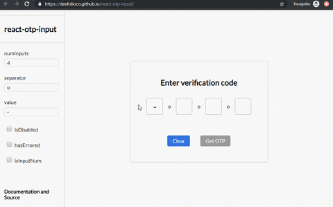
@unit-finance/react-otp-input
Advanced tools
A fully customizable, one-time password input component for the web built with React


A fully customizable, one-time password input component for the web built with React.

npm install --save react-otp-input
import React, { Component } from 'react';
import OtpInput from 'react-otp-input';

export default class App extends Component {
  state = { otp: '' };

  handleChange = (otp) => this.setState({ otp });

  render() {
    return (
      <OtpInput
        value={this.state.otp}
        onChange={this.handleChange}
        numInputs={6}
        separator={<span>-</span>}
      />
    );
  }
}
| Name | Type | Required | Default | Description |
|---|---|---|---|---|
| numInputs | number | true | 4 | Number of OTP inputs to be rendered. |
| onChange | function | true | console.log | Returns OTP code typed in inputs. |
| value | string / number | true | '' | The value of the OTP passed into the component. |
| placeholder | string | false | none | Specify an expected value of each input. The length of this string should be equal to numInputs. |
| separator | component | false | none | Provide a custom separator between inputs by passing a component. For instance, <span>-</span> would add - between each input. |
| containerStyle | style (object) / className (string) | false | none | Style applied or class passed to container of inputs. |
| inputStyle | style (object) / className (string) | false | none | Style applied or class passed to each input. |
| focusStyle | style (object) / className (string) | false | none | Style applied or class passed to inputs on focus. |
| isDisabled | boolean | false | false | Disables all the inputs. |
| disabledStyle | style (object) / className (string) | false | none | Style applied or class passed to each input when disabled. |
| hasErrored | boolean | false | false | Indicates there is an error in the inputs. |
| errorStyle | style (object) / className (string) | false | none | Style applied or class passed to each input when errored. |
| shouldAutoFocus | boolean | false | false | Auto focuses input on initial page load. |
| isInputNum | boolean | false | false | Restrict input to only numbers. |
| isInputSecure | boolean | false | false | Masks input characters. |
| data-cy | string | false | - | Test attribute passed to the inputs. |
| data-testid | string | false | - | Test attribute passed to the inputs. |
react-otp-input is now a controlled component to facilitate functionalities that weren't possible before from the application using it, such as clearing or pre-assigning values. For v1.0.0 and above, a value prop needs to be passed in the component for it to function as expected.
npm run dev


Feel free to open issues and pull requests!
Thanks goes to these wonderful people (emoji key):
 Abhishek Warokar 💻 🎨 🚧 🤔 👀 |  Aj 💻 🎨 🤔 |  Aromal Anil 💻 🔧 |  Gabriele Corti 💻 ️️️️♿️ |  Anoop 💻 |  Dewansh Rawat 🐛 |  Ishan Chhabra 💻 |
 yaojie 💻 |
This project follows the all-contributors specification. Contributions of any kind welcome!
FAQs
A fully customizable, one-time password input component for the web built with React
We found that @unit-finance/react-otp-input demonstrated a not healthy version release cadence and project activity because the last version was released a year ago. It has 3 open source maintainers collaborating on the project.
Did you know?

Socket for GitHub automatically highlights issues in each pull request and monitors the health of all your open source dependencies. Discover the contents of your packages and block harmful activity before you install or update your dependencies.
Product
Socket for Jira lets teams turn alerts into Jira tickets with manual creation, automated ticketing rules, and two-way sync.

Company News
Socket won two 2026 Reppy Awards from RepVue, ranking in the top 5% of all sales orgs. AE Alexandra Lister shares what it's like to grow a sales career here.

Security News
NIST will stop enriching most CVEs under a new risk-based model, narrowing the NVD's scope as vulnerability submissions continue to surge.