React Native Wheel Picker


Introduction
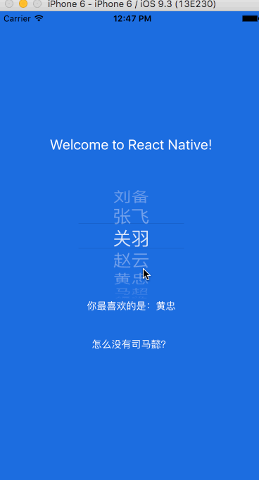
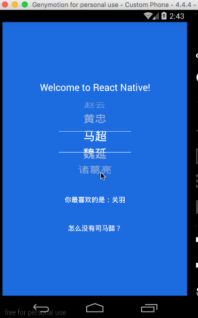
Cross platform Picker component based on React-native.
Since picker is originally supported by ios while Android only supports a ugly Spinner component. If you want to have the same user behaviour, you can use this.
The android component is based on https://github.com/AigeStudio/WheelPicker which runs super fast and smoothly. It also supports curved effect which make it exactly the same looking and feel as the ios picker.
Getting Started
npm install @uynguyen505/react-native-wheel-picker --save
or
yarn add @uynguyen505/react-native-wheel-picker
To link the project, please run
react-native link @uynguyen505/react-native-wheel-picker
iOS
CocoaPods on iOS needs this extra step:
npm install @react-native-picker/picker --save
cd ios && pod install && cd ..
or
yarn add @react-native-picker/picker
cd ios && pod install && cd ..
Android
No additional step is required.
Example code
import React, { useState } from 'react';
import { View, Text } from 'react-native';

import Picker from '@uynguyen505/react-native-wheel-picker'
var PickerItem = Picker.Item;

const WheelPicker = () => {
  const [selectedItem, setSelectedItem ] = useState(2);
  const [itemList , setItemList ] = useState(['Item 1', 'Item 2', 'Item 3', 'Item 4', 'Item 5']);

  return (
    <View>
      <Picker
        style={{width: 150, height: 180}}
        selectedTextColor={'#2684FF'} // Work for Android
        lineColor="#000000" //to set top and bottom line color (Without gradients)
        lineGradientColorFrom="#008000" //to set top and bottom starting gradient line color
        lineGradientColorTo="#FF5733" //to set top and bottom ending gradient
        selectedValue={selectedItem}
        itemStyle={{color:'black', fontSize:26}}
        onValueChange={(index) => setSelectedItem(index) }>
        {itemList.map((value, i) => (
          <PickerItem label={value} value={i} key={i} color={selectedItem === i ? '#2684FF' : '#333333'}/> // Work for iOS
        ))}
      </Picker>
    </View>
  );
};

export default WheelPicker;
Credits
@lesliesam - for the original source code for which this code was forked off of
@m3rlin94 - for the line coloring code


