<vaadin-grid-pro>
Live Demo ↗
|
API documentation ↗
<vaadin-grid-pro> is a high quality data grid / data table Web Component with extended functionality, part of the Vaadin components.


<vaadin-grid-pro>
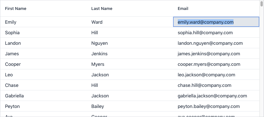
<vaadin-grid-pro-edit-column path="firstName" header="First Name"></vaadin-grid-pro-edit-column>
<vaadin-grid-pro-edit-column path="lastName" header="Last Name"></vaadin-grid-pro-edit-column>
<vaadin-grid-pro-edit-column path="email" header="Email"></vaadin-grid-pro-edit-column>
</vaadin-grid-pro>
<script>
const grid = document.querySelector('vaadin-grid-pro');
fetch('https://demo.vaadin.com/demo-data/1.0/people?count=200')
.then((res) => res.json())
.then((json) => (grid.items = json.result));
</script>
Installation
Install vaadin-grid-pro:
npm i @vaadin/vaadin-pro --save
Once installed, import it in your application:
import '@vaadin/grid-pro/vaadin-grid-pro.js';
Getting started
Vaadin components use the Lumo theme by default.
To use the Material theme, import the correspondent file from the theme/material folder.
Entry points
-
The component with the Lumo theme:
theme/lumo/vaadin-grid-pro.js
-
The component with the Material theme:
theme/material/vaadin-grid-pro.js
-
Alias for theme/lumo/vaadin-grid-pro.js:
vaadin-grid-pro.js
Contributing
Read the contributing guide to learn about our development process, how to propose bugfixes and improvements, and how to test your changes to Vaadin components.
License
Commercial Vaadin Developer License 4.0 (CVDLv4). For license terms, see LICENSE.
Vaadin collects development time usage statistics to improve this product. For details and to opt-out, see https://github.com/vaadin/vaadin-usage-statistics.


