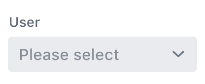


<vaadin-combo-box>
Live Demo ↗
|
API documentation ↗
<vaadin-combo-box> is a Web Component combining a dropdown list with an input field for filtering the list of items, part of the Vaadin components.
<vaadin-combo-box label="User" placeholder="Please select" item-value-path="email" item-label-path="email"></vaadin-combo-box>
<script>
const comboBox = document.querySelector('vaadin-combo-box');
fetch('https://randomuser.me/api?results=100&inc=name,email')
.then(res => res.json())
.then(json => comboBox.items = json.results);
</script>

Installation
Install vaadin-combo-box:
npm i @vaadin/vaadin-combo-box --save
Once installed, import it in your application:
import '@vaadin/vaadin-combo-box/vaadin-combo-box.js';
Getting Started
Vaadin components use the Lumo theme by default.
To use the Material theme, import the correspondent file from the theme/material folder.
Entry points
-
The components with the Lumo theme:
theme/lumo/vaadin-combo-box.js
theme/lumo/vaadin-combo-box-light.js
-
The components with the Material theme:
theme/material/vaadin-combo-box.js
theme/material/vaadin-combo-box-light.js
-
Alias for theme/lumo/vaadin-combo-box.js
theme/lumo/vaadin-combo-box-light.js
vaadin-combo-box.js
vaadin-combo-box-light.js
Running API docs and tests in a browser
-
Fork the vaadin-combo-box repository and clone it locally.
-
Make sure you have node.js 12.x installed.
-
Make sure you have npm installed.
-
When in the vaadin-combo-box directory, run npm install to install dependencies.
-
Run npm start, browser will automatically open the component API documentation.
-
You can also open visual tests, for example:
Running tests from the command line
- When in the
vaadin-combo-box directory, run npm test
Debugging tests in the browser
- Run
npm run debug, then choose manual mode (M) and open the link in browser.
Following the coding style
We are using ESLint for linting JavaScript code. You can check if your code is following our standards by running npm run lint, which will automatically lint all .js files.
Big Thanks
Cross-browser Testing Platform and Open Source <3 Provided by Sauce Labs.
Contributing
To contribute to the component, please read the guideline first.
License
Apache License 2.0
Vaadin collects development time usage statistics to improve this product. For details and to opt-out, see https://github.com/vaadin/vaadin-usage-statistics.


