
Security News
The Changelog Podcast: Practical Steps to Stay Safe on npm
Learn the essential steps every developer should take to stay secure on npm and reduce exposure to supply chain attacks.
By Sarah Gooding - Oct 31, 2025
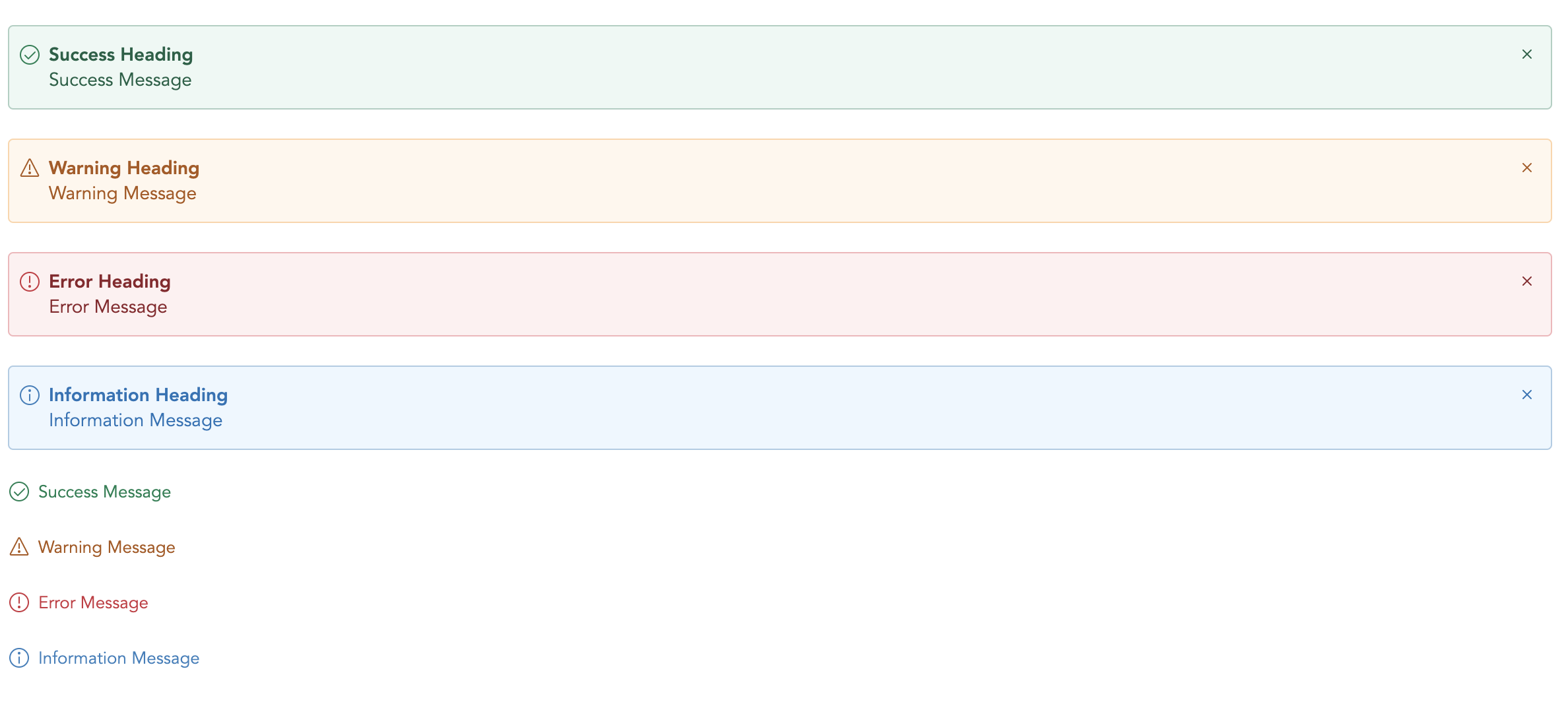
@vuesimple/vs-alert
Advanced tools
A light weight vue plugin built groundup.


Code Sandbox: Link
npm i @vuesimple/vs-alert
<template>
  <vs-alert variant="success"> Success </vs-alert>
</template>

<script>
  import VsAlert from '@vuesimple/vs-alert';

  export default {
    components: {
      VsAlert,
    },
  };
</script>
<script src="https://unpkg.com/@vuesimple/vs-alert@<version>/dist/vs-alert.min.js"></script>
// Main/Entry file
app.use(VsAlert.plugin);
<template>
  <vs-alert variant="success"> Success </vs-alert>
</template>
 Nuxt.js
Nuxt Code Snippet
After installation,
Create a file /plugins/vs-alert.js
import Vue from 'vue';
import VsAlert from '@vuesimple/vs-alert';

Vue.component('vs-alert', VsAlert);
Update nuxt.config.js
module.exports = {
  ...
  plugins: [
    { src: '~plugins/vs-alert', mode: 'client' }
    ...
  ]
}
In the page/ component
<template>
  <vs-alert variant="success"> Success </vs-alert>
</template>
Note
<no-ssr>...</no-ssr> tag.import VsAlert from '@vuesimple/vs-alert'
& add in component:{VsAlert} and use it within component, without globally installing in plugin folder.| Name | Type | Default | Description |
|---|---|---|---|
| variant | String | - | Type of alert to be shown. (success, warning, error, info, secondary) |
| title | String | - | The alert title (text only). For HTML, use the header slot. |
| showClose | Boolean | false | Show alert close icon |
| small | Boolean | false | Applies reduced padding |
| toast | Boolean | false | Applies toast design |
| noBg | Boolean | false | Remove background color |
| Name | Description |
|---|---|
| close | Emitted when the alert close icons is clicked. Listen for it using @close. |
You can define own item markup via slots:
| Name | Description |
|---|---|
| (default) | Holds the alert content and can contain HTML. |
| icon | Slot to add custom icon for type |
| title | Slot to add custom title |
FAQs
A simple vue alert. Perfect for all your alert scenarios.
We found that @vuesimple/vs-alert demonstrated a healthy version release cadence and project activity because the last version was released less than a year ago. It has 1 open source maintainer collaborating on the project.
Did you know?

Socket for GitHub automatically highlights issues in each pull request and monitors the health of all your open source dependencies. Discover the contents of your packages and block harmful activity before you install or update your dependencies.
Security News
Learn the essential steps every developer should take to stay secure on npm and reduce exposure to supply chain attacks.

Security News
Experts push back on new claims about AI-driven ransomware, warning that hype and sponsored research are distorting how the threat is understood.

Security News
Ruby's creator Matz assumes control of RubyGems and Bundler repositories while former maintainers agree to step back and transfer all rights to end the dispute.