
Research
Two Malicious Rust Crates Impersonate Popular Logger to Steal Wallet Keys
Socket uncovers malicious Rust crates impersonating fast_log to steal Solana and Ethereum wallet keys from source code.
By Kirill Boychenko - Sep 24, 2025
@web3uikit/core
Advanced tools

Beautiful and lightweight UI components for web3 developers. This UI library will speed up your dapp development no matter which chain you build on.
Live StoryBook DEMO: https://web3ui.github.io/web3uikit/

Star usIf this ui-kit helps you build your dApps faster - please star this project, every star makes us very happy!
Need help?If you need help with setting up the boilerplate or have other questions - don't hesitate to write in our community forum and we will check asap. Forum link. The best thing about this boilerplate is the super active community ready to help at any time! We help each other.
Quick Startnpm install @web3uikit/core
or
yarn add @web3uikit/core
import { CryptoCards, Button } from 'web3uikit';

const App = () => (
    <>
        <CryptoCards
            chain="ethereum"
            bgColor="blue"
            chainType="Network"
            onClick={console.log}
        />
        <Button theme="primary" type="button" text="Launch Dapp" />
    </>
);
If you are using web3uikit with Next.js, be sure to follow the official guide, since we are using styled-components under the hood.
Table of contentsStar usNeed help?Quick Start
Table of contentsUI Components
Interaction Components
Popup
UI Components<Accordion />The accordion component is a nice user interface element that can allow you to show and hide text or other components, so you do not overwhelm your user with too much awesome content

Try the <Accordion /> component in the interactive documentation
<Avatar />
Try the <Avatar /> component in the interactive documentation
<Badge />
Try the <Badge /> component in the interactive documentation
<BannerStrip />
Try the <BannerStrip /> component in the interactive documentation
<Breadcrumbs />
Try the <Breadcrumbs /> component in the interactive documentation
<Card />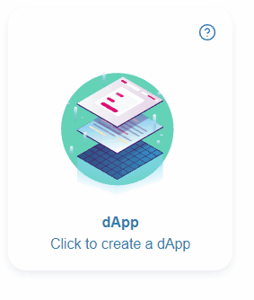
Try the <Card /> component in the interactive documentation
<CryptoCards />
Try the <CryptoCards /> component in the interactive documentation
<CryptoLogos />
Try the <CryptoLogos /> component in the interactive documentation
<Icon />
Try the <Icon /> component in the interactive documentation
<Illustration />

Try the ` component in the interactive documentation
<Information />
Try the <Information /> component in the interactive documentation
<LinkTo />LinkTo component is a simple link component that can be used to navigate to another page or to another component.

Try the <LinkTo /> component in the interactive documentation
<Logo />Logo component is a simple logo component having moralis or other icons that can be used in any layout.

Try the <Logo /> component in the interactive documentation
<Notification />
To call the Notification component use the useNotification() hook. Example:
const App = () => {
    const dispatch = useNotification();

    const handleNewNotification = () => {
        dispatch({
            type: 'info',
            message: 'Somebody messaged you',
            title: 'New Notification',
            icon,
            position: position || 'topR',
        });
    };

    return (
        <>
            <Button
                text="Error"
                onClick={handleNewNotification}
                theme="colored"
                color="red"
                isFullWidth={true}
            />
        </>
    );
};
Requires the application to be within a <NotificationProvider>
Example:
<NotificationProvider>
    <App />
<NotificationProvider>
Try the <Notification /> component in the interactive documentation
<Table />
Try the <Table /> component in the interactive documentation
<Tag />
Try the <Tag /> component in the interactive documentation
<Todo />
Try the <Todo /> component in the interactive documentation
<Widget />
Try the <Widget /> component in the interactive documentation
Interaction Components<Button />
Try the <Button /> component in the interactive documentation
<Checkbox />
Try the <Checkbox /> component in the interactive documentation
<CodeArea />
Try the <CodeArea /> component in the interactive documentation
<Credentials />
Try the <Credentials /> component in the interactive documentation
<Form />
Try the <Form /> component in the interactive documentation
<Input />
Try the <Input /> component in the interactive documentation
<Radios />
Try the <Radios /> component in the interactive documentation
<Select />
Try the <Select /> component in the interactive documentation
<TextArea />
Try the <TextArea /> component in the interactive documentation
Popup<Modal />Modal is a popup that can have arbitary elements and can be closed by clicking on the close or cancel buttons.

Try the <Modal /> component in the interactive documentation
<Tooltip />
Try the <Tooltip /> component in the interactive documentation
FAQs
Unknown package
We found that @web3uikit/core demonstrated a not healthy version release cadence and project activity because the last version was released a year ago. It has 2 open source maintainers collaborating on the project.
Did you know?

Socket for GitHub automatically highlights issues in each pull request and monitors the health of all your open source dependencies. Discover the contents of your packages and block harmful activity before you install or update your dependencies.
Research
Socket uncovers malicious Rust crates impersonating fast_log to steal Solana and Ethereum wallet keys from source code.

Research
A malicious package uses a QR code as steganography in an innovative technique.

Research
/Security News
Socket identified 80 fake candidates targeting engineering roles, including suspected North Korean operators, exposing the new reality of hiring as a security function.