

Research
Two Malicious Rust Crates Impersonate Popular Logger to Steal Wallet Keys
Socket uncovers malicious Rust crates impersonating fast_log to steal Solana and Ethereum wallet keys from source code.
By Kirill Boychenko - Sep 24, 2025
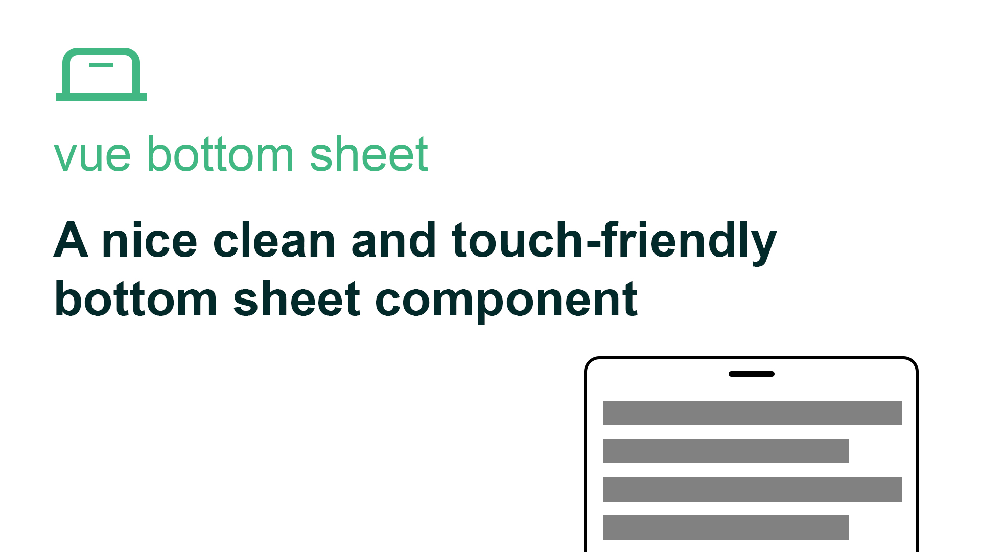
@webzlodimir/vue-bottom-sheet
Advanced tools


A nice clean and touch-friendly bottom sheet component based on Vue.js and Hammer.js for Vue 2 & Vue 3
npm install @webzlodimir/vue-bottom-sheet
yarn add @webzlodimir/vue-bottom-sheet
<template>
  <vue-bottom-sheet ref="myBottomSheet">
    <h1>Lorem Ipsum</h1>
    <h2>What is Lorem Ipsum?</h2>
    <p>
      <strong>Lorem Ipsum</strong> is simply dummy text
    </p>
  </vue-bottom-sheet>
</template>

<script setup>
import { VueBottomSheet } from "@webzlodimir/vue-bottom-sheet";
import  "@webzlodimir/vue-bottom-sheet/dist/style.css";
import { ref } from "vue";

const myBottomSheet = ref(null)

const open = () => {
  myBottomSheet.value.open();
}

const close = () => {
  myBottomSheet.value.close();
}
</script>
| Prop | Type | Description | Example |
|---|---|---|---|
| overlay | Boolean | Remove back overlay | :overlay="false" |
| click-to-close | Boolean | Click outside card to close | :click-to-close="false" |
| max-width | String | Set max-width of component card | max-width="640px" |
| max-height | String | Set max-height of component card | max-height="90%" |
| effect | String | Set effect for component card | effect="fx-fadein-scale" |
| rounded | Boolean | Round the top two corners of the sheet | :rounded="false" |
| is-full-screen | Boolean | Enable or disable full-screen mode | :is-full-screen="true" |
| swipe-able | Boolean | Enable or disable swipe to close | :swipe-able="false" |
| overlay-color | String | Set overlay color with opacity | :overlay-color="#0000004D" |
| background-scrollable | Boolean | Enable scroll | :background-scrollable="true" |
| background-clickable | Boolean | Enable background click, doesn't work if click-to-close=true | :background-clickable="true" |
| Event | Description | Example |
|---|---|---|
| opened | Fire when card component is opened | @opened="" |
| closed | Fire when card component is closed | @closed="" |
You can see all the effects on the demo page
FAQs
The npm package @webzlodimir/vue-bottom-sheet receives a total of 4,659 weekly downloads. As such, @webzlodimir/vue-bottom-sheet popularity was classified as popular.
We found that @webzlodimir/vue-bottom-sheet demonstrated a not healthy version release cadence and project activity because the last version was released a year ago. It has 1 open source maintainer collaborating on the project.
Did you know?

Socket for GitHub automatically highlights issues in each pull request and monitors the health of all your open source dependencies. Discover the contents of your packages and block harmful activity before you install or update your dependencies.
Research
Socket uncovers malicious Rust crates impersonating fast_log to steal Solana and Ethereum wallet keys from source code.

Research
A malicious package uses a QR code as steganography in an innovative technique.

Research
/Security News
Socket identified 80 fake candidates targeting engineering roles, including suspected North Korean operators, exposing the new reality of hiring as a security function.