
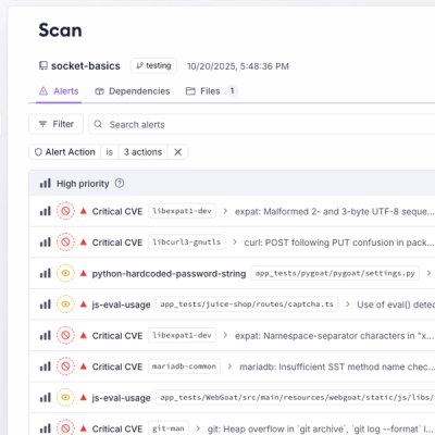
Research
Malicious NuGet Packages Typosquat Nethereum to Exfiltrate Wallet Keys
The Socket Threat Research Team uncovered malicious NuGet packages typosquatting the popular Nethereum project to steal wallet keys.
By Kirill Boychenko - Oct 22, 2025
@wistia/wistia-player-react
Advanced tools
An embeddable wistia-player web component and React wrapper to add responsive, lightweight, and SEO-friendly videos to your site.
Wistia's React Wrapper of the <wistia-player/> web component. Used to add responsive, lightweight, and SEO-friendly videos to your site.
For more usage information, check out our Wistia Player React Component documentation.
npm install @wistia/wistia-player-react
The only required prop is mediaId, the ID of the media that will be embedded.
import { WistiaPlayer } from '@wistia/wistia-player-react';

<WistiaPlayer mediaId="abc123" />;
The <WistiaPlayer> component takes the same options (as React props) which one can set on the <wistia-player> web component. There is a list at the Embed options support page. The only difference here is that numbers, booleans, etc are expected to be JS values of those types rather than strings. Event callbacks can also be added, formatted in a way which is familiar React development (e.g. the play event would become onPlay).
import { WistiaPlayer } from '@wistia/wistia-player-react';

<WistiaPlayer
  mediaId="abc123"
  playerColor="1e64f0"
  onPlay={() => console.log('Wistia video is playing!')}
/>;
The player will automatically load in a lightweight placeholder "swatch" image as soon as possible. However, in certain cases (such as server-side rendering) there can still be a slight layout shift while we wait for that placeholder. In order to avoid shift completely, you can explicitly set the aspect of your video:
import { WistiaPlayer } from '@wistia/wistia-player-react';

<WistiaPlayer mediaId="abc123" aspect={16 / 9} />;
The player is responsive by default. If a fixed-size player is better for your use-case, you can pass in width and height values instead:
import { WistiaPlayer } from '@wistia/wistia-player-react';

<WistiaPlayer
  mediaId="abc123"
  style={{
    width: '640px',
    height: '360px',
  }}
/>;
Wistia’s “popovers” are video embeds that open in modal overlays when a target element is clicked. For these embeds, there is an explicit, required wistiaPopover prop (true/false) as well as an optional popoverContent prop. If left undefined, the default popoverContent value is thumbnail. For popovers with popoverContent="link, the <WistiaPlayer> component expects to have children.
import { WistiaPlayer } from '@wistia/wistia-player-react';

<WistiaPlayer mediaId="abc123" wistiaPopover={true} popoverContent="link">
  <span>Popover Link</span>
</WistiaPlayer>;
FAQs
An embeddable wistia-player web component and React wrapper to add responsive, lightweight, and SEO-friendly videos to your site.
The npm package @wistia/wistia-player-react receives a total of 20,125 weekly downloads. As such, @wistia/wistia-player-react popularity was classified as popular.
We found that @wistia/wistia-player-react demonstrated a healthy version release cadence and project activity because the last version was released less than a year ago. It has 3 open source maintainers collaborating on the project.
Did you know?

Socket for GitHub automatically highlights issues in each pull request and monitors the health of all your open source dependencies. Discover the contents of your packages and block harmful activity before you install or update your dependencies.
Research
The Socket Threat Research Team uncovered malicious NuGet packages typosquatting the popular Nethereum project to steal wallet keys.
Product
A single platform for static analysis, secrets detection, container scanning, and CVE checks—built on trusted open source tools, ready to run out of the box.
Product
Socket is launching experimental protection for the Hugging Face ecosystem, scanning for malware and malicious payload injections inside model files to prevent silent AI supply chain attacks.