Security News
tea.xyz Spam Plagues npm and RubyGems Package Registries
Tea.xyz, a crypto project aimed at rewarding open source contributions, is once again facing backlash due to an influx of spam packages flooding public package registries.
@wudev/drag-drop
Advanced tools
Readme
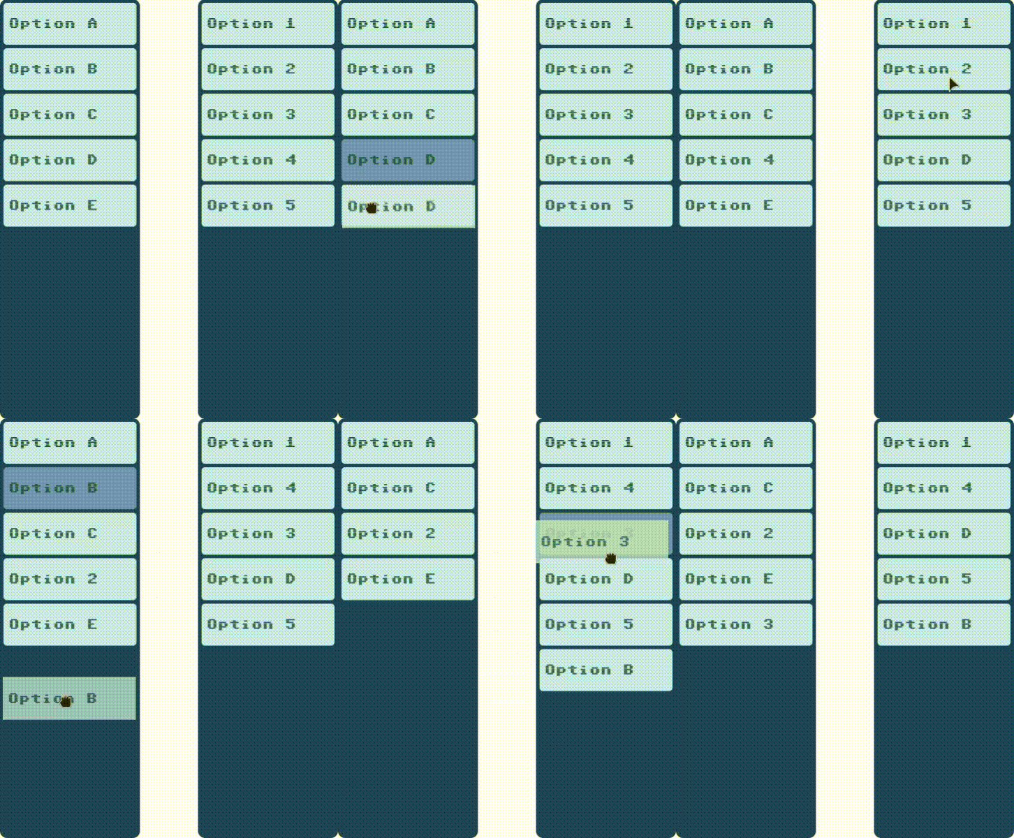
This is a small library to enable drag and drop functionality in lists of HTML elements.
This library use the polyfill DragDropTouch by Bernardo-Castilho to support touch.
To install Drag and Drop you can use npm:
npm install @wudev/drag-drop
Or you can copy the code of the files:
drag-drop.min.js This file includes the polyfill DragDropTouch by Bernardo-Castilhodrag-drop-no-polyfill.min.js This file doesn't include the polyfill so you have to add support touch.
The library consists of the following files:
DragDrop.ts Main class to enable drag and drop on a container element.DragDropItem.ts Helper class to enable drag and drop on a single item.types.ts Some types used in the classes.This class enables drag and drop on a list of elements inside a container.
import DragDrop from '@wudev/drag-drop';

const container = document.getElementById('list');
const dragDrop = new DragDrop(container, 'li');
The DragDrop class handles:
draggable attributes and listeners to itemsThe DragDropItem class handles drag and drop functionality for a single item. This is used internally by DragDrop.
import {DragDropItem} from '@wudev/drag-drop';

const item = document.getElementById('item');
const dragDropItem = new DragDropItem(item, container, (origin, destiny) => {
	//code to exchange elements...
});
The DragDropItem class add to the item the next css classes:
/* Generates an opacity on the element that is being dragged */
.drag-start {
	opacity: 0.5;
}

/* Displays a dotted border on the element below the element being dragged */
.drag-over {
	border-color: 1px dotted #5fa8d3;
}
FAQs
Classes to apply drag and drop an element or an all of in a list of HTML elements.
The npm package @wudev/drag-drop receives a total of 1 weekly downloads. As such, @wudev/drag-drop popularity was classified as not popular.
We found that @wudev/drag-drop demonstrated a healthy version release cadence and project activity because the last version was released less than a year ago. It has 1 open source maintainer collaborating on the project.
Did you know?

Socket for GitHub automatically highlights issues in each pull request and monitors the health of all your open source dependencies. Discover the contents of your packages and block harmful activity before you install or update your dependencies.

Security News
Tea.xyz, a crypto project aimed at rewarding open source contributions, is once again facing backlash due to an influx of spam packages flooding public package registries.

Security News
As cyber threats become more autonomous, AI-powered defenses are crucial for businesses to stay ahead of attackers who can exploit software vulnerabilities at scale.

Security News
UnitedHealth Group disclosed that the ransomware attack on Change Healthcare compromised protected health information for millions in the U.S., with estimated costs to the company expected to reach $1 billion.