Product
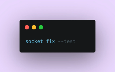
Introducing Socket Fix for Safe, Automated Dependency Upgrades
Automatically fix and test dependency updates with socket fix—a new CLI tool that turns CVE alerts into safe, automated upgrades.
By John-David Dalton - Apr 25, 2025
@zendeskgarden/react-dropdowns
Advanced tools
Components relating to dropdowns in the Garden Design System
This package includes components relating to dropdowns in the Garden Design System.
npm install @zendeskgarden/react-dropdowns
# Peer Dependencies - Also Required
npm install react react-dom styled-components @zendeskgarden/react-theming
import { ThemeProvider } from '@zendeskgarden/react-theming';
import { Dropdown, Menu, Item, Trigger } from '@zendeskgarden/react-dropdowns';

/**
 * Place a `ThemeProvider` at the root of your React application
 */
<ThemeProvider>
  <Dropdown onSelect={value => console.log(`Selected: ${value}`)}>
    <Trigger>
      <button>This triggers a menu</button>
    </Trigger>
    <Menu placement="end" hasArrow>
      <Item value="option-1">Option 1</Item>
      <Item value="option-2">Option 2</Item>
      <Item value="option-3">Option 3</Item>
    </Menu>
  </Dropdown>
</ThemeProvider>;
For all components within the react-dropdowns package, the menu layouts and
implementations are interchangeable.
Whether you're making a Select, Autocomplete, or a traditional Menu the <Menu> implementation
will adapted to its consumer.
The react-dropdowns package abstracts the common concepts of Menus, Selects, and Autocompletes
into a common API. This includes consistent visuals, common keyboard interaction, and a fully accessible
experience for sighted and non-sighted users.
The customizations available within this can be broken into two groups: placement / positioning and dropdown state
Internally, the <Dropdown> component uses PopperJS
for its positioning calculations.
The <Menu> component accepts all customizations regarding placement, boundaries, overflows,
etc. via the popperModifiers prop.
/** Customize default overflow settings to position against the `viewport` */
<Menu popperModifiers={{ preventOverflow: { boundariesElement: 'viewport' } }}>
  <Item value="item-1">Item 1</Item>
  <Item value="item-2">Item 2</Item>
  <Item value="item-3">Item 3</Item>
</Menu>
We use the Downshift render-prop library to handle our keyboard and accessibility logic.
The following states can be controlled directly from the <Dropdown> component:
AutocompleteAll other customizations may be provided directly to the Downshift provider
via the downshiftProps prop.
Downshift provides several advanced customization features that can be very helpful when customizing this component. The stateReducer pattern is a common customization strategy.
If you are using server side rendering you may need to configure specific Downshift settings.
This package re-exports the Downshift resetIdCounter utility. It allows resetting the internal id
counter which is used to generate unique ids for Downshift.
FAQs
Components related to dropdowns in the Garden Design System
The npm package @zendeskgarden/react-dropdowns receives a total of 52,217 weekly downloads. As such, @zendeskgarden/react-dropdowns popularity was classified as popular.
We found that @zendeskgarden/react-dropdowns demonstrated a healthy version release cadence and project activity because the last version was released less than a year ago. It has 1 open source maintainer collaborating on the project.
Did you know?

Socket for GitHub automatically highlights issues in each pull request and monitors the health of all your open source dependencies. Discover the contents of your packages and block harmful activity before you install or update your dependencies.
Product
Automatically fix and test dependency updates with socket fix—a new CLI tool that turns CVE alerts into safe, automated upgrades.

Security News
CISA denies CVE funding issues amid backlash over a new CVE foundation formed by board members, raising concerns about transparency and program governance.
Product
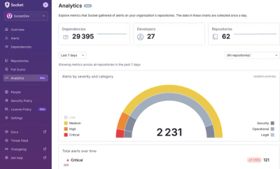
We’re excited to announce a powerful new capability in Socket: historical data and enhanced analytics.