Security News
CISA Rebuffs Funding Concerns as CVE Foundation Draws Criticism
CISA denies CVE funding issues amid backlash over a new CVE foundation formed by board members, raising concerns about transparency and program governance.
@zendeskgarden/react-dropdowns
Advanced tools
Components related to dropdowns in the Garden Design System
This package includes components related to dropdowns in the Garden Design System.
npm install @zendeskgarden/react-dropdowns
# Peer Dependencies - Also Required
npm install react react-dom styled-components @zendeskgarden/react-theming
import { ThemeProvider } from '@zendeskgarden/react-theming';
import { Field, Label, Combobox, Option } from '@zendeskgarden/react-dropdowns';

/**
 * Place a `ThemeProvider` at the root of your React application
 */
<ThemeProvider>
  <Field>
    <Field.Label>Label</Field.Label>
    <Combobox>
      <Option value="One" />
      <Option value="Two" />
      <Option value="Three" />
    </Combobox>
  </Field>
</ThemeProvider>;
Beyond this basic example, Garden's Combobox offers a comprehensive set of
WAI-ARIA compliant combobox features. Key capabilities include:
Combobox functions in both uncontrolled and
controlled
modes. Controlled mode enables aspects, such as input value, selection value(s),
listbox expansion, and current option active index, to share and adapt to the
surrounding UI.Combobox with list
autocomplete.
Filtering implementation is left to the API consumer.Combobox API ensures the selection of one or more
listbox option values, while also supporting the W3C no autocomplete
example
for use cases like search.Combobox to provide WAI-ARIA
multi-select
listbox
functionality with option-as-tag value rendering.Combobox supports select-only
mode,
where the user cannot modify the <input>.Combobox offers various filtering methods for listbox
options. Details of the filtering implementation are left to the API consumer.Combobox can convert input value text to rich HTML
markup on blur in single-selection mode.Combobox allows adding start and end media (SVG icons).
Certain features will replace end media with Garden's standard dropdown chevron
treatment.Combobox API utilizes fully accessible <OptGroup>
components for grouping, similar to the corresponding HTML element.Combobox supports compact
sizing.Combobox builds on Garden’s Field API context to
establish accessible relationships with corresponding Label, Hint, and Message
components.Combobox provides validation styling and
accessibility comparable to other Garden form components.import { ThemeProvider } from '@zendeskgarden/react-theming';
import { Menu, Item } from '@zendeskgarden/react-dropdowns';
/**
* Place a `ThemeProvider` at the root of your React application
*/
<ThemeProvider>
<Menu button="Choose an item">
<Item value="item-01" label="One" />
<Item value="item-02" label="Two" />
<Item value="item-03" label="Three" />
</Menu>
</ThemeProvider>;
Visit storybook for live examples.
FAQs
Components related to dropdowns in the Garden Design System
The npm package @zendeskgarden/react-dropdowns receives a total of 52,217 weekly downloads. As such, @zendeskgarden/react-dropdowns popularity was classified as popular.
We found that @zendeskgarden/react-dropdowns demonstrated a healthy version release cadence and project activity because the last version was released less than a year ago. It has 1 open source maintainer collaborating on the project.
Did you know?

Socket for GitHub automatically highlights issues in each pull request and monitors the health of all your open source dependencies. Discover the contents of your packages and block harmful activity before you install or update your dependencies.

Security News
CISA denies CVE funding issues amid backlash over a new CVE foundation formed by board members, raising concerns about transparency and program governance.

Product
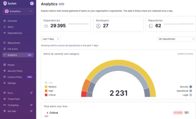
We’re excited to announce a powerful new capability in Socket: historical data and enhanced analytics.

Product
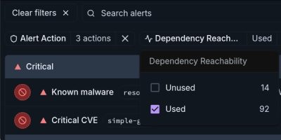
Module Reachability filters out unreachable CVEs so you can focus on vulnerabilities that actually matter to your application.