Admin Table Page
Chinese
Admin Table Page component based on Vue3.js and Element-plus
- Write a table page with search fields, toolbar and pagination functions by simple configure
- Only need a promise function that fetchs data from the server to automatically complete the table data pulling and rendering
- Support automatic refresh and manual refresh of the table data when fetching data from the server
- Automatically pagination
- Select rows on different pages even when fetching data from the server
- When search fields or pagination changed, the table datas will be loaded automatically
- Customize each part of the component through different named slot
- Support Chinese and English language
- Adaptive layout for different device
Issue Reporting
If you have found a bug, please report it in this issues section. Thanks!
Local Demo
npm install / yarn install
npm run dev / yarn run dev
Open http://localhost:8173 to see the demo
Installation
NPM
npm install admin-table-page
Yarn
yarn add admin-table-page
Usage
Global Scope
import AdminTablePage from "admin-table-page";
import "admin-table-page/lib/style.css";
import "admin-table-page/style/index.scss";
import { createApp } from "vue";
const app = createApp(...);
app.use(ConfigTable);
VUE SFC Component
<template>
<admin-table-page
:columns="columns"
:fetch-method="getDataApi"
:tool-buttons="toolButtons"
:refresh="5000"
:action-column="actionColumn"
selectable="multiple"
row-key="id"
/>
</template>
<script setup>
import { AdminTablePage } from "admin-table-page";
import "admin-table-page/lib/style.css";
import "admin-table-page/style/index.scss";
const columns = [{
prop: "name",
label: "Name",
filterable: true
}, {
prop: "age",
label: "Age",
filterOptions: {
type: "select",
options: ["Under 10 years old", "10 to 20 years old"]
}
}];
const toolButtons = [{
text: "New Record",
icon: "Plus",
onClick: handleAdd
}]
const actionColumn = [{
text: "Edit",
onClick: row => handleEdit(row)
}, {
text: "Delete",
onClick: row => handleDelete(row)
}]
const getDataApi = () => {
return new Promise((resolve, reject) => {
resolve({
total: 2,
list: [{
name: "name1",
age: 1
}, {
name: "name2",
age: 2
}]
})
})
}
</script>
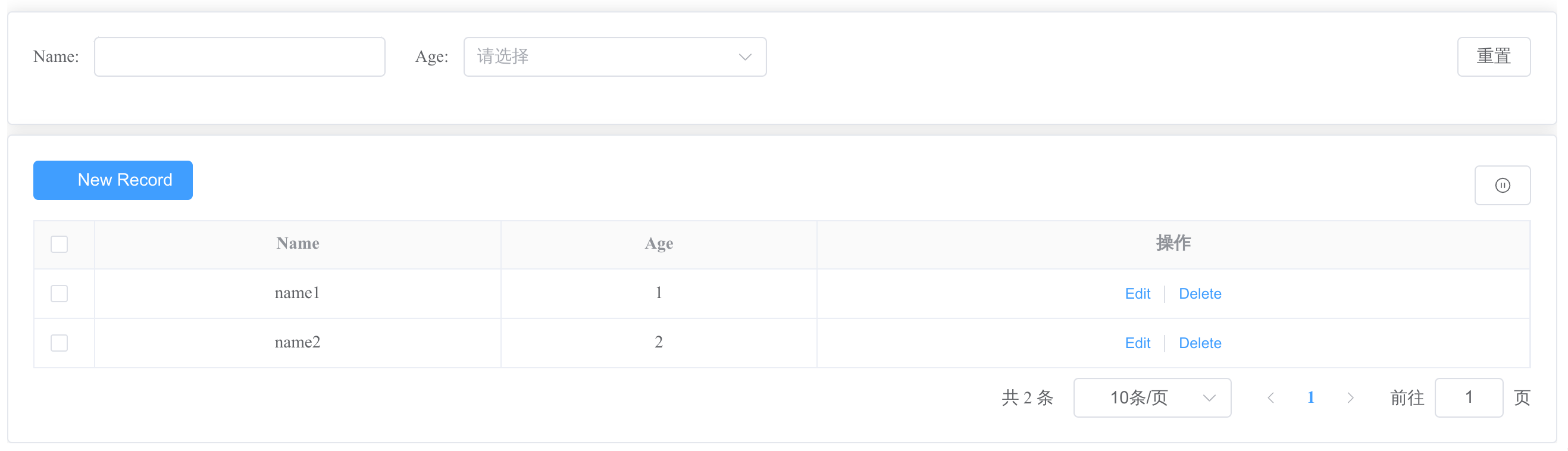
Then, you can get a page like this:
Props
| columns | The defination of the table's columns.
In addition to the original attributes of el-table-column, use filterable or filterOptions to define the filtering of the column Filter | array | - | [] |
| local-data | The local table data, same as ElTalbe's data property | array | - | [] |
| total-key | To map the key for total count in the result when fetch datas from remote. | string | - | "total" |
| list-key | To map the key for data list in the result when fetch datas from remote. | string | - | "list" |
| fetch-method | The method to get the table data from remote server | (query: object) => Promise<{totalKey: number, listKey: array}> | - | - |
| refresh | How to refresh the table data | string/number | string value:
"" - Never to refresh Table
"manual" - Refresh table data manually"
number value:
Table refresh period with milliseconds. For example,:refresh="5000" | "" |
| tool-buttons | Toolbar buttons. Toolbar button Attributes | array | - | - |
| show-index | Display the index of the row when it's true. | boolean | false
true | false |
| row-key | Same as el-table, it's required when set selectable to "single" or "multiple" | string | - | - |
| selectable | How to select the rows in table. | boolean/string | string value:
"single" - single select
"multiple" - multiple select
boolean value:
false: not suppor selection | false |
| locale | i18n locale config | string | "zhCn", "en" | "zhCn" |
| action-column | The action column shown in each row. | array | - | - |
| action-column-label | The label of action column | string | - | en - "Actions"
zhCn - "操作" |
| extra-query | The extra query params need to send to server when fetch datas from remote. | object | - | - |
| el-pagination-props | Other el-pagination Attributes | object | - | - |
| tips | tips string for the table. | string | - | - |
In addition, other attributes of el-table can fallthrough.
Method
| reload | Reload the table data. You can pass other parameters besides searchFields and pagination parameters | (params) => void |
| getSelections | Return the selected rows or seleted row object. When multiple selecting, you can get the selected rows on different pages. | () => array or object |
In addition, all methods of el-table are alse suppored.
Events
| select-change | triggers when selection change.
Returns a row Object when selectable is "single".
Returns rows Array when selectable is "multiple" | row/rows |
Custom Slots
| search | The search |
| tools | The toolbar |
| actions | The action column |
| actions_header | The header of the action column |
| tips | The tips of the table |
| extra_columns | Extra customed columns |
| [column.prop] | Each column can be customed by slot named with the column's prop |
| [column.prop]_header | The header of column can be customed by named slot |
Toolbar Buttons
| text | true | The text displayed on the button. | String | - |
| onClick | true | The callback function for click events. | Function | - |
| show | false | Whether to display the button. Default is true. | Boolean | true |
In addition, all attributes for el-button are supported. For example,
const toolButtons = [{
  text: "test button",
  onClick: () => { console.log("it's toolbar button")},
  icon: "Plus",
  type: "danger",
  link
}]
Filter
Only support el-input、el-select and el-date-picker(type="date") for search components.
You can set filterable or filterOptions for each element in the array defined by columns.
- filterable is a boolean value. You can get a el-input filter component for the column when it's true.
- filterOptions is an object. You can set other properties for the filter component like defaultHidden to set whether it's hidden by default, or use other types of filter components we support.
Attributes of filterOptions
| type | string | false | The type of the search field. | "input"
"select"
"date" | "input" |
| defaultHidden | boolean | false | Whether this filter component is hidden by default. | true
false | false |
| options | array | false | The select options.
It's required when type is "select". The element for options Array can be string、number or object with keys named label and value. | ["options1", "options2",...]
or
[{ label: "option1", value: "option1" }] | - |
In addition, all attributes for el-input/el-select/el-date-picker(type="date") are supported. For example,
const columns = [{
  prop: "username",
  label: "Username",
  filterable: true
}, {
  prop: "age",
  label: "Age",
  filterOptions:{
    type: "select",
    options: ["18", "19"],
    defaultHidden: true
  }
}]


