Security Fundamentals
Turtles, Clams, and Cyber Threat Actors: Shell Usage
The Socket Threat Research Team uncovers how threat actors weaponize shell techniques across npm, PyPI, and Go ecosystems to maintain persistence and exfiltrate data.
alternative-react-components
Advanced tools
<Alternative /> is a React component that wraps two components <SideA />, <SideB /> inside,
displays <SideA /> as a normal state, yet displays <SideB /> when you interact with(hover/click on) <Alternative />.
This alternative state of <Alternative /> is transformed along with several kinds of animation to choose from.
<Alternative
  sideA={SideAComponent}
  sideB={SideBComponent}
  clickToTrigger  // default to be false, means hover to alter components
  className={"your-class-name"}  // it is possible to style the outmost <div> of <Alternative /> by giving classnames
/>
more animations
FAQs
Alternative components for React, with fun animations
We found that alternative-react-components demonstrated a not healthy version release cadence and project activity because the last version was released a year ago. It has 1 open source maintainer collaborating on the project.
Did you know?

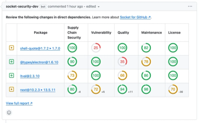
Socket for GitHub automatically highlights issues in each pull request and monitors the health of all your open source dependencies. Discover the contents of your packages and block harmful activity before you install or update your dependencies.

Security Fundamentals
The Socket Threat Research Team uncovers how threat actors weaponize shell techniques across npm, PyPI, and Go ecosystems to maintain persistence and exfiltrate data.

Security News
At VulnCon 2025, NIST scrapped its NVD consortium plans, admitted it can't keep up with CVEs, and outlined automation efforts amid a mounting backlog.

Product
We redesigned our GitHub PR comments to deliver clear, actionable security insights without adding noise to your workflow.