Research
/Security News
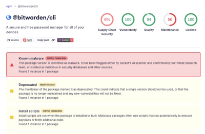
Bitwarden CLI Compromised in Ongoing Checkmarx Supply Chain Campaign
Bitwarden CLI 2026.4.0 was compromised in the Checkmarx supply chain campaign after attackers abused a GitHub Action in Bitwarden’s CI/CD pipeline.
angular-2-dropdown-multiselect
Advanced tools
Customizable dropdown multiselect in Angular 2 with bootstrap css.
Works with Angular Final and AOT compilation
Customizable dropdown multiselect in AngularX, TypeScript with bootstrap css.
See demo: http://softsimon.github.io/angular-2-dropdown-multiselect
git clone https://github.com/softsimon/angular-2-dropdown-multiselect.git.bower install angular-2-dropdown-multiselect --save.npm install angular-2-dropdown-multiselect --save-dev.Import MultiselectDropdown into your @NgModule.
import { MultiselectDropdownModule } from 'angular-2-dropdown-multiselect';

@NgModule({
  // ...
  imports: [
    MultiselectDropdownModule,
  ]
  // ...
})
Define options in your consuming component:
import { IMultiSelectOption } from 'angular-2-dropdown-multiselect';

export class MyClass implements OnInit {
    optionsModel: number[];
    ngOnInit() {
        myOptions: IMultiSelectOption[] = [
            { id: 1, name: 'Option 1' },
            { id: 2, name: 'Option 2' },
        ];
    }
    onChange() {
        console.log(this.optionsModel);
    }
}
In your template, use the component directive:
<ss-multiselect-dropdown [options]="myOptions" [(ngModel)]="optionsModel" (ngModelChange)="onChange($event)"></ss-multiselect-dropdown>
Import the IMultiSelectOption and IMultiSelectTexts interfaces to enable/override settings and text strings:
// Default selection
optionsModel: number[] = [1, 2];

// Settings configuration
mySettings: IMultiSelectSettings = {
    enableSearch: true,
    checkedStyle: 'fontawesome',
    buttonClasses: 'btn btn-default btn-block',
    dynamicTitleMaxItems: 3,
    displayAllSelectedText: true
};

// Text configuration
myTexts: IMultiSelectTexts = {
    checkAll: 'Select all',
    uncheckAll: 'Unselect all',
    checked: 'item selected',
    checkedPlural: 'items selected',
    searchPlaceholder: 'Find',
    defaultTitle: 'Select',
    allSelected: 'All selected',
};

// Labels / Parents
myOptions: IMultiSelectOption[] = [
    { id: 1, name: 'Car brands', isLabel: true },
    { id: 2, name: 'Volvo', parentId: 1 },
    { id: 3, name: 'Honda', parentId: 1 },
    { id: 4, name: 'BMW', parentId: 1 },
    { id: 5, name: 'Colors', isLabel: true },
    { id: 6, name: 'Blue', parentId: 5 },
    { id: 7, name: 'Red', parentId: 5 },
    { id: 8, name: 'White', parentId: 5 }
];
<ss-multiselect-dropdown [options]="myOptions" [texts]="myTexts" [settings]="mySettings" [(ngModel)]="optionsModel"></ss-multiselect-dropdown>
| Setting | Description | Default Value |
|---|---|---|
| pullRight | Float the dropdown to the right | false |
| enableSearch | Enable searching the dropdown items | false |
| checkedStyle | Style of checked items one of 'checkboxes', 'glyphicon' or 'fontawesome' | 'checkboxes' |
| buttonClasses | CSS classes to apply to the trigger button | 'btn btn-default' |
| itemClasses | CSS classes to apply to items | '' |
| containerClasses | CSS classes to apply to container div | 'dropdown-inline' |
| selectionLimit | Maximum number of items that may be selected (0 = no limit) | 0 |
| autoUnselect | Unselect the previous selection(s) once selectionLimit is reached | false |
| closeOnSelect | If enabled, dropdown will be closed after selection | false |
| showCheckAll | Display the checkAll item to select all options | false |
| showUncheckAll | Display the uncheckAll item to unselect all options | false |
| fixedTitle | Use the default title (do not apply the dynamic title) | false |
| dynamicTitleMaxItems | The maximum number of options to display in the dynamic title | 3 |
| maxHeight | The maximum height for the dropdown (including unit) | '300px' |
| displayAllSelectedText | Display the allSelected text when all options are selected | false |
| Text Item | Description | Default Value |
|---|---|---|
| checkAll | The text for the "check all" option | 'Check all' |
| uncheckAll | The text for the "uncheck all" option | 'Uncheck all' |
| checked | Text for "checked" with single item selected (used in dynamic title) | 'checked' |
| checkedPlural | Text for "checked" with multiple items selected (used in dynamic title) | 'checked' |
| searchPlaceholder | Text initially displayed in search input | 'Search...' |
| defaultTitle | Title displayed in button before selection | 'Select' |
| allSelected | Text displayed when all items are selected (must be enabled in options) | 'All selected' |
Although this dropdown is designed for multiple selections, a common request is to only allow a single selection without requiring the user to unselect their previous selection each time. This can be accomplished by setting selectionLimit to 1 and autoUnselect to true.
{
  ...
  selectionLimit: 1,
  autoUnselect: true,
  ...
}
import { IMultiSelectOption } from 'angular-2-dropdown-multiselect';

export class MyClass implements OnInit {
    model: number[];
    myOptions: IMultiSelectOption[] = [
        { id: 1, name: 'Option 1' },
        { id: 2, name: 'Option 2' },
    ];

    ngOnInit() {
        this.myForm = this.formBuilder.group({
            optionsModel: [1, 2], // Default model
        });

        this.myForm.controls['optionsModel'].valueChanges
            .subscribe((selectedOptions) => {
                // changes
            });
    }
}
<form [formGroup]="myForm">
    <ss-multiselect-dropdown [options]="myOptions" formControlName="optionsModel"></ss-multiselect-dropdown>
</form>
Pull requests are welcome!
[MIT]
FAQs
Customizable dropdown multiselect in Angular 2 with bootstrap css.
The npm package angular-2-dropdown-multiselect receives a total of 2,561 weekly downloads. As such, angular-2-dropdown-multiselect popularity was classified as popular.
We found that angular-2-dropdown-multiselect demonstrated a not healthy version release cadence and project activity because the last version was released a year ago. It has 1 open source maintainer collaborating on the project.
Did you know?

Socket for GitHub automatically highlights issues in each pull request and monitors the health of all your open source dependencies. Discover the contents of your packages and block harmful activity before you install or update your dependencies.

Research
/Security News
Bitwarden CLI 2026.4.0 was compromised in the Checkmarx supply chain campaign after attackers abused a GitHub Action in Bitwarden’s CI/CD pipeline.

Research
/Security News
Docker and Socket have uncovered malicious Checkmarx KICS images and suspicious code extension releases in a broader supply chain compromise.

Product
Stay on top of alert changes with filtered subscriptions, batched summaries, and notification routing built for triage.