Product
Introducing Rust Support in Socket
Socket now supports Rust and Cargo, offering package search for all users and experimental SBOM generation for enterprise projects.
anjrot-components
Advanced tools
This project is a React component library created for a YouTube tutorial. It demonstrates how to build reusable UI components using React, TypeScript, and Tailwind CSS.
This project is a React component library created for a YouTube tutorial. It demonstrates how to build reusable UI components using React, TypeScript, and Tailwind CSS.
This project was created as part of a YouTube tutorial. To learn how to build your own React component library step-by-step watch the video.
npm install
npm run storybook
To use this library in another project, follow these steps:
Add the library to your project as a dependency using npm or yarn:
npm install anjrot-components
# or
yarn add anjrot-components
To use this library in your project, make sure Tailwind CSS processes the classes in the components provided by the library. Add the following line to the content section of your tailwind.config.js:
content: ["./node_modules/anjrot-components/**/*.{js,ts,jsx,tsx}"],
Now you can import and use components from the library in your project. For example:
import { Button, Input, Stack } from "anjrot-components";

export default function MyComponent() {
  return (
    <div>
      <Button onClick={() => alert("Clicked!")}>Click Me</Button>
      <Input placeholder="Enter your text here" />
      <Stack gap={4}>
        <div>Item 1</div>
        <div>Item 2</div>
      </Stack>
    </div>
  );
}
Restart your development server after making these changes to ensure Tailwind CSS processes the classes correctly.
This library includes the following components:
Each component has its own story for Storybook, allowing you to view and interact with the components in isolation.
For detailed documentation on each component, please refer to the individual component files in the src directory.
We welcome contributions! Please see our CONTRIBUTING.md for details on how to contribute to this project.
This project is licensed under the LICENSE file in the root directory of this project.
For a detailed list of changes and version updates, please refer to our CHANGELOG.md.
Thank you to all the contributors who have helped make this project possible!
Will use this Library for our newest Video Tutorials.
Trigger upgrade version
Made with ❤️ for the YouTube community
FAQs
This project is a React component library created for a YouTube tutorial. It demonstrates how to build reusable UI components using React, TypeScript, and Tailwind CSS.
The npm package anjrot-components receives a total of 6 weekly downloads. As such, anjrot-components popularity was classified as not popular.
We found that anjrot-components demonstrated a healthy version release cadence and project activity because the last version was released less than a year ago. It has 1 open source maintainer collaborating on the project.
Did you know?

Socket for GitHub automatically highlights issues in each pull request and monitors the health of all your open source dependencies. Discover the contents of your packages and block harmful activity before you install or update your dependencies.

Product
Socket now supports Rust and Cargo, offering package search for all users and experimental SBOM generation for enterprise projects.

Product
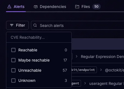
Socket’s precomputed reachability slashes false positives by flagging up to 80% of vulnerabilities as irrelevant, with no setup and instant results.

Product
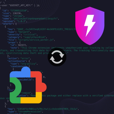
Socket is launching experimental protection for Chrome extensions, scanning for malware and risky permissions to prevent silent supply chain attacks.