App Icon Badge
✨ Easily generate icons with environment and version badges for your Mobile application. ✨
🚀 Motivation
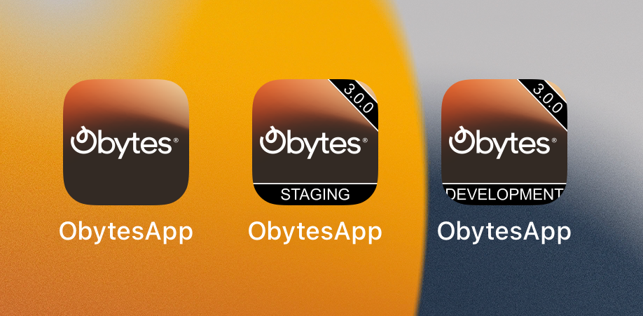
During the development of a mobile application, we typically generate different applications based on the environment (staging, development, production).
However, it starts getting confusing when we install all of them on our device, especially if they have the same icon and name. In addition to that, it is difficult for our testers to trace bugs not knowing which version of the application they are using.
Therefore, we need a way to differentiate the applications based on the environment and version. This library generates a badge with the environment and version information and adds it to the app icon.
📱 Features
- 🙌 Easy to use as an Expo plugin or a simple library.
- 📱 Supports universal icons and adaptive icons.
- 🧩 Supports multiple badges.
- 🎨 Fully customizable; you can change the badge text, color, background, and position.
📦 Installation
Install the package.
yarn add app-icon-badge
npm install app-icon-badge
pnpm add app-icon-badge
🛠️ Usage
Expo Plugin
As we mentioned above, we built the package to be used in Expo projects and generate icons that will be provided to the icon and android.adaptiveIcon.foregroundImage properties in app.json. So, we recommend following the official Expo documentation to generate the icons.
To use the plugin, you need to add it to your app.config.js file.
const environment = 'staging';
export default ({ config }) => ({
...config,
name: 'my-app',
icon: './assets/icon.png',
android: {
adaptiveIcon: {
foregroundImage: './assets/adaptive-icon.png',
backgroundColor: '#FFFFFF',
},
},
plugins: [
[
'app-icon-badge',
{
enabled: true,
badges: [
{
text: environment,
type: 'banner',
color: 'white',
background: '#FF0000',
},
{
text: 'V1.0.1',
type: 'ribbon',
},
],
},
],
],
});
Options:
enabled - enable/disable the plugin based on the environment (usually disabled for production builds)badges - an array of badges, you can think of it as an array of layers that will be added to the icon. Each badge has :
text - the text that will be displayed on the badge.type - the type of the badge, either banner or ribbon (default is banner).position - the position of the badge, based on the type property, it can be top or bottom for banner and left or right for ribbon (default is top for banner and right for ribbon).color - the color of the text only black and white color are supported (default is white).background - the background color of the badge, only hex format is supported (default is #000000).
Note: please refer to our starter for a complete working example.
This plugin, when enabled, will use the icon and android.adaptiveIcon.foregroundImage properties in app.json to generate icons with badges, which will be saved in the .expo directory. The plugin will then update your Expo config to use these new icons instead of the original ones. If you are familiar with Expo plugins, you can take a look at the source code.
As a library
We also wanted to make it possible to use the library in any React Native project, so we added the ability to use it as a library, but it's up to you to make it work with the build process you are using.
import { addBadge } from 'app-icon-badge';
import path from 'path';
const icon = path.resolve(__dirname, './assets/icon.png');
addBadge({
icon,
dstPath: './assets/icon.${environment}.png',
badges: [
{
text: 'staging',
type: 'banner',
color: 'white',
background: '#FF0000',
},
{
text: 'V1.0.1',
type: 'ribbon',
},
],
});
API
icon - the path to the original icon you want to add the badge to.dstPath - the path to the generated icon with the badge. If not provided, the icon will be generated in the same directory as the original icon under the name icon.result.png.badges - an array of badges, you can think of it as an array of layers that will be added to the icon. Each badge has :
text - the text that will be displayed on the badge.type - the type of the badge, either banner or ribbon (default is banner).position - the position of the badge, based on the type property, it can be top or bottom for banner and left or right for ribbon (default is top for banner and right for ribbon).color - the color of the text only black and white color are supported (default is white).background - the background color of the badge, only hex format is supported (default is #000000).
🚧 RoadMap
The library is still in its early stages. We have a lot of ideas to improve it and make it more useful. Here are some of the things we have already had the chance to implement, as well as our plans for additions in the future:
Feel free to suggest any other features or contribute to the project yourself by helping us implement upcoming features.
👀 More about the library
The library uses Jimp, an image-processing library for Node with zero native dependencies, to generate app icons with environment or version badges.
This Library was built to work with expo projects, but it can also be used in any React Native project and as a standalone library to generate icons with badges.
Worth mentioning that this library was built to be added to the build process of our react native starter kit Obytes Starter. The starter kit is based on the best practices and tools that we have found to be most effective in our own projects and it comes with this library pre-installed and configured. Make sure to give it a try if you are looking for a React Native starter kit.
🔥 How to contribute?
We appreciate your desire to support our effort. We highly value your participation and look forward to receiving your contributions.
If you decided that you would like to contribute, you can follow these steps:
- Fork the repository.
- Create your feature branch (git checkout -b my-new-feature).
- Install dependencies, we use pnpm, please make sure to install it, if you don't have it already.
cd app-icon-badge
pnpm install
- Run the example provided in the
example directory. You should see a new icon with the badge generated in the same directory as the original icon under the name icon.development.png.
pnpm start
For a better experience, we are using nodemon to watch for changes and re-run the example while developing. Make sure to open the resulting image with Visual Studio Code and split the screen to see the changes live.
- Commit & push your changes then open a new Pull Request.
Feel free to open an issue if you have a suggestion, question, or feedback.
If our project has helped you in any way, please consider giving it a star ⭐️.
📝 License
This project is MIT licensed.


