Security News
tea.xyz Spam Plagues npm and RubyGems Package Registries
Tea.xyz, a crypto project aimed at rewarding open source contributions, is once again facing backlash due to an influx of spam packages flooding public package registries.
auth-input
Advanced tools
Readme

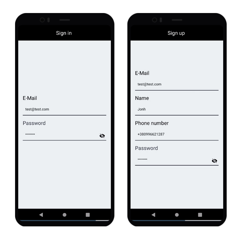
Auth Input is a React Native custom component, providing fields for entering name, password, phone number and email.
Install the package with NPM.
npm i auth-input
Usage is very simple. Just add the component to your file.
import React, {useState} from 'react';
import { Text, View } from 'react-native';
import AuthInput from 'auth-input'

export default function App() {
    const [email, setEmail] = useState('')
    const [password, setPassword] = useState('')

    const emailHandler = (text) => {
        setEmail(text)
    }
    const passwordHandler = (text) => {
        setPassword(text)
    }


  return (
                        <AuthInput
                            type="email"
                            label="E-Mail"
                            keyboardType="email-address"
                            minLength={5}
                            maxLength={35}
                            autoCapitalize="none"
                            errorText="Please, use a valid e-mail."
                            onInputChange={emailHandler}
                            value={email}
                        />

                        <AuthInput
                            type="password"
                            label="Password"
                            keyboardType="default"
                            minLength={5}
                            maxLength={15}
                            autoCapitalize="none"
                            errorText="Please, use a valid password."
                            onInputChange={passwordHandler}
                            value={password}
                        />
    </View>
  );
}
| Prop | Type | Description | Default | Optional |
|---|---|---|---|---|
| type | string | Type of input ("email", "phone", "name" or "password") | - | no |
| label | string | Text above the input | - | no |
| keyboardType | string | Default Ract Native TextInput keyboard types | default | yes |
| minLength | number | lower bound of text length | - | yes |
| maxLength | number | Upper limit of text length | - | yes |
| errorText | string | Text that appears when the user has entered incorrect data | - | no |
| onInputChange | function | Input handler function | - | no |
| value | string | Input state | - | no |
| borderColor | string | Bottom border color | black | yes |
| errorTextColor | string | Error color | red | yes |
| textColor | string | Text color | black | yes |
| labelColor | string | Label above the input color | textColor | yes |
| labelColor | number | Label above the input font size | 20 | yes |
You can use properties of TextInput.
Pull requests are welcome. For major changes, please open an issue first to discuss what you would like to change.
Please make sure to update tests as appropriate.
FAQs
Set of authentication inputs for React Native including name, email, phone number and show/hide password.
The npm package auth-input receives a total of 0 weekly downloads. As such, auth-input popularity was classified as not popular.
We found that auth-input demonstrated a not healthy version release cadence and project activity because the last version was released a year ago. It has 1 open source maintainer collaborating on the project.
Did you know?

Socket for GitHub automatically highlights issues in each pull request and monitors the health of all your open source dependencies. Discover the contents of your packages and block harmful activity before you install or update your dependencies.

Security News
Tea.xyz, a crypto project aimed at rewarding open source contributions, is once again facing backlash due to an influx of spam packages flooding public package registries.

Security News
As cyber threats become more autonomous, AI-powered defenses are crucial for businesses to stay ahead of attackers who can exploit software vulnerabilities at scale.

Security News
UnitedHealth Group disclosed that the ransomware attack on Change Healthcare compromised protected health information for millions in the U.S., with estimated costs to the company expected to reach $1 billion.