Product
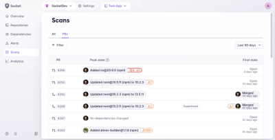
Introducing Pull Request Stories to Help Security Teams Track Supply Chain Risks
Socket’s new Pull Request Stories give security teams clear visibility into dependency risks and outcomes across scanned pull requests.
auth0-lock-noreact
Advanced tools
Auth0 is an authentication broker that supports social identity providers as well as enterprise identity providers such as Active Directory, LDAP, Google Apps, Salesforce.
From CDN
<!-- Latest patch release (recommended for production) -->
<script src="http://cdn.auth0.com/js/lock/10.13.0/lock.min.js"></script>
From bower
bower install auth0-lock
<script src="bower_components/auth0-lock/build/lock.min.js"></script>
From npm
npm install auth0-lock
After installing the auth0-lock module, you'll need bundle it up along with all of its dependencies. We have examples for browserify and webpack.
If you are targeting mobile audiences, it's recommended that you add:
<meta name="viewport" content="width=device-width, initial-scale=1, maximum-scale=1, user-scalable=0"/>
Initializes a new instance of Auth0Lock configured with your application clientID and your account's domain at Auth0. You can find this information at your application settings.
var clientId = "YOUR_AUTH0_APP_CLIENTID";
var domain = "YOUR_DOMAIN_AT.auth0.com";
var lock = new Auth0Lock(clientId, domain);

lock.on("authenticated", function(authResult) {
  lock.getUserInfo(authResult.accessToken, function(error, profile) {
    if (error) {
      // Handle error
      return;
    }

    localStorage.setItem("accessToken", authResult.accessToken);
    localStorage.setItem("profile", JSON.stringify(profile));

    // Update DOM
  });
});
Note: this method is soon to be deprecated, use
getUserInfoinstead.
Once the user has logged in and you are in possesion of an id token, you can obtain the profile with getProfile.
Once the user has logged in and you are in possesion of an access token, you can obtain the profile with getUserInfo.
lock.getUserInfo(accessToken, function(error, profile) {
  if (!error) {
    alert("hello " + profile.name);
  }
});
Lock will emit events during its lifecycle.
show: emitted when Lock is shown. Has no arguments.hide: emitted when Lock is hidden. Has no arguments.unrecoverable_error: emitted when there is an unrecoverable error, for instance when no connection is available. Has the error as the only argument.authenticated: emitted after a successful authentication. Has the authentication result as the only argument.authorization_error: emitted when authorization fails. Has error as the only argument.hash_parsed: every time a new Auth0Lock object is initialized in redirect mode (the default), it will attempt to parse the hash part of the url looking for the result of a login attempt. This is a low level event for advanced use cases and authenticated and authorization_error should be preferred when possible. After that this event will be emitted with null if it couldn't find anything in the hash. It will be emitted with the same argument as the authenticated event after a successful login or with the same argument as authorization_error if something went wrong. This event won't be emitted in popup mode because there is no need to parse the url's hash part.Displays the widget, allowing to override some options.
allowedConnections, auth.params, allowLogin, allowSignUp, allowForgotPassword, initialScreen, rememberLastLogin and flashMessage. See below for the details. Keep in mind that auth.params will be fully replaced and not merged.// without options
lock.show();
// will override the allowedConnections option passed to the constructor, if any
lock.show({allowedConnections: ["twitter", "facebook"]})
// will override the entire auth.params object passed to the constructor, if any
lock.show({auth: {params: {state: 'auth_state'}}})
If you set the auth.autoParseHash option to false, you'll need to call this method to complete the authentication flow. This method is useful when you're using a client-side router that uses a # to handle urls (angular2 with useHash or react-router with hashHistory).
null.lock.resumeAuth(hash, function(error, authResult) {
if (error) {
alert("Could not parse hash");
}
console.log(authResult.accessToken);
});
The appearance of the widget and the mechanics of authentication can be customized with an options object which has one or more of the following properties. Each method that opens the dialog can take an options object as its first argument.
closable it won't be closed even if this option is set to true. Defaults to false.false when a container option is provided or the Lock is being render on a mobile device. Otherwise it defaults to true.null will disable the functionality. To fetch avatar from other provider see below.id of the html element where the Lock will be rendered. This makes the Lock appear inline instead of in a modal window."en". Supported languages are:
de: Germanen: Englishes: Spanishit: Italiannb: Norwegian bokmålpt-BR: Brazilian Portugueseru: Russianzh: Chineseja: Japanese{}. See below Language Dictionary Specification for the details.container option is provided its value is always false, otherwise it defaults to true.window.open is accepted. Defaults to {}.initialScreen option is set to to "login" (the default). Defaults to true.error or success flash message when Lock is shown.
error or success.Theme options are grouped in the theme property of the options object.
var options = {
  theme: {
    labeledSubmitButton: false,
    logo: "https://example.com/assets/logo.png",
    primaryColor: "green",
    authButtons: {
      connectionName: {
        displayName: "...",
        primaryColor: "...",
        foregroundColor: "...",
        icon: "http://.../logo.png"
      }
    }
  }
};
true. When set to false a icon will be shown. The labels can be customized through the languageDictionary.logo to ensure all colors go well together with the logo's color palette. Defaults to "#ea5323"."#eb5424"."#FFFFFF"."http://site.com/logo.png".Authentication options are grouped in the auth property of the options object.
var options = {
  auth: {
   params: {param1: "value1"},
   autoParseHash: true,
   redirect: true,
   redirectUrl: "some url",
   responseMode: "form_post",
   responseType: "token",
   sso: true,
   connectionScopes: {
    connectionName: [ 'scope1', 'scope2' ]
   }
  }
};
{}.true, Lock will parse the window.location.hash string when instantiated. If set to false, you'll have to manually resume authentication using the resumeAuth method.true, the default, redirect mode will be used. Otherwise, popup mode is chosen. See below for more details."" (no redirect URL)."form_post" if you want the code or the token to be transmitted via an HTTP POST request to the redirectUrl instead of being included in its query or fragment parts. Otherwise, it should be ommited."token" for Single Page Applications, and "code" otherwise. Also, "id_token" is supported for the first case. Defaults to "code" when redirectUrl is provided, and to "token" otherwise."big" and "small". The default style depends on the connections that are available:
"big" when there are 5 connections at most, and default to "small" otherwise."big" when there are 3 social connections at most, and default to "small" otherwise.[].false the widget won't display the login screen. This is useful if you want to use the widget just for sign ups (the login and sign up tabs in the sign up screen will be hidden) or to reset passwords (the back button in the forgot password screen will be hidden). In such cases you may also need to specify the initialScreen, allowForgotPassword and allowSignUp options. It defaults to true.false hides the "Don't remember your password?" link in the login screen, making the forgot password screen unreachable. Defaults to true. Keep in mind that if you are using a database connection with a custom database which doesn't have a change password script the forgot password screen won't be available.false hides the login and sign up tabs in the login screen, making the sign up screen unreachable. Defaults to true. Keep in mind that if the database connection has sign ups disabled or you are using a custom database with coesn't have a create script, then the sign up screen won't be available."login", "signUp", and "forgotPassword". If this option is left unspecified, the widget will pick the first screen that is available from the previous list. Is recommended that you set allowLogin to "false" when you set initialScreen to "forgotPassword", otherwise a back button will be shown in the forgot password screen and it might not be clear to the user where is she/he going back.true.true displays a checkbox input along the terms and conditions that must be checked before signing up. The terms and conditions can be specified via the languageDictionary option, see the example below. Defaults to false.{prefill: {email: "someone@auth0.com", username: "someone"}}. When omitted no initial value will be provided.requires_username flag set, otherwise it will be ignored. Possible values are "username" and "email" and by default both username and email are allowed.defaultDatabaseConnection is provided the database connection will be used and this option will be ignored.var options = {
container: "myContainer",
closable: false,
languageDictionary: {
signUpTerms: "I agree to the <a href='/terms' target='_new'>terms of service</a> and <a href='/privacy' target='_new'>privacy policy</a>.",
title: "My Company",
},
autofocus: false
};
domain has the format *.auth0.com. Otherwise, it uses the provided domain.https://cdn.auth0.com.true.A language dictionary is an object that allows you to customize every piece of text the Lock needs to display. For instance, the following code will change the title displayed in the header and the placeholder for the email field.
var options = {
  languageDictionary: {
    emailInputPlaceholder: "please enter you email",
    title: "My Company"
  },
};
Extra input fields can be added to the sign up screen with the additionalSignUpFields option. Every input must have a name and a placeholder, and an icon url can also be provided. Also, the initial value can be provided with the prefill option, which can be a string with the value or a function that obtains it. Other options depend on the type of the field, which is defined via the type option and defaults to "text".
The new fields are rendered below the regular sign up input fields in the order they are provided.
A validator function can also be provided.
var options = {
  additionalSignUpFields: [{
    name: "address",
    placeholder: "enter your address",
    // The following properties are optional
    icon: "https://example.com/assests/address_icon.png",
    prefill: "street 123",
    validator: function(address) {
      return {
         valid: address.length >= 10,
         hint: "Must have 10 or more chars" // optional
      };
    }
  }]
}
To specify a select field type: "select" needs to be provided along with the options property.
var options = {
  additionalSignUpFields: [{
    type: "select",
    name: "location",
    placeholder: "choose your location",
    options: [
      {value: "us", label: "United States"},
      {value: "fr", label: "France"},
      {value: "ar", label: "Argentina"}
    ],
    // The following properties are optional
    icon: "https://example.com/assests/location_icon.png",
    prefill: "us"
  }]
}
The options and the prefill value can be provided through a function.
var options = {
  additionalSignUpFields: [{
    type: "select",
    name: "location",
    placeholder: "choose your location",
    options: function(cb) {
      // obtain options, in case of error you call cb with the error in the
      // first arg instead of null
      cb(null, options);
    },
    icon: "https://example.com/assests/location_icon.png",
    prefill: function(cb) {
      // obtain prefill, in case of error you call cb with the error in the
      // first arg instead of null
      cb(null, prefill);
    }
  }]
}
To specify a checkbox field use: type: "checkbox"
The prefill value can determine the default state of the checkbox and it is required.
var options = {
  additionalSignUpFields: [{
    type: "checkbox",
    name: "newsletter",
    prefill: "true",
    placeholder: "I hereby agree that I want to receive marketing emails from your company",
  }]
}
Lock can show avatars fetched from anywhere. A custom avatar provider can be specified with the avatar option by passing an object with the keys url and displayName. Both properties are functions that take an email and a callback function.
var options = {
  avatar: {
    url: function(email, cb) {
      // obtain url for email, in case of error you call cb with the error in
      // the first arg instead of null
      cb(null, url);
    },
    displayName: function(email, cb) {
      // obtain displayName for email, in case of error you call cb with the
      // error in the first arg instead of null
      cb(null, displayName);
    }
  }
};
A popup window can be displayed instead of redirecting the user to a social provider website. While this has the advantage of preserving page state, it has some issues. Often times users have popup blockers that prevent the login page from even displaying. There are also known issues with mobile browsers. For example, in recent versions of Chrome on iOS, the login popup does not get closed properly after login. For these reasons, we encourage developers to avoid this mode, even with Single Page Apps.
If you nevertheless decide to use it, you can activate popup mode by passing the option auth: {redirect: false} when constructing Auth0Lock.
var clientId = "YOUR_AUTH0_APP_CLIENTID";
var domain = "YOUR_DOMAIN_AT.auth0.com";
var options = {
  auth: {
    redirect: false
  }
};

var lock = new Auth0Lock(clientId, domain, options);
lock.show();
More information can be found in Auth0's documentation.
We ensure browser compatibility in Chrome, Safari, Firefox and IE >= 10. We currently use zuul along with Saucelabs to run integration tests on each push.
If you have found a bug or if you have a feature request, please report them at this repository issues section. Please do not report security vulnerabilities on the public GitHub issue tracker. The Responsible Disclosure Program details the procedure for disclosing security issues.
This project is licensed under the MIT license. See the LICENSE file for more info.
v10.13.0 (2017-03-13)
Closed issues
=, & characters is incorrectly parsed from url fragment #913Fixed
FAQs
Auth0 Lock
We found that auth0-lock-noreact demonstrated a not healthy version release cadence and project activity because the last version was released a year ago. It has 1 open source maintainer collaborating on the project.
Did you know?

Socket for GitHub automatically highlights issues in each pull request and monitors the health of all your open source dependencies. Discover the contents of your packages and block harmful activity before you install or update your dependencies.

Product
Socket’s new Pull Request Stories give security teams clear visibility into dependency risks and outcomes across scanned pull requests.

Research
/Security News
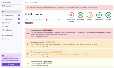
npm author Qix’s account was compromised, with malicious versions of popular packages like chalk-template, color-convert, and strip-ansi published.

Research
Four npm packages disguised as cryptographic tools steal developer credentials and send them to attacker-controlled Telegram infrastructure.