Bonanza 

Customizable autocomplete for really large collections
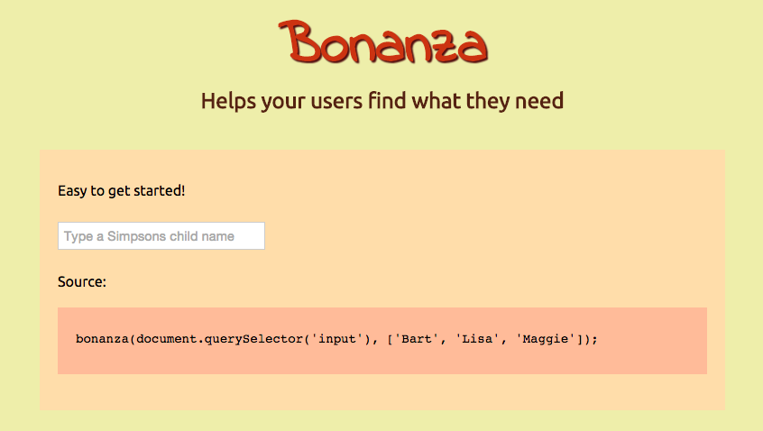
See examples here!
Install
Use it as an npm package:
npm install bonanza --save
Or just download it from bower
bower install bonanza --save
Angular support
Just use this package instead
Usage
You just need an input to work on and a function (a.k.a. callback) that returns your favorite data
bonanza(element, options?, callback | list)
element (required):
a HTMLInput Javascript element that will be used for autocompletionoptions (optional):
a set of parameters to customize bonanza as neededcallback | list (required):
bonanza doesn't know how to get your data, so it needs a function that receives a query, and returns the rows as an Array that will be used to fill the autocomplete info, or even an array with all the results that you need to display.
The example below shows you how to easily set up bonanza for an input element:
bonanza(element, function (query, callback) {
  get('/someApi?query=' + query.search + '&offset=' + query.offset + '&limit=' + query.limit, function (err, data) {
    if (err) {
      callback(err);
      return;
    }

    callback(null, data);
  });
});
The options are detailed below:
options.templates
An object with a set of functions. Here you have a detailed table with all that you need to replace:
| item | (obj) => obj | List items |
| label | (obj) => obj | Input value when user selects some item |
| isDisabled | (obj) => false | Marks an item as disabled |
| noResults | (search) => \No results for "${search}"`` | Showed when query returns no results |
| loadMore | ... | Showed at bottom when there is more data to show |
| loading | Loading ... | Showed at bottom when loading more data |
options.css
An object with a set of CSS class names. The detailed list of css classes by default can be found below:
| container | bz-container | The div class for the main container |
| hide | bz-hide | Class to hide the container |
| list | bz-list | The class for the ul inside the container |
| item | bz-list-item | Every li element for the results |
| disabled | bz-list-item-disabled | A disabled element in the list |
| selected | bz-list-item-selected | When an item is being selected |
| loading | bz-list-loading | The "loading" li item |
| loadMore | bz-list-load-more | The "load more" li item |
| noResults | bz-list-no-results | The li item showed when no results for last search |
| inputLoading | bz-loading | A class for the input element when loading |
| match | bz-text-match | A class when the search matches the text on an item |
options.openOnFocus
A boolean that decides whatever the list will be open on focus event or not. true by default.
options.showLoading
If true it will show a loading text when bonanza does the first search (with the list empty). true by defualt.
options.showLoadMore
If true it will show a "load more" legend text when bonanza has more items to show. true by defualt.
options.limit
The max number of rows expected, 10 by default.
options.scrollDistance
The distance in px before the bottom that will make bonanza start loading more items. 0 by default.
options.hasMoreItems
A function that helps to decide whatever the list being accesed has more items to display or not. By default is this function:
function (result) { return !!result.length && result.length === this.limit; }
options.getItems
This will be used to parse what you send from your callback, to the array that bonanza expects as a result. It contains the following function by default:
function (result) { return result; }
API
The object being returned after initializing bonanza is an EventEmitter instance. bonanza emits a set of events detailed below:
| focus | When the user made focus on the input element |
| change | Every time the user picks an option |
| select | Every time the user selects an option, usually navigating the list with the arrow keys |
| cancel | Every time the user cancels the operation, usually touching the esc key |
| open | When something opens the items list |
| close | When the user or an event closes the list |
| search | When starting to do a search |
| success | When the search returns data |
| error | Every time an error sadly occurs |
Contributing
The dist folder as well as the version in the package.json file should not be modified. Create a PR with your changes and if needed a test asserting them. Once merged a new version will be uploaded to bower and npm with the dist folder updated.
License
MIT


