New Case Study:See how Anthropic automated 95% of dependency reviews with Socket.Learn More
Socket
Sign inDemoInstall
Socket

bootstrap-show-notification

Package Overview
Dependencies
Maintainers
1
Versions
20
Alerts
File Explorer

Advanced tools

Socket logo

Install Socket

Detect and block malicious and high-risk dependencies

Install

bootstrap-show-notification

Shows Bootstrap 4 Alerts as notifications, fixed above the content.

  • 1.2.2
  • latest
  • Source
  • npm
  • Socket score

Version published
Weekly downloads
37
increased by48%
Maintainers
1
Weekly downloads
 
Created
Source

bootstrap-show-notification

This component is Bootstrap 4 only. For a Bootstrap 5 compatible package with similar functionality, see bootstrap-show-toast.

A jQuery plugin wrapper around Bootstrap 4 Alerts, to show them as toasts (also called notifications) dynamically from JavaScript.

bootstrap-show-notification Example

=>

  • Responsive and mobile friendly
  • Needs no extra CSS

Try it

Installation

npm install bootstrap-show-notification

Usage

<script src="./node_modules/bootstrap-show-notification/src/bootstrap-show-notification.js"></script>
<script>
    // simple example
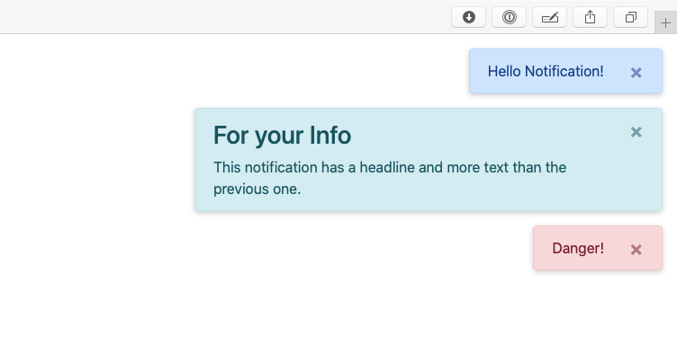
    $("#button-show-simple").click(function () {
        $.showNotification({body: "Hello Notification!"})
    })
    // type info and more complex body
    $("#button-show-info").click(function () {
        $.showNotification({
            body: "<h3>For your Info</h3>This notification has a title and a body and more text than the previous one.", type: "info"
        })
    })
    // type danger
    $("#button-show-danger").click(function () {
        $.showNotification({
            body: "Danger!", type: "danger"
        })
    })
    // type secondary and sticky
    $("#button-show-sticky").click(function () {
        $.showNotification({
            body: "This notification will stay", type: "secondary", duration: 0
        })
    })
</script>

Props (defaults)

this.props = {
    body: "", // the text, shown
    type: "primary", // the appearance
    duration: 5500, // duration till auto-hide, set to `0` to disable auto-hide
    maxWidth: "520px", // the notification maxWidth
    shadow: "0 2px 6px rgba(0,0,0,0.2)", // the box-shadow
    zIndex: 100,
    margin: "1rem", // the margin (above maxWidth)
    direction: "prepend" // or "append", the stack direction
}

Documentation

More Bootstrap extensions

Check out my further Bootstrap extensions

Keywords

FAQs

Package last updated on 27 Aug 2022

Did you know?

Socket

Socket for GitHub automatically highlights issues in each pull request and monitors the health of all your open source dependencies. Discover the contents of your packages and block harmful activity before you install or update your dependencies.

Install

Related posts

SocketSocket SOC 2 Logo

Product

  • Package Alerts
  • Integrations
  • Docs
  • Pricing
  • FAQ
  • Roadmap
  • Changelog

Packages

npm

Stay in touch

Get open source security insights delivered straight into your inbox.


  • Terms
  • Privacy
  • Security

Made with ⚡️ by Socket Inc