Browser UI State


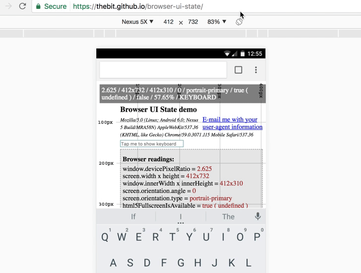
Live Demo - Open in Chrome, emulate to Nexus 5X and play with
different modes (look for state property with values e.g. EXPANDED, COLLAPSED, KEYBOARD, etc)
Motivation
Unfortunately browsers does not provide any API to allow us to determine their UI state in context of
address or other bars visibility, on-screen keyboard presence, etc.
Such need exist for SPAs (usually games or
video content) which does not have long body to scroll through so that browser UI disappears.
So they need some way to "expand" the browser to some kind of "full screen" to provide immersive user-experience.
There is HTML5 Fullscreen API to solve
this problem, but it is not supported cross-browser (for example
not supported in iOS as well as on some Android stock browsers). Also not all browsers are using unprefixed version of the API,
leading to creation of vendor-agnostic wrapper libraries like Fscreen.
Fortunately with the help of a bit of mathematics, spreadsheets and some gathered browser's statistics -
it is possible to determine the state by calculating deviation between current viewport aspect ratio
(reported by window.innerWidth and height) and static screen aspect ratio (reported by screen.width and height).
This, being packaged into library, allows to build on top of it cross-browser full screen solutions like
displaying overlay (only when needed) with message to the user e.g. "To use this app please swipe up the page".
This very library does not provide (and does not intended to) any out-of-the-box full screen solutions.
Installation
$ npm i browser-ui-state

Don't be afraid of caret (^) in your package.json for this dependency - semver will be used correctly for sure :hand::expressionless: :one:.:zero:.:zero:.
Usage
The library's API intended to be called whenever browser resize or orientation change happens:
import BrowserUiState from 'browser-ui-state'
const browserUiState = new BrowserUiState()
const resizeHandler = () => {
console.log(browserUiState.orientation)
console.log(browserUiState.state)
}
window.addEventListener('load', resizeHandler)
window.addEventListener('resize', resizeHandler)
window.addEventListener('orientationchange', resizeHandler)
states.js -
see all supported states
Old school:
<!DOCTYPE html>
<html>
<head>
    <meta name="viewport"
        content="width=device-width, initial-scale=1, maximum-scale=1, minimum-scale=1, user-scalable=no">

    <script type="text/javascript" src="https://unpkg.com/browser-ui-state"></script>
    <script>
        var browserUiState = new BrowserUiState.default()

        function resizeHandler() {
            console.log(browserUiState.orientation)
            console.log(browserUiState.state)
        }

        window.addEventListener('load', resizeHandler)
        window.addEventListener('resize', resizeHandler)
        window.addEventListener('orientationchange', resizeHandler)
    </script>
</head>
<body>
</body>
</html>
Detecting device orientation
You might wonder why this library also reports orientation.
Well... because it needs it for internal calculations and there is also a problem in Web to
correctly determine current device's orientation: just check what your orientation media query
will report to you in portrait when on-screen keyboard is shown (and it resizes viewport like in Chrome).
There is HTML5 Screen Orientation API
but it's browser support is similar to the one with HTML5 Fullscreen API.
Advanced
Library also allows to access its internal calculations for whatever advanced usage:
console.log(browserUiState.screenAspectRatio.toFixed(2))
console.log(browserUiState.viewportAspectRatio.toFixed(2))
console.log(browserUiState.delta.toFixed(2))
console.log(`${browserUiState.deviation.toFixed(2)}%`)
console.log(`${browserUiState.collapsedThreshold}%`)
console.log(`${browserUiState.keyboardThreshold}%`)
Dependencies
Only one: Fscreen - ~60 lines of
code (used for vendor agnostic access to the
Fullscreen API)
Matrix of supported devices and browsers
See Matrix
Engine explanation
See Engine


