
Product
Socket for Jira Is Now Available
Socket for Jira lets teams turn alerts into Jira tickets with manual creation, automated ticketing rules, and two-way sync.
By Jeppe Hasseriis - Apr 20, 2026
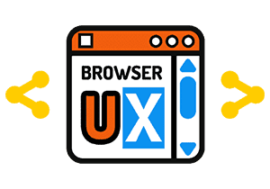
browserux-share-button
Advanced tools
A smart, customizable Web Component for sharing content via Web Share API with graceful fallback.
EN | FR
A modern solution to enable seamless content sharing across all devices and platforms.
BrowserUX Share Button is a lightweight, accessible, and customizable Web Component that simplifies sharing URLs via the native Web Share API, when available, or a responsive fallback modal. It supports multiple platforms (Email, X, WhatsApp, etc.), automatically retrieves share metadata, and offers full localization, visual customization, and framework compatibility.

ShareButton.registerPlatform()document.title, <meta>, and Web App Manifest<html lang>bux:share-success, bux:share-abort, bux:copy-success, and moreshare(), setShareData(), openFallback(), closeFallback()no-shadownpm install browserux-share-button
Or via CDN:
<script type="module" src="https://unpkg.com/browserux-share-button/dist/browserux-share-button.esm.js"></script>
import 'browserux-share-button';
<browserux-share-button></browserux-share-button>
With explicit share data and platform control:
<browserux-share-button
  title="My article"
  text="A short description"
  url="https://example.com/article"
  lang="en"
  facebook="false"
  sms="false"
></browserux-share-button>
| Parameter | Type | Description |
|---|---|---|
url | Attribute | URL to share (default: location.href) |
title | Attribute | Share title (default: document.title) |
text | Attribute | Share description (default: <meta description>) |
lang | Attribute | Language code for built-in labels |
manifest-src | Attribute | Custom path to Web App Manifest |
no-shadow | Attribute | Disable Shadow DOM encapsulation |
[platform]="false" | Attribute | Disable a platform: email, x, facebook, whatsapp, sms, linkedin, telegram, reddit |
icon | Slot | Custom icon inside the share button (default: 🔗) |
bux:share-success | Event | Native share completed, e.detail: { title, text, url } |
bux:share-abort | Event | User cancelled the native share dialog |
bux:share-error | Event | Share failed, e.detail: { error } |
bux:fallback-open | Event | Fallback modal opened |
bux:fallback-close | Event | Fallback modal closed |
bux:copy-success | Event | Link copied, e.detail: { url } |
bux:copy-error | Event | Clipboard write failed, e.detail: { error } |
share() | Method | Trigger share programmatically |
setShareData(data) | Method | Update share data at runtime |
openFallback() | Method | Open the fallback modal programmatically |
closeFallback() | Method | Close the fallback modal programmatically |
For detailed documentation, see docs/index.md.
url, title, text, lang, no-shadow, platform disablingbux:* events with payloads and use casesicon slot for custom button iconshare(), setShareData(), openFallback(), closeFallback()getShareIcon, getBestIconUrlMIT © 2026 Effeilo
FAQs
Did you know?

Socket for GitHub automatically highlights issues in each pull request and monitors the health of all your open source dependencies. Discover the contents of your packages and block harmful activity before you install or update your dependencies.
Product
Socket for Jira lets teams turn alerts into Jira tickets with manual creation, automated ticketing rules, and two-way sync.

Company News
Socket won two 2026 Reppy Awards from RepVue, ranking in the top 5% of all sales orgs. AE Alexandra Lister shares what it's like to grow a sales career here.

Security News
NIST will stop enriching most CVEs under a new risk-based model, narrowing the NVD's scope as vulnerability submissions continue to surge.