
Research
wget to Wipeout: Malicious Go Modules Fetch Destructive Payload
Socket's research uncovers three dangerous Go modules that contain obfuscated disk-wiping malware, threatening complete data loss.
By Kush Pandya - May 01, 2025
A plugin for Chai that builds on top of @testing-library/jest-dom to provide its same checkers but for Chai.
The following docs are adjusted from @testing-library/jest-dom's README.
This module is distributed via npm which is bundled with node and
should be installed as one of your project's devDependencies:
npm install --save-dev chai-jsdom
or
for installation with yarn package manager.
yarn add --dev chai-jsdom
Import chai-jsdom and use it with chai's use:
// In your own jest-setup.js (or any other name)
import { use } from 'chai';
import chaiJSDOM from 'chai-jsdom'

use(chaiJSDOM);
chai-jsdom can work with any library or framework that returns
DOM elements from queries. The custom matcher examples below are written using
matchers from @testing-library's suite of libraries (e.g. getByTestId,
queryByTestId, getByText, etc.)
.disabledThis allows you to check whether an element is disabled from the user's
perspective. According to the specification, the following elements can be
disabled:
button, input, select, textarea, optgroup, option, fieldset, and
custom elements.
This custom matcher considers an element as disabled if the element is among the
types of elements that can be disabled (listed above), and the disabled
attribute is present. It will also consider the element as disabled if it's
inside a parent form element that supports being disabled and has the disabled
attribute present.
<button data-testid="button" type="submit" disabled>submit</button>
<fieldset disabled><input type="text" data-testid="input" /></fieldset>
<a href="..." disabled>link</a>
expect(getByTestId('button')).to.be.disabled
expect(getByTestId('input')).to.be.disabled
expect(getByText('link')).not.to.be.disabled
This custom matcher does not take into account the presence or absence of the
aria-disabledattribute. For more on why this is the case, check #144.
.enabledThis allows you to check whether an element is not disabled from the user's perspective.
It works like not.disabled. Use this matcher to avoid double negation in
your tests.
This custom matcher does not take into account the presence or absence of the
aria-disabledattribute. For more on why this is the case, check #144.
.emptyThis allows you to assert whether an element has no visible content for the user. It ignores comments but will fail if the element contains white-space.
It extends Chai's empty when used with an HTML element.
<span data-testid="not-empty"><span data-testid="empty"></span></span>
<span data-testid="with-whitespace"> </span>
<span data-testid="with-comment"><!-- comment --></span>
expect(getByTestId('empty')).to.be.empty
expect(getByTestId('not-empty')).not.to.be.empty
expect(getByTestId('with-whitespace')).not.to.be.empty
.documentThis allows you to assert whether an element is present in the document or not.
<span data-testid="html-element"><span>Html Element</span></span>
<svg data-testid="svg-element"></svg>
expect(
  getByTestId(document.documentElement, 'html-element'),
).to.be.in.document
expect(getByTestId(document.documentElement, 'svg-element')).to.be.in.document
expect(
  queryByTestId(document.documentElement, 'does-not-exist'),
).not.to.be.in.document
Note: This matcher does not find detached elements. The element must be added to the document to be found by toBeInTheDocument. If you desire to search in a detached element please use:
.contain
.invalidThis allows you to check if an element, is currently invalid.
An element is invalid if it has an
aria-invalid attribute
with no value or a value of "true", or if the result of
checkValidity()
is false.
<input data-testid="no-aria-invalid" />
<input data-testid="aria-invalid" aria-invalid />
<input data-testid="aria-invalid-value" aria-invalid="true" />
<input data-testid="aria-invalid-false" aria-invalid="false" />

<form data-testid="valid-form">
  <input />
</form>

<form data-testid="invalid-form">
  <input required />
</form>
expect(getByTestId('no-aria-invalid')).not.to.be.invalid
expect(getByTestId('aria-invalid')).to.be.invalid
expect(getByTestId('aria-invalid-value')).to.be.invalid
expect(getByTestId('aria-invalid-false')).not.to.be.invalid

expect(getByTestId('valid-form')).not.to.be.invalid
expect(getByTestId('invalid-form')).to.be.invalid
.requiredThis allows you to check if a form element is currently required.
An element is required if it is having a required or aria-required="true"
attribute.
<input data-testid="required-input" required />
<input data-testid="aria-required-input" aria-required="true" />
<input data-testid="conflicted-input" required aria-required="false" />
<input data-testid="aria-not-required-input" aria-required="false" />
<input data-testid="optional-input" />
<input data-testid="unsupported-type" type="image" required />
<select data-testid="select" required></select>
<textarea data-testid="textarea" required></textarea>
<div data-testid="supported-role" role="tree" required></div>
<div data-testid="supported-role-aria" role="tree" aria-required="true"></div>
expect(getByTestId('required-input')).to.be.required
expect(getByTestId('aria-required-input')).to.be.required
expect(getByTestId('conflicted-input')).to.be.required
expect(getByTestId('aria-not-required-input')).not.to.be.required
expect(getByTestId('optional-input')).not.to.be.required
expect(getByTestId('unsupported-type')).not.to.be.required
expect(getByTestId('select')).to.be.required
expect(getByTestId('textarea')).to.be.required
expect(getByTestId('supported-role')).not.to.be.required
expect(getByTestId('supported-role-aria')).to.be.required
.validThis allows you to check if the value of an element, is currently valid.
An element is valid if it has no
aria-invalid attributes
or an attribute value of "false". The result of
checkValidity()
must also be true if it's a form element.
<input data-testid="no-aria-invalid" />
<input data-testid="aria-invalid" aria-invalid />
<input data-testid="aria-invalid-value" aria-invalid="true" />
<input data-testid="aria-invalid-false" aria-invalid="false" />

<form data-testid="valid-form">
  <input />
</form>

<form data-testid="invalid-form">
  <input required />
</form>
expect(getByTestId('no-aria-invalid')).to.be.valid
expect(getByTestId('aria-invalid')).not.to.be.valid
expect(getByTestId('aria-invalid-value')).not.to.be.valid
expect(getByTestId('aria-invalid-false')).to.be.valid

expect(getByTestId('valid-form')).to.be.valid
expect(getByTestId('invalid-form')).not.to.be.valid
.visibleThis allows you to check if an element is currently visible to the user.
An element is visible if all the following conditions are met:
display set to nonevisibility set to either hidden or
collapseopacity set to 0hidden
attribute<details /> it has the open attribute<div data-testid="zero-opacity" style="opacity: 0">Zero Opacity Example</div>
<div data-testid="visibility-hidden" style="visibility: hidden">
Visibility Hidden Example
</div>
<div data-testid="display-none" style="display: none">Display None Example</div>
<div style="opacity: 0">
<span data-testid="hidden-parent">Hidden Parent Example</span>
</div>
<div data-testid="visible">Visible Example</div>
<div data-testid="hidden-attribute" hidden>Hidden Attribute Example</div>
expect(getByText('Zero Opacity Example')).not.to.be.visible
expect(getByText('Visibility Hidden Example')).not.to.be.visible
expect(getByText('Display None Example')).not.to.be.visible
expect(getByText('Hidden Parent Example')).not.to.be.visible
expect(getByText('Visible Example')).to.be.visible
expect(getByText('Hidden Attribute Example')).not.to.be.visible
.containThis allows you to assert whether an element contains another element as a descendant or not.
This extends Chai's contain. You can use contains, contain and
contains as aliases.
<span data-testid="ancestor"><span data-testid="descendant"></span></span>
const ancestor = getByTestId('ancestor')
const descendant = getByTestId('descendant')
const nonExistantElement = getByTestId('does-not-exist')

expect(ancestor).to.contain(descendant)
expect(descendant).not.to.contain(ancestor)
expect(ancestor).not.to.contain(nonExistantElement)
.htmlAssert whether a string representing a HTML element is contained in another element. The string should contain valid html, and not any incomplete html.
<span data-testid="parent"><span data-testid="child"></span></span>
// These are valid uses
expect(getByTestId('parent')).to.contain.html('<span data-testid="child"></span>')
expect(getByTestId('parent')).to.contain.html('<span data-testid="child" />')
expect(getByTestId('parent')).not.to.contain.html('<br />')

// These won't work
expect(getByTestId('parent')).to.contain.html('data-testid="child"')
expect(getByTestId('parent')).to.contain.html('data-testid')
expect(getByTestId('parent')).to.contain.html('</span>')
Chances are you probably do not need to use this matcher. We encourage testing from the perspective of how the user perceives the app in a browser. That's why testing against a specific DOM structure is not advised.
It could be useful in situations where the code being tested renders html that was obtained from an external source, and you want to validate that that html code was used as intended.
It should not be used to check DOM structure that you control. Please use
.containinstead.
.descriptiontoHaveAccessibleDescription(expectedAccessibleDescription?: string | RegExp)
This allows you to assert that an element has the expected accessible description.
Every assertion done after .description is done on top of the accessible
description of the element tested.
<a
  data-testid="link"
  href="/"
  aria-label="Home page"
  title="A link to start over"
  >Start</a
>
<a data-testid="extra-link" href="/about" aria-label="About page">About</a>
<img src="avatar.jpg" data-testid="avatar" alt="User profile pic" />
<img
  src="logo.jpg"
  data-testid="logo"
  alt="Company logo"
  aria-describedby="t1"
/>
<span id="t1" role="presentation">The logo of Our Company</span>
expect(getByTestId('link')).to.have.a.description
expect(getByTestId('link')).to.have.a.description.that.equals('A link to start over')
expect(getByTestId('link')).to.have.a.description.that.does.not.equal('Home page')
expect(getByTestId('extra-link')).not.to.have.a.description
expect(getByTestId('avatar')).not.to.have.a.description
expect(getByTestId('logo')).to.have.a.description.that.does.not.equal('Company logo')
expect(getByTestId('logo')).to.have.a.description.that.equals(
  'The logo of Our Company',
)
expect(getByTestId('logo')).to.have.a.description.that.contains(
  'Our Company',
)
.accessibleNametoHaveAccessibleName(expectedAccessibleName?: string | RegExp)
This allows you to assert that an element has the expected accessible name. It is useful, for instance, to assert that form elements and buttons are properly labelled.
Every assertion done after .description is done on top of the accessible
name of the element tested.
<img data-testid="img-alt" src="" alt="Test alt" />
<img data-testid="img-empty-alt" src="" alt="" />
<svg data-testid="svg-title"><title>Test title</title></svg>
<button data-testid="button-img-alt"><img src="" alt="Test" /></button>
<p><img data-testid="img-paragraph" src="" alt="" /> Test content</p>
<button data-testid="svg-button"><svg><title>Test</title></svg></p>
<div><svg data-testid="svg-without-title"></svg></div>
<input data-testid="input-title" title="test" />
expect(getByTestId('img-alt')).toHaveAccessibleName('Test alt')
expect(getByTestId('img-empty-alt')).not.toHaveAccessibleName()
expect(getByTestId('svg-title')).toHaveAccessibleName('Test title')
expect(getByTestId('button-img-alt')).toHaveAccessibleName()
expect(getByTestId('img-paragraph')).not.toHaveAccessibleName()
expect(getByTestId('svg-button')).toHaveAccessibleName()
expect(getByTestId('svg-without-title')).not.toHaveAccessibleName()
expect(getByTestId('input-title')).toHaveAccessibleName()
toHaveAttributetoHaveAttribute(attr: string, value?: any)
This allows you to check whether the given element has an attribute or not. You can also optionally check that the attribute has a specific expected value or partial match using expect.stringContaining/expect.stringMatching
<button data-testid="ok-button" type="submit" disabled>ok</button>
const button = getByTestId('ok-button')

expect(button).toHaveAttribute('disabled')
expect(button).toHaveAttribute('type', 'submit')
expect(button).not.toHaveAttribute('type', 'button')

expect(button).toHaveAttribute('type', expect.stringContaining('sub'))
expect(button).toHaveAttribute('type', expect.not.stringContaining('but'))
.classtoHaveClass(...classNames: string[], options?: {exact: boolean})
This allows you to check whether the given element has certain classes within
its class attribute.
Every assertion done after .class is done on the class of the element being
tested. include and members get extended to support a string with multiple
classes.
<button data-testid="delete-button" class="btn extra btn-danger">
  Delete item
</button>
<button data-testid="no-classes">No Classes</button>
const deleteButton = getByTestId('delete-button')
const noClasses = getByTestId('no-classes')

expect(deleteButton).to.have.class.that.contains('extra')
expect(deleteButton).to.have.class.that.contains('btn-danger btn')
expect(deleteButton).to.have.class.that.contains.members(['btn-danger', 'btn'])
expect(deleteButton).to.have.class.that.does.not.contain('btn-link')

expect(deleteButton).to.have.class.that.equals('btn-danger extra btn') // to check if the element has EXACTLY a set of classes
expect(deleteButton).to.have.class.that.does.not.equal('btn-danger extra') // if it has more than expected it is going to fail

expect(noClasses).not.to.have.class
.focusedThis allows you to assert whether an element has focus or not.
You can use .focus as an alias.
<div><input type="text" data-testid="element-to-focus" /></div>
const input = getByTestId('element-to-focus')

input.focus()
expect(input).to.have.focus()

input.blur()
expect(input).not.to.be.focused()
.formValuesThis allows you to check if a form or fieldset contains form controls for each given name, and having the specified value.
It is important to stress that this matcher can only be invoked on a form or a fieldset element.
This allows it to take advantage of the .elements property in
formandfieldsetto reliably fetch all form controls within them.This also avoids the possibility that users provide a container that contains more than one
form, thereby intermixing form controls that are not related, and could even conflict with one another.
This matcher abstracts away the particularities with which a form control value
is obtained depending on the type of form control. For instance, <input>
elements have a value attribute, but <select> elements do not. Here's a list
of all cases covered:
<input type="number"> elements return the value as a number, instead of
a string.<input type="checkbox"> elements:
name attribute, it is treated as a
boolean, returning true if the checkbox is checked, false if
unchecked.name attribute, they are
all treated collectively as a single form control, which returns the value
as an array containing all the values of the selected checkboxes in the
collection.<input type="radio"> elements are all grouped by the name attribute, and
such a group treated as a single form control. This form control returns the
value as a string corresponding to the value attribute of the selected
radio button within the group.<input type="text"> elements return the value as a string. This also
applies to <input> elements having any other possible type attribute
that's not explicitly covered in different rules above (e.g. search,
email, date, password, hidden, etc.)<select> elements without the multiple attribute return the value as a
string corresponding to the value attribute of the selected option, or
undefined if there's no selected option.<select multiple> elements return the value as an array containing all
the values of the selected options.<textarea> elements return their value as a string. The value
corresponds to their node content.The above rules make it easy, for instance, to switch from using a single select control to using a group of radio buttons. Or to switch from a multi select control, to using a group of checkboxes. The resulting set of form values used by this matcher to compare against would be the same.
<form data-testid="login-form">
  <input type="text" name="username" value="jane.doe" />
  <input type="password" name="password" value="12345678" />
  <input type="checkbox" name="rememberMe" checked />
  <button type="submit">Sign in</button>
</form>
expect(getByTestId('login-form')).to.have.formValues({
  username: 'jane.doe',
  rememberMe: true,
})
.styleThis allows you to check if a certain element has some specific css properties with specific values applied. It matches only if the element has all the expected properties applied, not just some of them.
<button
  data-testid="delete-button"
  style="display: none; background-color: red"
>
  Delete item
</button>
const button = getByTestId('delete-button')

expect(button).to.have.style('display: none')
expect(button).to.have.style({display: 'none'})
expect(button).to.have.style(`
  background-color: red;
  display: none;
`)
expect(button).to.have.style({
  backgroundColor: 'red',
  display: 'none',
})
expect(button).not.to.have.style(`
  background-color: blue;
  display: none;
`)
expect(button).not.to.have.style({
  backgroundColor: 'blue',
  display: 'none',
})
This also works with rules that are applied to the element via a class name for which some rules are defined in a stylesheet currently active in the document. The usual rules of css precedence apply.
.textThis allows you to check whether the given node has a text content or not. This supports elements, but also text nodes and fragments.
Every assertion done after this will be done on the textContent of the element being tested.
<span data-testid="text-content">Text Content</span>
const element = getByTestId('text-content')

expect(element).to.have.text.that.contains('Content')
expect(element).to.have.text.that.matches(/^Text Content$/) // to match the whole content
expect(element).to.have.text.that.matches(/content$/i) // to use case-insensitive match
expect(element).to.have.text.that.does.not.contain('content')
.valueThis allows you to check whether the given form element has the specified value.
It accepts <input>, <select> and <textarea> elements with the exception of
<input type="checkbox"> and <input type="radio">, which can be meaningfully
matched only using .checked or
.formValues.
Every assertion done after this will be done on the value of the element being tested.
For all other form elements, the value is matched using the same algorithm as in
.formValues does.
<input type="text" value="text" data-testid="input-text" />
<input type="number" value="5" data-testid="input-number" />
<input type="text" data-testid="input-empty" />
<select multiple data-testid="select-number">
  <option value="first">First Value</option>
  <option value="second" selected>Second Value</option>
  <option value="third" selected>Third Value</option>
</select>
const textInput = getByTestId('input-text')
const numberInput = getByTestId('input-number')
const emptyInput = getByTestId('input-empty')
const selectInput = getByTestId('select-number')

expect(textInput).to.have.value.that.equals('text')
expect(numberInput).to.have.value.that.equals(5)
expect(emptyInput).not.to.have.value
expect(selectInput).to.have.value.that.has.members(['second', 'third'])
.displayThis allows you to check whether the given form element has the specified
displayed value (the one the end user will see) when used before .value.
It accepts <input>, <select> and <textarea> elements with the exception
of <input type="checkbox"> and <input type="radio">, which can be
meaningfully matched only using .checked or
.formValues.
<label for="input-example">First name</label>
<input type="text" id="input-example" value="Luca" />

<label for="textarea-example">Description</label>
<textarea id="textarea-example">An example description here.</textarea>

<label for="single-select-example">Fruit</label>
<select id="single-select-example">
  <option value="">Select a fruit...</option>
  <option value="banana">Banana</option>
  <option value="ananas">Ananas</option>
  <option value="avocado">Avocado</option>
</select>

<label for="multiple-select-example">Fruits</label>
<select id="multiple-select-example" multiple>
  <option value="">Select a fruit...</option>
  <option value="banana" selected>Banana</option>
  <option value="ananas">Ananas</option>
  <option value="avocado" selected>Avocado</option>
</select>
const input = screen.getByLabelText('First name')
const textarea = screen.getByLabelText('Description')
const selectSingle = screen.getByLabelText('Fruit')
const selectMultiple = screen.getByLabelText('Fruits')

expect(input).to.have.display.value.that.equals('Luca')
expect(input).to.have.display.value.that.matches(/Luc/)
expect(textarea).to.have.display.value.that.equals('An example description here.')
expect(textarea).to.have.display.value.that.matches(/example/)
expect(selectSingle).to.have.display.value.that.equals('Select a fruit...')
expect(selectSingle).to.have.display.value.that.matches(/Select/)
expect(selectMultiple).to.have.display.value.that.matches(/Avocado/)
    .and.contains('Banana')
.checkedThis allows you to check whether the given element is checked. It accepts an
input of type checkbox or radio and elements with a role of checkbox,
radio or switch with a valid aria-checked attribute of "true" or
"false".
<input type="checkbox" checked data-testid="input-checkbox-checked" />
<input type="checkbox" data-testid="input-checkbox-unchecked" />
<div role="checkbox" aria-checked="true" data-testid="aria-checkbox-checked" />
<div
  role="checkbox"
  aria-checked="false"
  data-testid="aria-checkbox-unchecked"
/>

<input type="radio" checked value="foo" data-testid="input-radio-checked" />
<input type="radio" value="foo" data-testid="input-radio-unchecked" />
<div role="radio" aria-checked="true" data-testid="aria-radio-checked" />
<div role="radio" aria-checked="false" data-testid="aria-radio-unchecked" />
<div role="switch" aria-checked="true" data-testid="aria-switch-checked" />
<div role="switch" aria-checked="false" data-testid="aria-switch-unchecked" />
const inputCheckboxChecked = getByTestId('input-checkbox-checked')
const inputCheckboxUnchecked = getByTestId('input-checkbox-unchecked')
const ariaCheckboxChecked = getByTestId('aria-checkbox-checked')
const ariaCheckboxUnchecked = getByTestId('aria-checkbox-unchecked')
expect(inputCheckboxChecked).to.be.checked
expect(inputCheckboxUnchecked).not.to.be.checked
expect(ariaCheckboxChecked).to.be.checked
expect(ariaCheckboxUnchecked).not.to.be.checked

const inputRadioChecked = getByTestId('input-radio-checked')
const inputRadioUnchecked = getByTestId('input-radio-unchecked')
const ariaRadioChecked = getByTestId('aria-radio-checked')
const ariaRadioUnchecked = getByTestId('aria-radio-unchecked')
expect(inputRadioChecked).to.be.checked
expect(inputRadioUnchecked).not.to.be.checked
expect(ariaRadioChecked).to.be.checked
expect(ariaRadioUnchecked).not.to.be.checked

const ariaSwitchChecked = getByTestId('aria-switch-checked')
const ariaSwitchUnchecked = getByTestId('aria-switch-unchecked')
expect(ariaSwitchChecked).to.be.checked
expect(ariaSwitchUnchecked).not.to.be.checked
.partiallyThis allows you to check whether the given element is partially checked when
used before .checked. It accepts an input of type checkbox and elements
with a role of checkbox with a aria-checked="mixed", or input of type
checkbox with indeterminate set to true
<input type="checkbox" aria-checked="mixed" data-testid="aria-checkbox-mixed" />
<input type="checkbox" checked data-testid="input-checkbox-checked" />
<input type="checkbox" data-testid="input-checkbox-unchecked" />
<div role="checkbox" aria-checked="true" data-testid="aria-checkbox-checked" />
<div
  role="checkbox"
  aria-checked="false"
  data-testid="aria-checkbox-unchecked"
/>
<input type="checkbox" data-testid="input-checkbox-indeterminate" />
const ariaCheckboxMixed = getByTestId('aria-checkbox-mixed')
const inputCheckboxChecked = getByTestId('input-checkbox-checked')
const inputCheckboxUnchecked = getByTestId('input-checkbox-unchecked')
const ariaCheckboxChecked = getByTestId('aria-checkbox-checked')
const ariaCheckboxUnchecked = getByTestId('aria-checkbox-unchecked')
const inputCheckboxIndeterminate = getByTestId('input-checkbox-indeterminate')

expect(ariaCheckboxMixed).to.be.partially.checked
expect(inputCheckboxChecked).not.to.be.partially.checked
expect(inputCheckboxUnchecked).not.to.be.partially.checked
expect(ariaCheckboxChecked).not.to.be.partially.checked
expect(ariaCheckboxUnchecked).not.to.be.partially.checked

inputCheckboxIndeterminate.indeterminate = true
expect(inputCheckboxIndeterminate).to.be.partially.checked
.errorThis allows you to check whether the given element has an ARIA error message or not.
Every assertion done after this will be done on the error message of the element being tested.
Use the aria-errormessage attribute to reference another element that contains
custom error message text. Multiple ids is NOT allowed. Authors MUST use
aria-invalid in conjunction with aria-errormessage. Learn more from
aria-errormessage spec.
Whitespace is normalized.
<label for="startTime"> Please enter a start time for the meeting: </label>
<input
  id="startTime"
  type="text"
  aria-errormessage="msgID"
  aria-invalid="true"
  value="11:30 PM"
/>
<span id="msgID" aria-live="assertive" style="visibility:visible">
  Invalid time: the time must be between 9:00 AM and 5:00 PM
</span>
const timeInput = getByLabel('startTime')

expect(timeInput).to.have.error(
  'Invalid time: the time must be between 9:00 AM and 5:00 PM',
)
expect(timeInput).to.have.error.that.matches(/invalid time/i) // to partially match
expect(timeInput).to.have.error.that.contains('Invalid time') // to partially match
expect(timeInput).to.have.error.that.does.not.contain('Pikachu!')
FAQs
jest-dom style assertions for Chai
The npm package chai-jsdom receives a total of 2 weekly downloads. As such, chai-jsdom popularity was classified as not popular.
We found that chai-jsdom demonstrated a not healthy version release cadence and project activity because the last version was released a year ago. It has 1 open source maintainer collaborating on the project.
Did you know?

Socket for GitHub automatically highlights issues in each pull request and monitors the health of all your open source dependencies. Discover the contents of your packages and block harmful activity before you install or update your dependencies.
Research
Socket's research uncovers three dangerous Go modules that contain obfuscated disk-wiping malware, threatening complete data loss.
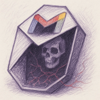
Research
Socket uncovers malicious packages on PyPI using Gmail's SMTP protocol for command and control (C2) to exfiltrate data and execute commands.

Product
We redesigned Socket's first logged-in page to display rich and insightful visualizations about your repositories protected against supply chain threats.