An opinionated clock-style vanilla-js timepicker.
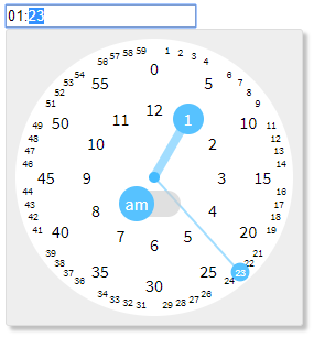
Demo
Features
- Keyboard and numpad friendly
- Autocomplete - e.g.
"1"->"01:00", "12"->"12:00", "1234"->"12:34"
- Support up/down arrow key to increment/decrement
- Mouse and touch friendly
- 3 clicks are sufficient to pick a time - am/pm, hour, minute
- Click targets often used are large enough
- No need to scroll
- Declarative usage
- Vanilla JS - no need jQuery or any other frameworks
- Lightweight (CSS + JS ~ 7kB gzipped)
Installation
via npm (with a module bundler)
$ npm install clocklet
import "clocklet/css/clocklet.min.css";
import clocklet from "clocklet";
via CDN
<link rel="stylesheet" href="https://cdn.jsdelivr.net/npm/clocklet@0.3.0/css/clocklet.min.css">
<script src="https://cdn.jsdelivr.net/npm/clocklet@0.3.0"></script>
<script></script>
Download directly
clocklet.min.css
clocklet.min.js
Usage
Place <input> elements having data-clocklet attribute (either before or after loading the clocklet script).
When these elements get focused, the timepicker popups.
<input data-clocklet>
CodePen
Options
Default options
Default options can be set as properties of clocklet.defaultOptions object.
Option names must be described in camelCase.
clocklet.defaultOptions.zIndex = 9999;
clocklet.defaultOptions.format = "hh:mm a";
Element-specific options
Element-specific options can be specified as semicolon-separated data-clocklet attribute value.
Option names must be described in kebab-case.
<input data-clocklet="class-name: my-clocklet-style; placement: top;">
Available options
| class-name | string | "" | Class name to set to the root element of the popup. |
| format | string | "HH:mm" | Time format (template) of the input element.
Some tokens are replaced with the selected time value.
See the format tokens section below. |
| placement | "top" | "bottom" | "bottom" | Popup placement. |
| alignment | "left" | "center" | "right" | "left" | Popup alignment. |
| append-to | "body" | "parent" | "body" | The parent element into which the popup element will be inserted. |
| z-index | number | string | "" | Popup z-order.
If this value is an empty string, (1 + z-index of the input element) is used. |
Format tokens
| H | "0" .. "23" | Hour in 0-based 24-hour notation with no padding. |
| HH | "00" .. "23" | Hour in 0-based 24-hour notation with zero padding. |
| _H | " 0" .. "23" | Hour in 0-based 24-hour notation with space padding. |
| h | "1" .. "12" | Hour in 1-based 12-hour notation with no padding. |
| hh | "01" .. "12" | Hour in 1-based 12-hour notation with zero padding. |
| _h | " 1" .. "12" | Hour in 1-based 12-hour notation with space padding. |
| k | "1" .. "24" | Hour in 1-based 24-hour notation with no padding. |
| kk | "01" .. "24" | Hour in 1-based 24-hour notation with zero padding. |
| _k | " 1" .. "24" | Hour in 1-based 24-hour notation with space padding. |
| m | "0" .. "59" | Minute with no padding. |
| mm | "00" .. "59" | Minute with zero padding. |
| _m | " 0" .. "59" | Minute with space padding. |
| a | "am" | "pm" | Post or ante meridiem abbreviation in lowercase without periods. |
| aa | "a.m." | "p.m." | Post or ante meridiem abbreviation in lowercase with periods. |
| A | "AM" | "PM" | Post or ante meridiem abbreviation in uppercase without periods. |
| AA | "A.M." | "P.M." | Post or ante meridiem abbreviation in uppercase with periods. |
Events
Following events are raised on the input element by this library.
| clocklet.opening | true | { options: {...} } | Raised before showing the clocklet popup. |
| clocklet.opened | false | { options: {...} } | Raised after showing the clocklet popup. |
| clocklet.closing | true | {} | Raised before hiding the clocklet popup. |
| clocklet.closed | false | {} | Raised after hiding the clocklet popup. |
| input | false | undefined | Raised after changing the input value. |
For example:
<input id="my-clocklet" data-clocklet>
<script>
  document
    .getElementById("my-clocklet")
    .addEventListener("clocklet.opening", function (event) {
      console.log(event.details.options);
      if (DO_NOT_NEED_TIMEPICKER) {
        event.preventDefault();
      }
    });
</script>
API
clocklet.defaultOptions
See default options section.
clocklet.open(inputElement[, options])
Show the timepicker for the specified inputElement with the options (optional).
clocklet.close()
Hide the timepicker.
clocklet.inline(containerElement[, { input, format }])
Place the timepicker into the containerElement.
The optional parameter is the binding setting for the input element.
License
WTFPL