Columns3000
A simple flex-based column/grid component for React.
Use it
yarn add columns3000
import {Columns, Column} from 'columns3000';
<Columns
columns={12}
justify="flex-start"
// Gutter With units! use px, rem, vw, etc, even css variables or calc()!
gutter="16px"
breakpoint="720px"
>
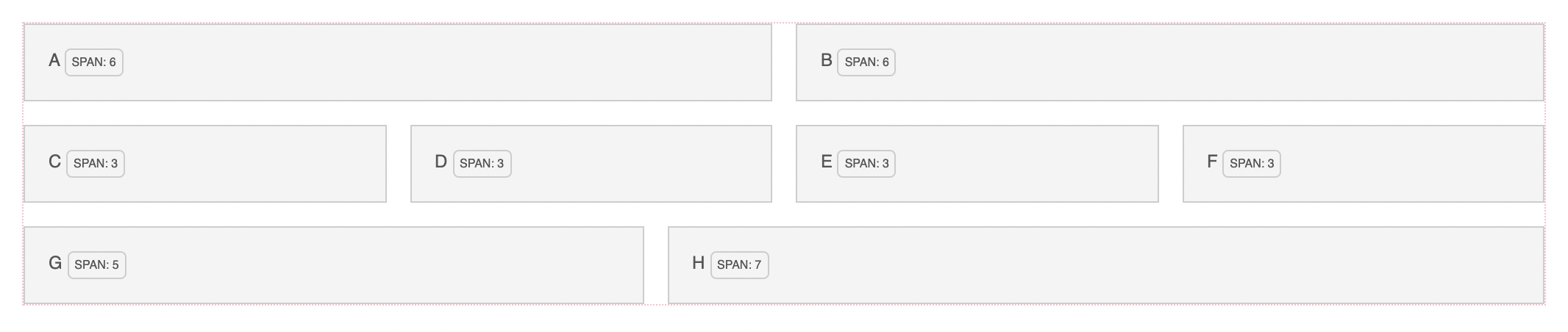
<Column span={6}>This is column spans 6!</Column>
<Column span={6}>This is column spans 6 too!</Column>
</Columns>;
Responsive gutters, span or columns?
I suggest using useMedia from react-use like below:
import {Columns, Column} from 'columns3000';
import {useMedia} from 'react-use';
const isNarrow = useMedia('(max-width: 1024px)');
const span = isNarrow ? 2 : 4;
const gutter = isNarrow ? '16px' : 'var(--gutterLarge)';
<Columns
columns={12}
justify="flex-start"
// Gutter With units! use px, rem, vw, etc, even css variables or calc()!
gutter={gutter}
breakpoint="720px"
>
<Column span={span}>Spans 4 on width > 1024 and 2 below!</Column>
<Column span={span}>Same!</Column>
<Column span={span}>Same!</Column>
<Column span={span}>Same!</Column>
</Columns>;
Columns props
| Property | Type | Description | Default value |
|---|
| columns | number | total number of columns of the grid system | 12 |
| justify | string | css property justify-content, alignment of inner columns | flex-start |
| gutter | string | the horizontal/vertical spacing between columns | 16px |
| breakpoint | string | the viewport width where single/multi-column layout is toggled | 720px |
Column props
| Property | Type | Description | Default value |
|---|
| span | number | amount of columns the columns spans horizontally | required prop |
| grow | boolean | flex-grows the column | false |
Why
If you're like me who:
- Works with React most the time
- Usually going for css-in-js, particularly
emotion. (Note: this uses
emotion!) - Finds themselves considering to reach out for a no-frills super simple
column/grid layout wrappers
- Likes it simple and cute
Look no further! I tried to basically make a component to make myself happy for
most of the use cases I do/would encounter. This does not use any other
classNames or some imported css. I think it's "clean" in it just uses emotion
generated classnames, and takes advantage of css variables to make it do its
thing.
What
A Columns parent and Column wrapper components. Togehter they do these
things:
- Define a grid layout based on a number of columns and gutter size
- Each column (child) within the grid layout would
span a specified number of
columns - When a breakpoint is reached, toggle between single-column ("mobile") or
multi-column configurations
That's it!
Enjoy 🌸


