Product
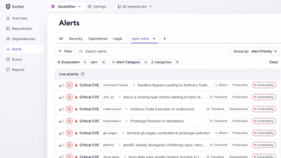
Introducing Custom Tabs for Org Alerts
Create and share saved alert views with custom tabs on the org alerts page, making it easier for teams to return to consistent, named filter sets.
A collection of useful CSS custom functions
A comprehensive collection of CSS custom functions that leverage the new native CSS @function rule.
No build step required! Feel free to copy-paste what you need. No credit needed.
[!CAUTION] Work in progress.
Currently only supported in Chrome 141+. The @function rule is going through the W3C standardization process and will be available in other browsers soon.
npm install css-extras
@import 'css-extras';
Or link directly in HTML:
<link rel="stylesheet" href="node_modules/css-extras/index.css">
Then use any of the functions in your CSS:
.element {
	/* Math functions */
	padding: --negate(var(--spacing));
	margin: --abs(-20px);

	/* Color functions */
	background: --opacity(blue, 50%);
	border-color: --tint(var(--primary-color), 20%);

	/* Typography */
	font-size: --fluid-type(16px, 24px);

	/* Layout */
	border-radius: --conditional-radius(1rem);

	/* And many more! */
}
Demo (requires Chrome 141+)
This package includes ~50 CSS custom functions organized into these categories:
.card {
	/* Conditional border radius */
	border-radius: --conditional-radius(1rem);

	/* Smooth shadow */
	box-shadow: --smooth-shadow(rgb(0 0 0 / 0.2), 16px, 3);

	/* Fluid spacing */
	padding: --spacing(4);
	margin-block: --spacing(3);

	/* Theme-aware background */
	background: --theme-color(var(--card-bg), 95%, 10%);

	/* Fluid typography */
	font-size: --fluid-type(14px, 16px, 320px, 1280px);
}

.card-title {
	font-size: --modular-scale(1rem, 1.25, 2);
	color: --shade(var(--primary-color), 20%);
}

.card:hover {
	transform: translateY(--negate(4px));
	box-shadow: --glow(var(--primary-color), 20px, 0.3);
}
.layout {
	display: grid;
	grid-template-columns: --sidebar-layout(280px, 50ch);
	gap: --spacing(4);
	padding: --container-padding(2rem, 1400px);
}

.content-grid {
	display: grid;
	grid-template-columns: --auto-grid(300px, 3);
	gap: --spacing(3);
}

.responsive-element {
	padding: --responsive-value(1rem, 2.5rem, 320px, 1200px);
	font-size: --responsive-value(14px, 18px, 320px, 1200px);
}
IMPORTANT: Theme functions require color-scheme: light dark to work:
:root {
	color-scheme: light dark; /* Required! */
}

.button {
	/* Theme-aware values (works with ANY value type!) */
	color: --light-dark(black, white);
	background: --theme-color(var(--brand-color), 90%, 20%);
	border-color: --light-dark(#d1d5db, #374151);

	/* Works with non-color values too */
	padding: --light-dark(0.5rem 1rem, 0.75rem 1.5rem);
	font-weight: --light-dark(500, 400);
	background-image: --light-dark(url(icon-light.svg), url(icon-dark.svg));
}
Check caniuse.com.
SPDX-License-Identifier: (MIT OR CC0-1.0)
FAQs
Useful CSS custom functions using the new @function rule
The npm package css-extras receives a total of 3 weekly downloads. As such, css-extras popularity was classified as not popular.
We found that css-extras demonstrated a healthy version release cadence and project activity because the last version was released less than a year ago. It has 1 open source maintainer collaborating on the project.
Did you know?

Socket for GitHub automatically highlights issues in each pull request and monitors the health of all your open source dependencies. Discover the contents of your packages and block harmful activity before you install or update your dependencies.

Product
Create and share saved alert views with custom tabs on the org alerts page, making it easier for teams to return to consistent, named filter sets.

Product
Socket’s Rust and Cargo support is now generally available, providing dependency analysis and supply chain visibility for Rust projects.

Security News
Chrome 144 introduces the Temporal API, a modern approach to date and time handling designed to fix long-standing issues with JavaScript’s Date object.