
css-screensize
Capture CSS <number> vars for screen --width and --height. 100% CSS, Zero JS
Useful for any 100% CSS game or environment without JS that needs --width and --height vars.
Setup
For small projects, use your favorite NPM CDN and import it either from HTML or CSS:
HTML:
<link rel="stylesheet" type="text/css" href="https://unpkg.com/css-screensize@1/screensize.css">
or CSS:
@import url("https://unpkg.com/css-screensize@1/screensize.css");
For typical projects, install and import:
$ npm install css-screensize
Then include the /node_modules/css-screensize/screensize.css file anywhere in the project.
Usage
Place the following HTML anywhere on the page:
<ol class="css-screensize" aria-hidden="true"><li><li><p><p><p><p><li><li></ol>
If you prefer cleaner/less minified markup, or different elements, as long as the dom shape is equivelant, with css-screensize class on the base, any elements will do.
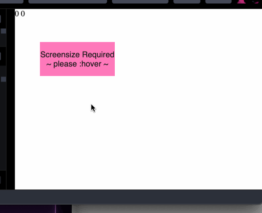
css-screensize will prompt the user to :hover on the page until the size is captured.
Once captured, css-screensize disappears and :root will have --width and --height vars with integer values equivelent to the number of pixels in that dimension.
calc(var(--width) * 1px) is equal to the computed pixel size of 100vw
calc(var(--height) * 1px) is equal to the computed pixel size of 100vh
If the window resizes more than 3px, css-screensize will reappear and prompt for :hover again automatically.
You can (should) customize the appearance of the prompt by adding CSS to your page like so:
.css-screensize {
  --enable: 1;
  --opacity: 0.9;
  --background: hotpink;
  --prompt: "Screensize Required\A~ please :hover ~";
  --confirm: "...Capturing Screensize";
}
The values shown here are the defaults. You can disable it by setting --enable: 0; or set --opacity: 0; so the users can't see that it's happening. (though they will be unable to interact with the screen for about 100ms)
--prompt and --confirm are setting the content property of a pseudo element so they could be url-wrapped images (like a loading spinner gif) if prefered over strings.
Additionally, the default behavior is fixed position and covering the whole screen with a transform: scale(2) too. If you wish to make the user hover in a specific area within your UI, place the markup in your containing element, set your container to position: relative; (or similar) and add a contained class to the css-screensize element:
<div class="my-container">
  <ol class="css-screensize contained" aria-hidden="true"><li><li><p><p><p><p><li><li></ol>
</div>
css-screensize will then render position absolute and inset 0px, without the scale(2).
Here is a gif screen recording of the default, contained, css-screensize setting counter() values to the --width and --height of the window:


