
Open-source CSV and XLS/XLSX file importer for React and JavaScript
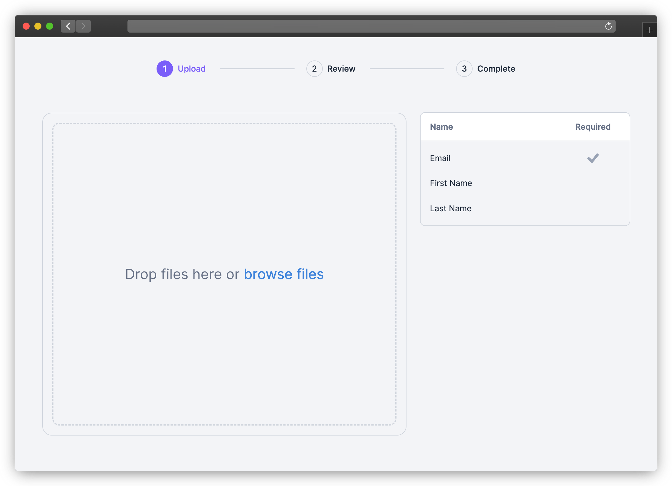
How It Works
- Embed the CSV Importer in your app with the React
or JavaScript SDK
- Define the columns your users can import (via the
template parameter) - Your users import their files in your app
- Retrieve the imported data from the
onComplete event
Get Started
1. Install SDK
Use NPM or Yarn to install the SDK for React
or JavaScript.
NPM
npm install csv-import-react
npm install csv-import-js
Yarn
yarn add csv-import-react
yarn add csv-import-js
2. Add the importer to your application
Using React:
import {useState} from "react";
import {CSVImporter} from "csv-import-react";

function MyComponent() {
  const [isOpen, setIsOpen] = useState(false);

  return (
    <>
      <button onClick={() => setIsOpen(true)}>Open CSV Importer</button>

      <CSVImporter
        modalIsOpen={isOpen}
        modalOnCloseTriggered={() => setIsOpen(false)}
        darkMode={true}
        onComplete={(data) => console.log(data)}
        template={{
          columns: [
            {
              name: "First Name",
              key: "first_name",
              required: true,
              description: "The first name of the user",
              suggested_mappings: ["First", "Name"],
            },
            {
              name: "Age",
              data_type: "number",
            },
          ],
        }}
      />
    </>
  );
}
Using JavaScript:
<head>
  <script src="https://unpkg.com/csv-import-js@latest/index.js"></script>
</head>
<body>
  <button id="uploadButton">Open CSV Importer</button>
  <div id="app"></div>
  <script>
    const importer = CSVImporter.createCSVImporter({
      domElement: document.getElementById("app"),
      modalOnCloseTriggered: () => importer?.closeModal(),
      onComplete: (data) => console.log(data),
      darkMode: true,
      template: {
        columns: [
          {
            name: "First Name",
            key: "first_name",
            required: true,
            description: "The first name of the user",
            suggested_mappings: ["First", "Name"],
          },
          {
            name: "Age",
            data_type: "number",
          },
        ],
      },
    });

    const uploadButton = document.getElementById("uploadButton");
    uploadButton.addEventListener("click", () => {
      importer?.showModal();
    });
  </script>
</body>
SDK Reference
isModal (boolean, default: true)
When set to true (default value), the importer will behave as a modal with its open state controlled by modalIsOpen. When set to false, the importer will be embedded directly in your page.
modalIsOpen (boolean, default: false)
Only used when isModal is true: Controls the importer modal being open or closed.
React SDK Only: For the JavaScript SDK, use .showModal() and .closeModal() to operate the modal.
modalOnCloseTriggered (function)
Only used when isModal is true: A function called when the user clicks the close button or clicks outside of (when used with modalCloseOnOutsideClick) the importer. useState can be used to control the importer modal opening and closing.
const [isOpen, setIsOpen] = useState(false);
<button onClick={() => setIsOpen(true)}>Open CSV Importer</button>
<CSVImporter
  modalIsOpen={isOpen}
  modalOnCloseTriggered={() => setIsOpen(false)}
  ...
/>
modalCloseOnOutsideClick (boolean, default: false)
Only used when isModal is true: Clicking outside the modal will call the modalOnCloseTriggered function.
template (object)
Configure the columns used for the import.
template={{
  columns: [
    {
      name: "First Name",
      key: "first_name",
      required: true,
      description: "The first name of the user",
      suggested_mappings: ["First", "Name"],
    },
    {
      name: "Age",
      data_type: "number",
    },
  ],
}}
onComplete (function)
Callback function that fires when a user completes an import. It returns data, an object that contains the row data, column definitions, and other information about the import.
onComplete={(data) => console.log(data)}
Example data:
{
  "num_rows": 2,
  "num_columns": 3,
  "columns": [
    {
      "key": "age",
      "name": "Age"
    },
    {
      "key": "email",
      "name": "Email"
    },
    {
      "key": "first_name",
      "name": "First Name"
    }
  ],
  "rows": [
    {
      "index": 0,
      "values": {
        "age": 23,
        "email": "maria@example.com",
        "first_name": "Maria"
      }
    },
    {
      "index": 1,
      "values": {
        "age": 32,
        "email": "robert@example.com",
        "first_name": "Robert"
      }
    }
  ]
}
darkMode (boolean, default: false)
Toggle between dark mode (true) and light mode (false).
primaryColor (string)
Specifies the primary color for the importer in hex format. Use customStyles to customize the UI in more detail.
primaryColor="#7A5EF8"
customStyles (object)
Apply custom styles to the importer with an object containing CSS properties and values. Note that custom style properties will override primaryColor and any default styles from darkMode.
Available options:
customStyles={{
  "font-family": "cursive",
  "font-size": "15px",
  "base-spacing": "2rem",
  "border-radius": "8px",
  "color-primary": "salmon",
  "color-primary-hover": "crimson",
  "color-secondary": "indianRed",
  "color-secondary-hover": "crimson",
  "color-tertiary": "indianRed",
  "color-tertiary-hover": "crimson",
  "color-border": "lightCoral",
  "color-text": "brown",
  "color-text-soft": "rgba(165, 42, 42, .5)",
  "color-text-on-primary": "#fff",
  "color-text-on-secondary": "#ffffff",
  "color-background": "bisque",
  "color-background-modal": "blanchedAlmond",
  "color-input-background": "blanchedAlmond",
  "color-input-background-soft": "white",
  "color-background-menu-hover": "bisque",
  "color-importer-link": "indigo",
  "color-progress-bar": "darkGreen"
}}
showDownloadTemplateButton (boolean, default: true)
When set to false, hide the Download Template button on the first screen of the importer.
When set to true, the importer will not display and skip the Header Row Selection step and always choose the first row in the file as the header.
Get In Touch
Let us know your feedback or feature requests! Submit a GitHub
issue here.


