Research
wget to Wipeout: Malicious Go Modules Fetch Destructive Payload
Socket's research uncovers three dangerous Go modules that contain obfuscated disk-wiping malware, threatening complete data loss.
curved-bottom-navigation-bar
Advanced tools
Hight performance animated bottom navigation bar for both Android and IOS

High performance animated bottom navigation bar for both Android and IOS 😎 with react navigation v5 or higher.
yarn add curved-bottom-navigation-bar
# or
npm install curved-bottom-navigation-bar
Also, you need to install react-native-reanimated-v2 & react-native-svg, and follow theirs installation instructions.
import React from 'react';
import { NavigationContainer } from '@react-navigation/native';
import { createBottomTabNavigator } from '@react-navigation/bottom-tabs';
import AnimatedTabBar, {TabsConfigsType} from 'curved-bottom-navigation-bar';
import {SafeAreaProvider} from 'react-native-safe-area-context';
const tabs: TabsConfigsType = {
    Home: {
        icon: ({ progress, focused }) => /* Icon Component */,
        renderTitle: ({ progress, title }) => /* Custom reanimated Component */
    },
    Profile: {
        icon: ({ progress, focused }) => /* Icon Component */,
        renderTitle: ({ progress, title }) => /* Custom reanimated Component */
    },
}

const Tab = createBottomTabNavigator();

export default function App() {
  return (
  <SafeAreaProvider>
    <NavigationContainer>
      <Tab.Navigator
        tabBar={props => (
          <AnimatedTabBar tabs={tabs} {...props} />
        )}
      >
        <Tab.Screen
          name="Home"
          component={HomeScreen}
        />
        <Tab.Screen
          name="Profile"
          component={ProfileScreen}
        />
      </Tab.Navigator>
    </NavigationContainer>
  </SafeAreaProvider>
  )
}
In order to animate the tab icon color, you will need to use the provded prop color that will be provided to the icon.
This example below should explain it better:
import React from 'react';
import Animated from 'react-native-reanimated';


interface AnimatedIconProps {
  progress: Animated.SharedValue<number>; // Reanimated - 0 is not Active, 1 is Active
  focused: boolean;
}

const AnimatedIcon = ({ progress }: AnimatedIconProps) => {
  return (
   /* DO SOME THING */
  );
};

export default AnimatedIcon;
Custom title value for tabbar
This example below should explain it better:
import React from 'react';
import Animated from 'react-native-reanimated';


interface AnimatedTitleProps {
  progress: Animated.SharedValue<number>; // Reanimated - 0 is not Active, 1 is Active
  title:string;
}

const AnimatedTitle = ({ progress, title }: AnimatedTitleProps) => {
  return (
   /* DO SOME THING */
  );
};

export default AnimatedTitle;
| name | required | default | description |
|---|---|---|---|
| duration | NO | 500 | Duration for the tabs animation. |
| barColor | NO | #FFFFFF | background color of bottom bar. |
| tabs | YES | A dictionary for all tabs configurations, check TabConfigsType interface. | |
| dotSize | NO | 60 | Size of dot. |
| dotColor | NO | #FFFFFF | Color of dot. |
| titleShown | NO | false | Whether to show or hide the title for the bottom bar |
| name | required | default | description |
|---|---|---|---|
| icon | YES | Component to be render as tab icon, it will recevie an animated node prop progress. | |
| renderTitle | NO | Component to be render as tab title, it will recevie an animated node prop progress and title. |
MIT
FAQs
Did you know?

Socket for GitHub automatically highlights issues in each pull request and monitors the health of all your open source dependencies. Discover the contents of your packages and block harmful activity before you install or update your dependencies.

Research
Socket's research uncovers three dangerous Go modules that contain obfuscated disk-wiping malware, threatening complete data loss.

Research
Socket uncovers malicious packages on PyPI using Gmail's SMTP protocol for command and control (C2) to exfiltrate data and execute commands.

Product
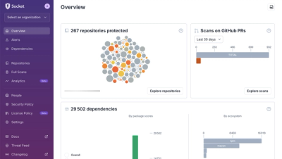
We redesigned Socket's first logged-in page to display rich and insightful visualizations about your repositories protected against supply chain threats.