Research
/Security News
Intercom’s npm Package Compromised in Ongoing Mini Shai-Hulud Worm Attack
Compromised intercom-client@7.0.4 npm package is tied to the ongoing Mini Shai-Hulud worm attack targeting developer and CI/CD secrets.
ember-cli-tooltipster-stylefix
Advanced tools
An Ember CLI add-on that wraps jQuery Tooltipster into an ember component.
An Ember CLI add-on that wraps Tooltipster into an ember component. The component supports most of Tooltipster features.
ember install ember-cli-tooltipster
  {{#tool-tipster title="This is my tooltip message!"}}
    Checkout my tooltip
  {{/tool-tipster}}
  {{#tool-tipster
     title="This is my tooltip message!"
     triggerEvent="click"
     position="right"
   }}
   The tooltip is displayed on the right when you click it!
  {{/tool-tipster}}
You can also easily extend the component to modify it to your needs (e.g a button component)
Just import TooltipsterComponent into your component and extend it
//components/my-button.js
import TooltipsterComponent from 'ember-cli-tooltipster/components/tool-tipster';

export default TooltipsterComponent.extend({
  tagName: 'button',

  classNames: ['my-awesome-button'],

  // define properties
  content: 'My awesome tooltip button',

  position: 'right',

  timer: 2000 // set the timer to automatically close after 2 seconds
});
Then in your template.
{{#my-button}} Tooltip Button {{/my-button}}
That's it, now your button will display a nice tooltip on the right that will automatically close after 2 seconds.
Besides the default theme four other themes are available that you can use for your tooltip.
By default the themes are not included when you install the addon.
To include the desired theme you need to set the corresponding setting in your build file.
//ember-cli-build.js

/* global require, module */
var EmberApp = require('ember-cli/lib/broccoli/ember-app');

module.exports = function(defaults) {
  var app = new EmberApp(defaults, {
    'ember-cli-tooltipster': {
      importTooltipsterPunk: true
    }
  });

  return app.toTree();
};
Available Settings
importTooltipsterLight:  false,
importTooltipsterNoir:   false,
importTooltipsterPunk:   false,
importTooltipsterShadow: false
When using the component, the following options are available:
Type: String
Default: fade
Determines how the tooltip will animate in and out.
Available Options: [fade, grow, swing, slide, fall]
Type: Boolean
Default: true
Adds the "speech bubble arrow" to the tooltip.
Type:hex code / rgb
Default: will inherit the tooltip's background color
Select a specific color for the "speech bubble arrow".
Type: Boolean
Default: true
If autoClose is set to false, the tooltip will never close unless you call the 'hide' method yourself.
Type: String, jQuery object
Default: null
If set, this will override the content of the tooltip.
Type: Boolean
Default: false
If the content of the tooltip is provided as a string, it is displayed as plain text by default. If this content should actually be interpreted as HTML, set this option to true.
Type: Boolean
Default: true
Tooltipster logs notices into the console when you're doing something you ideally shouldn't be doing. Set to false to disable logging.
Type: Number
Default: 300
Delay how long it takes (in milliseconds) for the tooltip to start animating in.
Type: Boolean
Default: false
Enable access of intractive content on hover.
Type: Number
Default: 0 (auto width)
Set a minimum width for the tooltip.
Type: Number
Default null (no max width)
Set a maximum width for the tooltip.
Type: Number
Default: 0
Offsets the tooltip (in pixels) farther left/right from the origin.
Type: Number
Default: 0
Offsets the tooltip (in pixels) farther up/down from the origin.
Type: String
Default: top
Set the position of the tooltip.
Available options: [right, left, top, top-right, top-left, bottom, bottom-right, bottom-left]
Type: Boolean
Default: false
Will reposition the tooltip if the origin moves. As this option may have an impact on performance, we suggest you enable it only if you need to.
Type: Number
Default: 0 (disabled)
How long the tooltip should be allowed to live before closing.
Type: String (CSS class)
Default: tooltipster-default
Set the theme used for your tooltip.
Type: String
Default: hover
Set how tooltips should be activated and closed.
Available options: [hover, click]
Type: Boolean
Default: true
If a tooltip is open while its content is updated, play a subtle animation when the content changes.
Type: String, jQuery object
Default: (?)
If using the iconDesktop or iconTouch options, this sets the content for your icon.
Type: Boolean
Default: true
If you provide a jQuery object to the 'icon' option, this sets if it is a clone of this object that should actually be used.
Type: Boolean
Default: false
Generate an icon next to your content that is responsible for activating the tooltip on non-touch devices.
Type: Boolean
Default: false
Generate an icon next to your content that is responsible for activating the tooltip on touch devices (tablets, phones, etc).
Type: CSS class
Default: tooltipster-icon
If using the iconDesktop or iconTouch options, this sets the class on the icon (used to style the icon).
In order to use the advanced options you need to extend the component and implement the functions. For more information check the examples on Tooltipster Docs
Type: Function
Default: function(origin, content) {}
Create a custom function to be fired only once at instantiation. If the function returns a value, this value will become the content of the tooltip
Type: Function
Default: function(origin, continueTooltip) { continueTooltip(); }
Create a custom function to be fired before the tooltip opens. This function may prevent or hold off the opening.
Type: Function
Default: function(origin, tooltip) {}
Create a custom function to be fired when the tooltip and its contents have been added to the DOM.
Type: Function
Default: function(origin) {}
Create a custom function to be fired once the tooltip has been closed and removed from the DOM.
Type: Function
Default: A function that will close the tooltip if the trigger is 'hover' and autoClose is false.
Called after the tooltip has been repositioned by the position tracker (if enabled).
FAQs
An Ember CLI add-on that wraps jQuery Tooltipster into an ember component.
We found that ember-cli-tooltipster-stylefix demonstrated a not healthy version release cadence and project activity because the last version was released a year ago. It has 1 open source maintainer collaborating on the project.
Did you know?

Socket for GitHub automatically highlights issues in each pull request and monitors the health of all your open source dependencies. Discover the contents of your packages and block harmful activity before you install or update your dependencies.

Research
/Security News
Compromised intercom-client@7.0.4 npm package is tied to the ongoing Mini Shai-Hulud worm attack targeting developer and CI/CD secrets.

Research
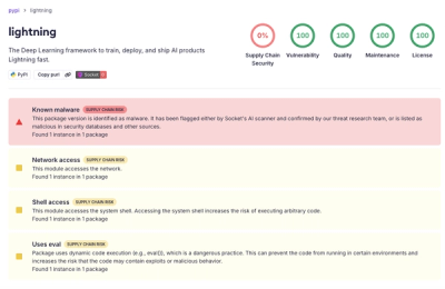
Socket detected a malicious supply chain attack on PyPI package lightning versions 2.6.2 and 2.6.3, which execute credential-stealing malware on import.

Research
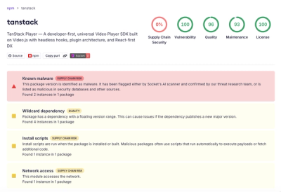
A brand-squatted TanStack npm package used postinstall scripts to steal .env files and exfiltrate developer secrets to an attacker-controlled endpoint.