Security News
Vite+ Joins the Push to Consolidate JavaScript Tooling
Evan You announces Vite+, a commercial, Rust-powered toolchain built on the Vite ecosystem to unify JavaScript development and fund open source.
feedbackfin
Advanced tools
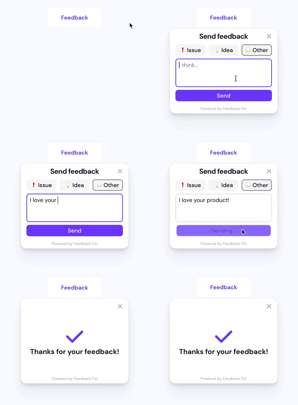
**A tiny widget to collect feedback anywhere on your website. That’s it.**
A tiny widget to collect feedback anywhere on your website. That’s it.

Load the widget on your page:
<script src="https://unpkg.com/feedbackfin@^1" defer></script>
Setup a webhook URL (read instructions in the next section) and configure that in the script. Optionally, add any user info that you want to pass in from the website:
<script>
  window.feedbackfin = { config: {}, ...window.feedbackfin };
  window.feedbackfin.config.url = "https://rowy-hooks.run.app/wh/...";
  window.feedbackfin.config.user = { name: "...", email: "..." };
  window.feedbackfin.config.mode = "form";
</script>
Set a button to open the widget:
<button data-feedbackfin-button>Feedback</button>
This is the URL to send the feedback to. The widget will make a POST request to this URL with the feedback data as a JSON body.
Generate a webhook URL easily using Rowy's low-code platform and manage feedback data on a collaborative spreadsheet-UI. Optionally, you can further automate on incoming feedback with Rowy's built-in code-editor (eg: notify on team slack/discord, email follow up etc).
End-to-end video instructions on the website ↗
Options are set in the window.feedbackfin.config object:
urlThe URL to send the feedback to. The widget will make a POST request to this URL with the data as a JSON body. See Setting up a webhook URL above.
userAn object whose contents will be submitted as part of the form. Note:
feedbackType, message, and timestamp are reserved fields and will be
overwritten by form values.
Typically:
window.feedbackfin.config.user = {
  name: "...",
  email: "...",
};
modeA string with options nps and form designating two different types of
feedback. nps takes input from users in the form of a Net Promoter Score
(NPS), with levels of user satisfaction ranging from Very Satisfied to Very
Unsatisfied and a text field allowing users to input their thoughts. The form
field is the original form created for Feedback Fin; user feedback is divided
into categories of Issues, Ideas, and Other.
disableErrorAlertOptionally, disables displaying
alerts if no
URL is set or the request fails. Default: disableErrorAlert: false
When the script is loaded, it looks for any elements with the
data-feedbackfin-button attribute and opens the widget when any of those
elements are clicked.
<button data-feedbackfin-button>Feedback</button>
The window.feedbackfin object exposes the open, close, and submit
methods, so they can also be called directly.
<button onclick="window.feedbackfin.open(event)">Feedback</button>
The widget uses event.target to compute its position using
Floating UI.
The widget is attached just before the closing </body> tag when it is open and
respects your page’s font-family. Styles are attached just before the opening
<head> tag so your customizations take precedence.
You can customize the widget’s appearance by:
Overriding the CSS variables.
For example, you can change the primary button color using:
:root {
  --feedbackfin-primary-color: #007aff;
  --feedbackfin-primary-color-text: #fff;
}
Overriding
the CSS rules.
Class names are prefixed with feedbackfin__.
Dark mode is activated when either:
the user sets their system theme to dark
i.e. @media (prefers-color-scheme: dark) is true, or
any parent element has a data-theme attribute whose value contains dark.
Example: <body data-theme="dark">
Dark mode colors are set using CSS variables. You can override them with:
@media (prefers-color-scheme: dark) {
  :root {
    ...;
  }
}

[data-theme*="dark"] {
  ...;
}
This widget is built using standard HTML form elements with the appropriate labels.
Focus is trapped within the widget when it is open using focus-trap. Be careful when nesting this widget inside another element with a focus trap.
Contribute to Feedback Fin with issues and pull requests in the GitHub repo.
FAQs
**A tiny widget to collect feedback anywhere on your website. That’s it.**
The npm package feedbackfin receives a total of 62 weekly downloads. As such, feedbackfin popularity was classified as not popular.
We found that feedbackfin demonstrated a not healthy version release cadence and project activity because the last version was released a year ago. It has 3 open source maintainers collaborating on the project.
Did you know?

Socket for GitHub automatically highlights issues in each pull request and monitors the health of all your open source dependencies. Discover the contents of your packages and block harmful activity before you install or update your dependencies.

Security News
Evan You announces Vite+, a commercial, Rust-powered toolchain built on the Vite ecosystem to unify JavaScript development and fund open source.

Security News
Ruby Central’s incident report on the RubyGems.org access dispute sparks backlash from former maintainers and renewed debate over project governance.

Research
/Security News
Socket researchers uncover how threat actors weaponize Discord across the npm, PyPI, and RubyGems ecosystems to exfiltrate sensitive data.