Research
Security News
Lazarus Strikes npm Again with New Wave of Malicious Packages
The Socket Research Team has discovered six new malicious npm packages linked to North Korea’s Lazarus Group, designed to steal credentials and deploy backdoors.
flex-wrap-layout
Advanced tools
Detects flex-wrap via JavaScript (unfortunately not possible in CSS).
detectWrappedElements() and useDetectWrappedElements() are JavaScript functions that detect when elements are wrapped and let you define the CSS that goes with it.
This allows for responsive UIs without hardcoded CSS (width, min-width, media queries...) using the "natural" width of elements instead.
detectWrappedElements():

npm install flex-wrap-layout
import React, { useRef } from 'react';
import ReactDOM from 'react-dom';

import { useDetectWrappedElements, wrapChildrenClassName } from 'flex-wrap-layout';
import 'flex-wrap-layout/src/detectWrappedElements.scss';

const boxStyle = {
  border: '1px solid',
  height: 60,
  margin: 5,
  padding: 5
};

function MyComponent() {
  const ref = useRef(null);
  useDetectWrappedElements(ref);

  return (
    <div ref={ref} className={wrapChildrenClassName}>
      <div style={boxStyle}>Paris</div>
      <div style={{ ...boxStyle, flex: 'auto' }}>Los Angeles</div>
      <div style={boxStyle}>Phnom Penh</div>
    </div>
  );
}

ReactDOM.render(<MyComponent />, document.getElementById('app'));
IE 11 and evergreen browsers
This will cause reflows (layout thrashing): https://gist.github.com/paulirish/5d52fb081b3570c81e3a
FAQs
Experiments with flexbox layout
We found that flex-wrap-layout demonstrated a not healthy version release cadence and project activity because the last version was released a year ago. It has 1 open source maintainer collaborating on the project.
Did you know?

Socket for GitHub automatically highlights issues in each pull request and monitors the health of all your open source dependencies. Discover the contents of your packages and block harmful activity before you install or update your dependencies.

Research
Security News
The Socket Research Team has discovered six new malicious npm packages linked to North Korea’s Lazarus Group, designed to steal credentials and deploy backdoors.

Security News
Socket CEO Feross Aboukhadijeh discusses the open web, open source security, and how Socket tackles software supply chain attacks on The Pair Program podcast.

Security News
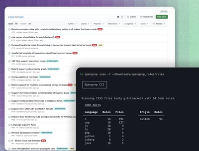
Opengrep continues building momentum with the alpha release of its Playground tool, demonstrating the project's rapid evolution just two months after its initial launch.