Security News
curl Shuts Down Bug Bounty Program After Flood of AI Slop Reports
A surge of AI-generated vulnerability reports has pushed open source maintainers to rethink bug bounties and tighten security disclosure processes.


A unique Flexbox grid system for SCSS and Stylus that allows you to create horizontal or vertical Flexbox grids on-the-fly.
block(1/4) would create blocks that are 1/4 the size of their container with a gutter between them)block(1/4) works the same if it's a top level element or nested)@import FlexGrid at the top of your stylesheet.FlexGrid operates primarily on 2 mixins: box() and block().
Think of box() like the container element in other grid systems - except it can work vertically as well as horizontally.
Think of block() like the columns in other grid systems - except it can work vertically as well as horizontally.
<section>
  <figure>...</figure>
  <figure>...</figure>
  <figure>...</figure>
</section>
section
  box()

figure
  block(1/3)
Now let's make those elements display vertically instead of horizontally.
section
  box(column)

figure
  block(1/3, column)
By default FlexGrid displays elements in a traditional grid. This means elements won't expand to fill their container. To change this behavior, simply use the flex() mixin.
<section>
  <figure>...</figure>
  <figure>...</figure>
</section>
section
  box()

figure
  block(1/3)
  &:first-child
    flex()
flex() can also be configured to create CSS masonry easily.
<section>
  <img src="http://placehold.it/700x150&text=1">
  <img src="http://placehold.it/400x150&text=2">
  <img src="http://placehold.it/200x150&text=3">
  <img src="http://placehold.it/375x150&text=4">
  ...
</section>
section
  box()

img
  block(1/3)
  &:first-child
    flex(masonry)
Finally, you may want to have a gutter for a specific grid. Just pass the $gut parameter your gutter size for both the box() and the block().
section
  box($gut: 60px)

figure
  block(1/3, $gut: 60px)
$gutter - The default gutter size between all grid elements.Note The grid, like Flexbox, takes some getting used to, but once you get the hang of it, it adds a lot of power to Flexbox by letting you size and space things according to a real grid other than just with proportions. Feel free to mix real Flexbox rules into your stylesheets as FlexGrid doesn't impede on Flexbox in any way.
FAQs
A unique Flexbox grid system for SCSS and Stylus.
The npm package flexgrid receives a total of 0 weekly downloads. As such, flexgrid popularity was classified as not popular.
We found that flexgrid demonstrated a not healthy version release cadence and project activity because the last version was released a year ago. It has 2 open source maintainers collaborating on the project.
Did you know?

Socket for GitHub automatically highlights issues in each pull request and monitors the health of all your open source dependencies. Discover the contents of your packages and block harmful activity before you install or update your dependencies.

Security News
A surge of AI-generated vulnerability reports has pushed open source maintainers to rethink bug bounties and tighten security disclosure processes.

Product
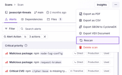
Scan results now load faster and remain consistent over time, with stable URLs and on-demand rescans for fresh security data.

Product
Socket's new Alert Details page is designed to surface more context, with a clearer layout, reachability dependency chains, and structured review.