

This project is still experimental, so feedback from component authors would be greatly appreciated!
Motivation
recompose had a great influence. It is great library that provide excellent way to lift state into functional wrappers, perform the most common React patterns, optimize rendering performance. Also it is possible to store common functions separately and share them between components. And as the result - component's source code become much more easier.
recompose - React utility belt for function components and higher-order components. Think of it like lodash for React.
Forgekit
Provide easier way to develop and manage component's features and inject them into the components.
Docs
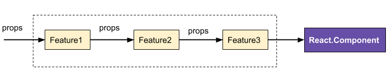
Feature function signature as props middleware:
Detailed information at feature api documentation
Feature = function(props): newProps
Feature.propTypes = {}
Feature.defaultProps = {}
Feature function signature as higher order component:
Detailed information at feature api documentation. This useful when need to work with lifecycle methods.
Feature = {
  props: function(props): newProps,
  hoc: function(Component: React.Component): function(props): React.Component
}

Feature.propTypes = {}
Feature.defaultProps = {}
Forgekit api
Detailed information at forgekit api documentation
In general it looks like props middleware.
But each feature also can implement a higher order component (usually for lifecycle methods).
import forgekit from 'forgekit';

forge(...features)(Component, displayName, bindProps)
ForgedButton propTypes and defaultProps are merged from all features and origin component.
Additional explanation at forgekit-comopnents#little-explanation
ForgedButton.propTypes = {
  ...Button.propTypes,
  ...Feature1.propTypes,
  ...Feature2.propTypes
}

ForgedButton.defaultProps = {
  ...Button.defaultProps,
  ...Feature1.defaultProps,
  ...Feature2.defaultProps
}
So if you use React Sotrybook with storybook-addon-ifno - it will show components props and default props correctly.
Feature examples
For example there is a <Button/> component with custom (high-level) props:
More details about custom (high-level) and native (low-level) props at feature documentation
- alert: PropTypes.bool - If true, component will have an alert styles
- icon: PropTypes.bool - Value of the icon (See Font Icon Component).
- iconPosition: PropTypes.oneOf(['left', 'right']) - Show icon form the left of right from label
- flat - If true, the button will have a flat look.
Let's find relations between custom (high-level) and native (low-level) props
- alert - affects style or className. The same behaviour is for flat property.
const alertFeature = ({
  alert,
  style,
  ...props
}) => {
  const alertStyles = alert ? {
    color: 'red'
  } : {};

  return {
    ...props,
    style: {
      ...(style || {}),
      ...alertStyles
    }
  }
};

alertFeature.propTypes = {
  alert: PropTypes.bool
}
- icon - affects children prop. Depending on iconPosition add
<Icon/> to the children.
const iconFeature = ({
  icon,
  iconPosition,
  children,
  ...props
}) => {

  return {
    ...props,
    children: [
      iconPosition == 'left' ? renderIcon(icon) : null,
      children,
      iconPosition == 'right' ? renderIcon(icon) : null,
    ]
  }
}

iconFeature.propTypes = {
  icon: PropTypes.string,
  iconPosition: PropTypes.oneOf(['left', 'right']),
}
Develop features with lifecycle methods
For example it is not possible to implement clickOutside feature if there is not access to lifecycle methods. To implement this feature:
- On componentDidMount - enable click outside listener
- On componentWillUnmount - remove listener
- get access to component's DOM element
This is possible with forgekit. Just define Feature as object:
class ClickOutside extends React.Component {
  componentDidMount() {}

  componentWillUnmount() {}

  render() {
    return this.props.children;
  }
}

const Feature = {
  hoc: Component => {
    return ({
      onClickOutside,
      ...props
    }) =>
      return (
        <ClickOutside onClickOutside={onClickOutside}>
          <Component {...props} />
        </ClickOutside>
      );
    }
  }
}
Forgekit advantages
...share common features between components
There are features that does not relate to certain component. They could be added into any component.
- clickOutside - Fires when click outside of the component
- highliteFlags - Depends on prop primary / alert / danger / warning - add styles to the component
- loaderOverlay - If loading prop is true - show loader overlay above the component
import forgekit from 'forgekit';

import Button from 'components/button';
import Layout from 'components/layout';

import clickOutside from 'features/click-outside';
import highliteFlags from 'features/highlite-flags';
import loaderOverlay from 'features/loader-overlay';


export const AppButton = forgekit(clickOutside, highliteFlags)(Button);
export const AppLayout = forgekit(clickOutside, loaderOverlay)(Layout);
There is one common feature - clickOutside.
Forged components <AppButton/> and <AppLayout/> accepts onClickOutside prop. But onClickOutsided is not duplicated at <Button/> and <Layout/> propTypes. It is automatically added with clickOutside feature.
- Feature could be shared between components and applications. So there is no code duplication.
...use only needed features
Look at any open source components library - each component has a lot of features and there are a lot of propTypes. For example component <Button/> has features:
- ripple - If true, component will have a ripple effect on click.
- icon - Value of the icon (See Font Icon Component).
- flat - If true, the button will have a flat look.
- raised - If true, the button will have a flat look.
- onMouseLeave - Fires after the mouse leaves the Component.
- inverse - If true, the neutral colors are inverted. Useful to put a button over a dark background.
A lot of more. And it is not possible to use only icon feature. All features implementations will be included to application build.
Forgekit allows to import only used features.
import forgekit from 'forgekit';

import Button from 'components/button';

import icon from 'button/features/icon';
import ripple from 'button/features/ripple';

export default forgekit(icon, ripple)(Button);
- No extra code at app build because you load only base component and forge it with needed features.
...easier to refactor and support clean code
All needed features could be imported from separated modules. This is very helpful when you want to share your component features with another team, another application or just push them to Github and make them open source.
Also this provide good way to keep your code cleaner: just create new module and develop new functionality instead of patching existing modules. And same with refactoring - just remove imports if need to clean some old or unused features. This is much easier than remove large number of lines from components code and then make sure that all other features work correctly.
- Easy to remove features — just remove feature import. Instead of removing number of lines from the component.
- Easy to write and understand code — feature is a simple function
- Code responsibility. Each feature — separated module and there is no extra code. Only feature implementation. Very boost code reading and understanding.
...feature customization
Each feature could be customized. Very similar with Redux middleware customization.
import fogekit from 'forgekit';

import icon from 'features/icon';
import highliteFlags from 'features/highlite-flags';

const Button = (children, ...props) => <button {...props}>{children}</button>;

const customHighliting = highliteFlags({
  alert: {
    color: 'white',
    fontWeight: 'bold'
    background: 'red'
  }
});

export default forge(icon, customHighliting)(Button);
...sharing features in open source
If there is any open source component's library that was built with Forgekit - it is simple to contribute because developers does not need to understand its whole structure and work with all library. Just develop feature function with tests and push it. Or even push to own repository.
...change component configuration
Example: change <Dropdown/> configuration to declarative style instead of passing all via props.
It is very easy to add or remove this feature. Do not need to change components code.
Install
npm install --save forgekit
Suggested dev. env for component development
- Use Forgekit or Recompose. Especially for base components.
- User React storybook for documentation.
- Write README.md for each component
- Use Storybook knobs addon
- Use Storybook info addon. Because Forgekit merge features propTypes it work correctly with this addon.
- Use Storybook readme addon
- Dont forget about Creeping featurism anti-pattern that can ruin your components. With Forgekit it is much more easier to manage comopnents features.
Forgekit components library
I will contribute to Forgekit components library:
- Develop all base components and features for them
- Add styles according to Google Material design
- Components should be easily stylized to any other design without extra styles at application build
Nearest plans
Create Forgekit react storybook plugin. Main goal - manage features and themes
- Show used features
- Show available features
- Show component and features documentation
- Components Theme customizations
Feedback wanted
Forgekit is still in the early stages and even still be an experimental project. Your are welcome to submit issue or PR if you have suggestions! Or write me on twitter @tuchk4.
:tada:
Referenced issues


