Security News
/Research
Wallet-Draining npm Package Impersonates Nodemailer to Hijack Crypto Transactions
Malicious npm package impersonates Nodemailer and drains wallets by hijacking crypto transactions across multiple blockchains.
gatsby-remark-images-contentful
Advanced tools
Process Images in Contentful markdown so they can use the images API.
Processes images in markdown so they can be used in the production build using contentful's Image API
In the processing, it make images responsive by:
srcset and sizes of the img element so regardless of the width of the
device, the correct image is downloaded.npm install --save gatsby-remark-images-contentful
// In your gatsby-config.js
plugins: [
  `gatsby-plugin-sharp`,
  {
    resolve: `gatsby-transformer-remark`,
    options: {
      plugins: [
        {
          resolve: `gatsby-remark-images-contentful`,
          options: {
            // It's important to specify the maxWidth (in pixels) of
            // the content container as this plugin uses this as the
            // base for generating different widths of each image.
            maxWidth: 590,
          },
        },
      ],
    },
  },
]
| Name | Default | Description |
|---|---|---|
maxWidth | 650 | The maxWidth in pixels of the div where the markdown will be displayed. This value is used when deciding what the width of the various responsive thumbnails should be. |
linkImagesToOriginal | true | Add a link to each image to the original image. Sometimes people want to see a full-sized version of an image e.g. to see extra detail on a part of the image and this is a convenient and common pattern for enabling this. Set this option to false to disable this behavior. |
showCaptions | false | Add a caption to each image with the contents of the title attribute, when this is not empty. Set this option to true to enable this behavior. |
sizeByPixelDensity | false | Analyze images' pixel density to make decisions about target image size. This is what GitHub is doing when embedding images in tickets. This is a useful setting for documentation pages with a lot of screenshots. It can have unintended side effects on high pixel density artworks. Example: A screenshot made on a retina screen with a resolution of 144 (e.g. Macbook) and a width of 100px, will be rendered at 50px. |
wrapperStyle | Add custom styles to the div wrapping the responsive images. Use the syntax for the style attribute e.g. margin-bottom:10px; background: red; | |
backgroundColor | white | Set the background color of the image to match the background image of your design |
FAQs
Process Images in Contentful markdown so they can use the images API.
The npm package gatsby-remark-images-contentful receives a total of 1,777 weekly downloads. As such, gatsby-remark-images-contentful popularity was classified as popular.
We found that gatsby-remark-images-contentful demonstrated a healthy version release cadence and project activity because the last version was released less than a year ago. It has 7 open source maintainers collaborating on the project.
Did you know?

Socket for GitHub automatically highlights issues in each pull request and monitors the health of all your open source dependencies. Discover the contents of your packages and block harmful activity before you install or update your dependencies.

Security News
/Research
Malicious npm package impersonates Nodemailer and drains wallets by hijacking crypto transactions across multiple blockchains.

Security News
This episode explores the hard problem of reachability analysis, from static analysis limits to handling dynamic languages and massive dependency trees.

Security News
/Research
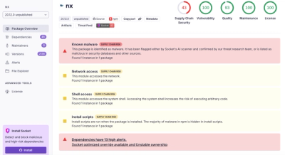
Malicious Nx npm versions stole secrets and wallet info using AI CLI tools; Socket’s AI scanner detected the supply chain attack and flagged the malware.